A polished demo of a tab bar for React that automatically shifts extra tabs to an overflow menu when necessary.
View a live demo.
Inspired by Osvaldas Valutis's 2018 CSS-Tricks article Container-Adapting Tabs With "More" Button.
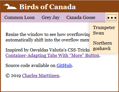
On narrow viewports when there is not enough room to display all of the tabs, move them to an overflow menu:
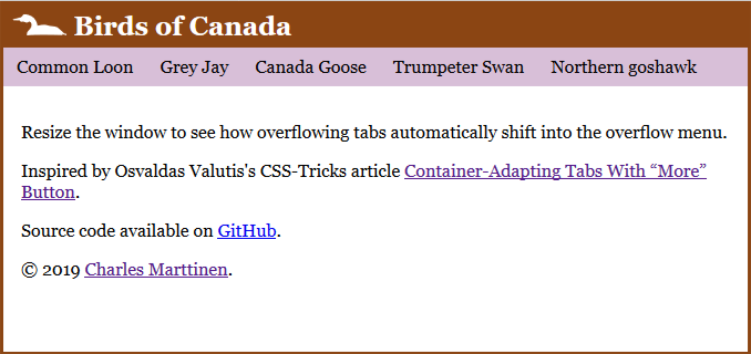
When there is enough room, just display the tabs and hide the overflow menu:
This is just a demo. If you'd like to use this in your own project, feel free to copy the source (copy the whole "src/DynamicTabs" directory), or create an issue and I might be able to publish it to NPM.
To use it, just wrap it around some elements of any type:
<DynamicTabs>
    <a href="https://en.wikipedia.org/wiki/Common_loon">
        Common Loon
    </a>
    <a href="https://en.wikipedia.org/wiki/Grey_jay">
        Grey Jay
    </a>
    <a href="https://en.wikipedia.org/wiki/Canada_goose">
        Canada Goose
    </a>
    <a href="https://en.wikipedia.org/wiki/Trumpeter_swan">
        Trumpeter Swan
    </a>
    <a href="https://en.wikipedia.org/wiki/Northern_goshawk">
        Northern goshawk
    </a>
</DynamicTabs>
A DynamicTabs component has an internal structure that looks like this:
<Container {...props}>
    <TabContainer innerRef>{children}</TabContainer>
    <MenuContainer innerRef>
        <MenuButton innerRef menuIsOpen />
        <Menu>{children}</Menu>
    </MenuContainer>
</Container>
Each component can be switched-out with your own by passing it into the components prop object, which will be merged with the default components:
<DynamicTabs components={{MenuButton: CustomMenuButton}}>
    {...elements}
</DynamicTabs>
See the default components in the "src/DynamicTabs/components" directory for examples.
In addition, any additional props set on the DynamicTabs component will be spread onto the internal Container component.
This project was bootstrapped with Create React App.
npm start runs the app in the development mode.
npm run build builds the app for production to the build folder.

