- Table of contents
This set of Python scripts allow you to convert pcap, pcapng or pdml 5G protocol traces (Wireshark, tcpdump, ...) into SVG sequence diagrams.
It was born from the need to automatically convert 5G traces into something readable given that we needed to account for:
- Mix of HTTP/2, 5G-NAS and PFCP protocols for 5G trace_visualizer
- Additionally, GTP/GTP', Diameter when testing 4G/5G interoperability
- Sequence details are quite tiring to check in the Wireshark GUI
- Specific versions of Wireshark may be needed to decode specific versions of (e.g.) 5G-NAS
- The shift to containers results into traces with multiple IP addresses that are dynamically allocated by k8s
- Mapping of IPs to container names in the deployment, including Calico and Multus interfaces
- In some cases, what is of interest are the exchanges between namespaces and not between containers
- Mapping of IPs to VM names in the deployment
- Different coloring of the different 5G protocols (NAS, HTTP/2, PFCP, ...), as well as differentiating between requests and responses where possible
We could not find a commercial tool doing exactly what we needed. While PlantUML can generate nice diagrams, doing those manually requires too much time. So we resorted to putting together this script.
- You need to have Java installed (executing the
javacommand must launch Java). This is required because PlantUML runs on Java plantuml.jarmust be placed in the base directory (see [place plantuml.jar here.txt](place plantuml.jar here.txt)). This application was tested with the 2019.11 version (Apache Software License Version) ofplantuml.jar. You can find it here.- Wireshark portable of the desired versions placed in the
/wiresharkfolder. See instructions in folder.
- clone the repo
- download and extract
plantuml.jarin the base directory. sudo apt -y install wireshark tsharksudo apt -y install default-jre python3-pipsudo pip3 install --upgrade pyyaml packaging
example run command - python3 trace_visualizer.py -wireshark "OS" ./doc/free5gc.pcap
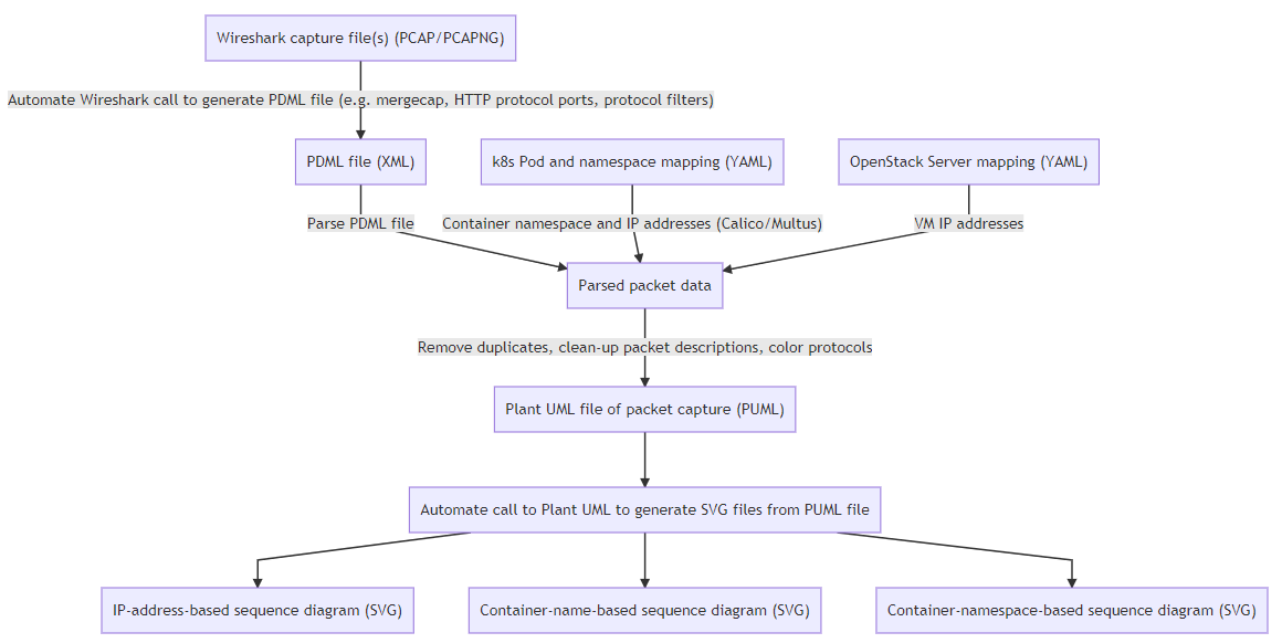
The figure below summarizes what this small application does (SVG, PNG, Mermaid)
You will notice several plotting_xxx.ipynb files.
These are iPython scripts that make use of the implemented functionality to generate nice, interactive plots vbased on data from 5G traces.
In order to run the scripts you will need:
- Jupyter Lab (I use Anaconda and that is what I will assume was installed for the sake of documentation)
- Install NodeJS:
conda install nodejs. - Plotly: used for plotting. In order to install it, you can follow the instructions here.
Since these scripts rely on parsing of 3rd party outputs, no assurance is given that these are up-to-date. You should consider them as just examples how you could accomplish such visualization(s).
The following scripts are included:
File: plotting_parsing_spirent.ipynb
For those of you using Spirent for testing, you may need to quickly compare certain parameters
(e.g. Basic Data Message One Way Trip Delay (micro-sec)).
The way Spirent stores test results is by means of an Excel file named <date>_RID-<test number>__<test name>.xls.
You can use this script to scan a folder containing such Excel files and load data from each of them in a table you can
use for comparing test runs.
Currently, the script only imports parameters from the L5-7 Client|Basic worksheet but can be easily extended.
An example is provided to plot a comparison bar chart of the one-way delay for each test.
For obvious reasons, no example files are provided.
File: plotting_pcap.ipynb
This cript provides some functionality to convert packet traces to DataFrame format and to plot the resulting data using plotly.
This script can be used to plot a 5GC packet capture on a time axis.
Do note that we are just plotting the first plot_data element (you can trace multiple capture files simultanously).
The color bars use the same protocol color code as the sequence diagram.
More interactive HTML version available here.
File: plotting_k8s_metrics.ipynb
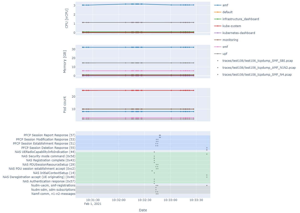
This script shows a more complex use case where k8s KPIs and packet traces can be plotted on a common time axis (no example raw data provided for this case). The end result would look as shown below:
In the case of the k8s KPIs, the data needs to be in the format output by kubectl get --raw /apis/metrics.k8s.io/v1beta1/pods/ per line.
File: plotting_latency_analysis.ipynb
Given:
- A test case where UDP or ICMP packets are transmitted between UE and DN
- That each generated packet has a unique data payload
- A packet trace of N3 packets (GTP-U)
- A packet trace of N6 packets
- That the hosts doing each capture are time-synchronized (or are the same host)
- This is usually the case if you use commonly-used test tools to test User Plane (UP)
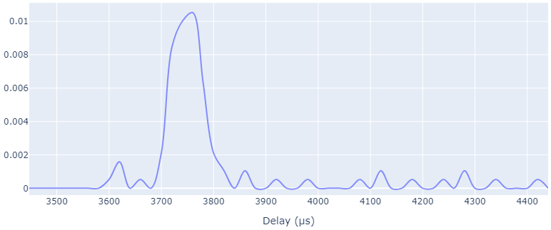
This script calculated the one-way delay for each single packet and plots a normalized histogram (i.e. a distribution) of the packet latency.
The packet parsing does not use the lxml library for parsing because it proved to be too resource-intensive to parse the whole PDML file just to get the payloads, so a custom XML parser is used instead. for ca. 90k packets, each trace took around 2 minutes on an i7 laptop without needing too much memory.
To enable re-use of the parsed data without having to parse again the pcap files, the parsed data is stored in
pickle format and compressed with
bz2.
Result based on the example data included (N3 capture, N6 capture):
Resulting (compressed) Pickle file: UP_example_analysis.pbz2
File: plotting_latency_compare.ipynb
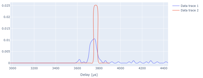
Used for comparing latency data of several analyzed user plane captures. Separated from the parsing script so as to avoid re-parsing every time.
Result based on the example data included (based on importing UP_example_analysis.pbz2 and UP_example_analysis_2.pbz2):
HTML version (interactive): latency_comparison.html
File: plotting_procedure_time.ipynb
Takes as input a CP trace and plots procedure duration:
- Distribution of procedure time
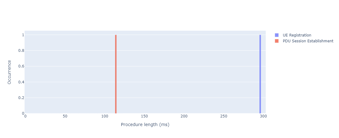 HTML version
 - Occurrence over time
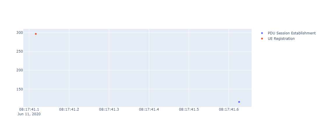 HTML version
Note: a limited set of procedures are supported for now. More may be supported over time.
Run python trace_visualizer.py --help for a list of all available parameters, default values and other things you may need.
The -wireshark option lets you use a specific Wireshark version. The way this works is by using this parameter to generate the path for the tshark and ,if more than one trace is specified, mergecap, call. It is a scripted command, nothing more:
OS: no absolute path fortsharkis generated. That is, thetsharkfrom the OS's path will be used<version number>: an absolute path location for thetsharkexecutable is generated. The executable is assumed to be located in the following location:wireshark/WiresharkPortable_<version number>.latest: similar to the previous option, this option scans thewiresharkfolder and out of all of the found folders chooses the one with the highest version number.
Example: WiresharkPortable version 3.4.4 should be placed in a directory named WiresharkPortable_3.4.4.
Do note that "Wireshark Portable" applies to Windows only. In Linux, the same concept applies. Just make sure that the script can find tshark and mergecap where it expects to. That is:
tshark:wireshark/WiresharkPortable_<version number>/App/Wireshark/tsharkmergecap:wireshark/WiresharkPortable_<version number>/App/Wireshark/mergecap
Note: whether symlinks work is not tested.
Many, many thanks to the free5GC project for providing some 5GC traces we could use to show some examples on how to use the application.
The free5GC is an open-source project for 5th generation (5G) mobile core networks. The ultimate goal of this project is to implement the 5G core network (5GC) defined in 3GPP Release 15 (R15) and beyond.
Please be sure to visit their project website free5GC and their Github repository.
They provided us with the following trace, which we will use to illustrate the examples.
While this tool was born with 5GC traces in mind, it turns out to be useful at visualizing HTTP/2 traces. We had this HTTP/2 example because at the beginning we could not find any freely available 5GC traces (they typically contain intra-NF communication and/or proprietary protocol specifics, so they are not easy to come by).
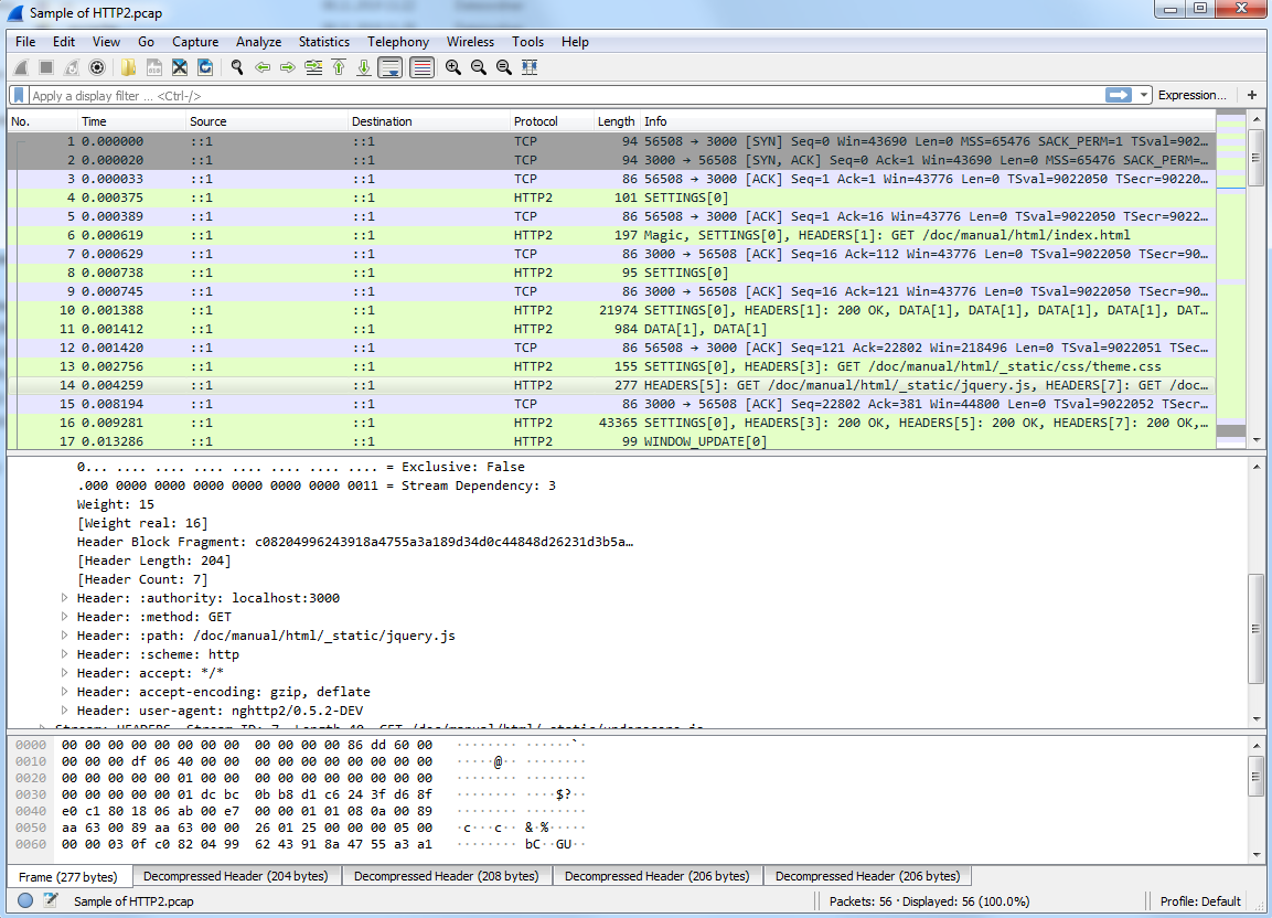
As alternative, we will use the sample HTTP/2 capture from the Wireshark wiki and show you how to use the application with the http2-h2c.pcap file
As shown in Wireshark, the capture should look as shown below:
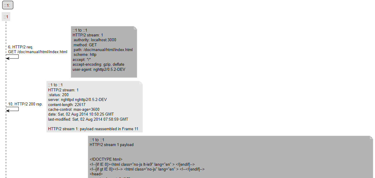
The following command converts the Wireshark trace into the SVG diagram shown below give that plantuml.jar and the WiresharkPortable_3.1.0 folder are placed where they should:
python trace_visualizer.py -wireshark "3.1.0" "<file path>\Sample of HTTP2.pcap"
Sometimes you would like to group several diagram actors into one (e.g. a pod with multiple calico interfaces) or several pods belonging to one namespace (e.g. belonging to the same NF).
Just use the -pods optional parameter and as parameter use the output of kubectl get pods --all-namespaces -o yaml
e.g. python trace_visualizer.py -pods "<path to YAML file>" -wireshark "3.1.0" "<file path>\Sample of HTTP2.pcap"
The script will now output a pod and namespace version of the SVGs, where the IPs will be replaced with pod names or namespace names respectively.
This allows you to message flows between pods and/or namespaces to have a clearer view of the messaging.
The application currently maps following information found in the kubectl YAML file:
namespaceassociation within themetadataelements- IP addresses associated to this pod:
cni.projectcalico.org/podIPwithin theannotationsmetadataelementipselements within the JSON data withink8s.v1.cni.cncf.io/networks-status
The name assigned to the pod is that found under the name element.
In case you only want to generate specific diagram types, you can use -diagrams <diagram types> option, e.g. -diagrams "ip,k8s_pod,k8s_namespace". Supported diagram types:
ip: does not use k8s pod information for diagram generationk8s_pod: generates diagrams where IPs are replaced by pod names and intra-pod communication (e.g. different Multus interfaces in a pod) are not shownk8s_namespace: similar tok8s_podbut messages are grouped by namespace
You may also input not a single capture as input, but a comma-separated list of capture files. In this case, the script will automatically call mergecap and merge the given capture files. This can be useful if you have capture files from e.g. several k8s worker nodes.
python trace_visualizer.py -wireshark "3.1.0" "<file path>\Sample of HTTP2.pcap,<file path>\Sample of another file.pcap"
The same Wireshark version will be used for all of the files for dissection.
Do note that this will only give you a useful output if you time-synchronized the hosts where the captures were taken (nothing to do with this script). Else, you will merge time-shifted captures.
Just use the -http2ports ports parameters. E.g. -http2ports "3000,80" tells Wireshark to decode communication on those ports as HTTP/2. Useful if you are using non-standard ports for your communication.
Let us try running python trace_visualizer.py -wireshark latest "doc/free5gc.pcap"
We obtain the following trace diagram:
SVG full diagram here
There seems to be some things missing. That is because the SBI communication will run on varying ports depending on the configuration/deployment. While some ports are used by default, those may not be the ones your deployment are using.
We know from our configuration (or looking at the Wireshark trace) that we have SBI communication on ports 29502, 29503, 29504, 29507, 29509, 29518.
Let's try again now running python trace_visualizer.py -wireshark 3.2.2 -http2ports "29502,29503,29504,29507,29509,29518" -limit 200 "<path_to_trace>\free5gc.pcap"
Note: the limit option overrides the default of maximum 100 messages per output SVG file (else PlantUML's Java runtime often runs out of memory and crashes).
The output looks more like a 5GC trace now:
SVG full diagram here
While testing a product under heavy development, you may find the case where some NAS messages follow a certain 3GPP release while some other messages follow another.
This may result in no single Wireshark version capable of decoding all messages. i.e., you will always have some [Malformed packet] payloads shown no matter what version you use.
In order to enable packet decoding using multiple Wireshark versions, use the option -wireshark <comma-separated-list-of-wireshark-versions>.
Example: -wireshark "2.9.0,3.1.0" will use Wireshark 2.9.0 as baseline dissector and the rest, in this case 3.1.0 as alternative. In case a malformed packet is detected for a given packet, the first non-malformed alternative (in this case 3.1.0, you may specify more) will be used instead.
You also have the option to use the OS-installed Wireshark version by using as version string OS. In this case, the script will not generate a full path for the tshark executable but rather a call to subprocess.run() without a full path and only the command itself.
It may happen that you have a lot of additional headers and that they make the generated figures less readable. In this case, you can use the ignorehttpheaders option.
Example: -ignorehttpheaders "x-forwarded-for,x-forwarded-proto,x-envoy-internal,x-request-id,x-istio-attributes,x-b3-traceid,x-b3-spanid,x-b3-sampled"
Omits each of the HTTP/2 headers in the list from the generated figures.
It may happen that your system uses a mix of VMs and containers. Or that the mapping for certain IPs is missing. The -openstackservers <path to YAML file> option allows you to set an additional IP mapping for generating labels.
The syntax of the YAML file is chosen so that it is easy to export the data from OpenStack and directly use it as input without further processing.
Any IP found in the fixed field will be mapped to the server label. E.g. messages originating from 192.168.10.2 and 192.168.6.19 IPs will both be shown as originating from the same element, which will be labeled Test system running on VM with several IPs.
Only the labels shown are parsed. Your YAML file may contain additional labels (most probably the case if it is an exported file).
servers:
  'Test system running on VM with several IPs':
    interfaces:
      test:
        fixed:     "192.168.10.2"
      n1_n2:
        fixed:     "192.168.3.19"
      n3:
        fixed:     "192.168.5.19"
      n6:
        fixed:     "192.168.6.19"
      oam:
        fixed:     "192.168.1.19"
The following example servers.yaml file is used to generate the diagram below:
Run python trace_visualizer.py -wireshark 3.2.2 -http2ports "29502,29503,29504,29507,29509,29518" -limit 200 -openstackservers "<path_to_servers.yaml>\servers.yaml" -show_selfmessages True "<path_to_trace>\free5gc.pcap"
Note: self-messages are typically omitted from the generated diagram. since in this case part of the 5GC is running on localhost, the -show_selfmessages True option is used to show self-messages.
SVG full diagram here
There is an option to add relative timestamps to the generated diagrams (e.g. to measure processing time).
Just use the show_timestamp True option, e.g. python trace_visualizer.py -wireshark 3.2.2 -http2ports "29502,29503,29504,29507,29509,29518" -limit 200 -openstackservers "<path_to_servers.yaml>\servers.yaml" -show_selfmessages True -show_timestamp True "<path_to_trace>\free5gc.pcap"
SVG full diagram here
Do you want to put some pictures in a Wiki or send a diagram to a colleague but there is too much information? There is the option to omit most of the information and also to explicitly show some: -simple_diagrams and -force_show_frames
As an example, we will generate a diagram showing only a couple of NAS messages for PDU session establishment: frames 15 (registration request), 175 (registration complete) and 228 (PDU session establishment accept).
Just use the show_timestamp True option, e.g. python trace_visualizer.py -wireshark 3.2.2 -http2ports "29502,29503,29504,29507,29509,29518" -limit 200 -openstackservers "<path_to_servers.yaml>\servers.yaml" -show_selfmessages True -show_timestamp True -simple_diagrams True -force_show_frames "15,175,228" "<path_to_trace>\free5gc.pcap"
SVG full diagram here
Maybe you have a vendor trace but cannot share a diagram because it contains proprietary information? Or have a real trace but you also cannot share it because it contains personal information? (e.g. real IMSIs).
There are some workaround you can use to get around this.
Let us assume that we want to show the information below but the actual IMSIs (imsi-2089300007487) in frames 36, 38 cannot be shown.
Since this application works on an exported PDML file, you can just edit the generated PDML file and remove/edit from there any information you want. As long as the XML is valid, the output will still be generated.
Just search for <field name="num" pos="0" show="36" in the PDML file to go to frame 36 and edit it accordingly.
Note that you odo not have to edit the parsed HTTP/2 fields but rather the http2.data.data hex payload. It is cumbersome, but since this application does HTTP/2 frame reconstruction (a data payload can span more than one HTTP/2 frame), it works with the binary payload. Just use a HEX-to-ASCII converter (e.g. here), edit the payload and convert it back to HEX (e.g. here). In this case, we will change the payloads to change imsi-2089300007487 to imsi-XXXXXXXXXXXXX (removed). You can find the edited trace here.
The same for frame 38. The output can be seen below
SVG full diagram here
Editing headers is simpler. To modify the header shown below,
You just need to go to frame 31 and to the <field name="http2.header" showname="Header: :path: . The application uses the show value of each header to generate the diagrams (in this case <field name="http2.header.value"). In this case we changed the value to show="/nudr-dr/v1/subscription-data/imsi-XXXXXXXXXXXXX/authentication-data/authentication-subscription".
Maybe some editing features will be added in the feature, but will depend on whether that is really needed or not.
There may be some issues with HTTP/2 frame fragment reconstruction, so drop me a line if you find some issues
