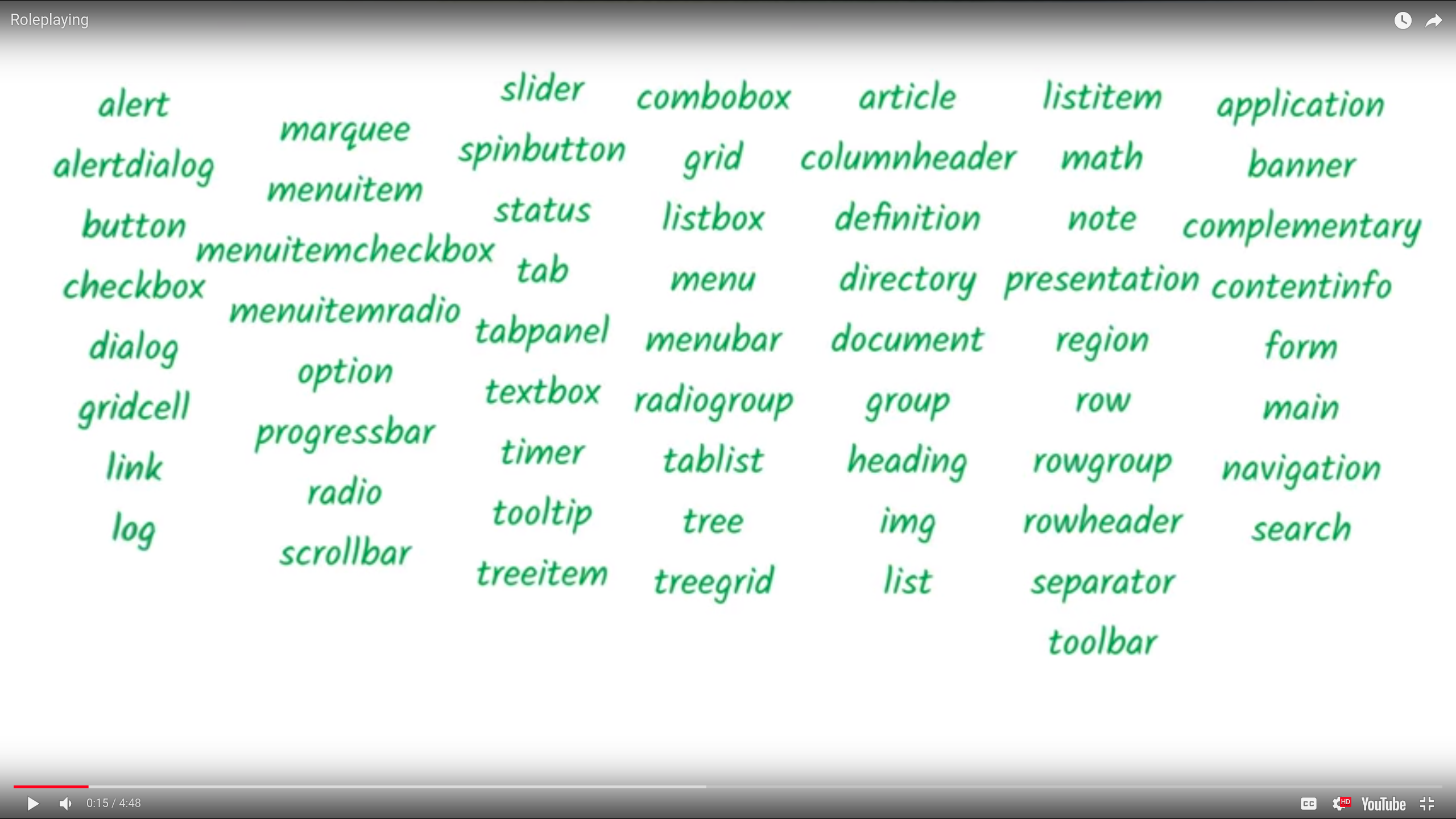
These are accessbility notes.
<input id="roo" type="checkbox">
<label for="roo"><div role="checkbox"
aria-checked="true">
Recieve promotional offers
</div>
<!-- Role='checkbox' name/label='Recieve promotional offers' state='checked'
-->Aria only modifys accessibility tree. So you will have to add in keyboard event handling, add focusability, modify element behavior, modify element appearance.
Role, Name/Label, state, value
Make sure that tabindex and role are used in the same place. So when the keyboard lands on the element the role is conveyed
Abstract Roles cannot be used on its own.
Aria 1.1 practice guide(draft)
HTML Aria(list of default aria roles built into HTML elements)(No Roles means you )
aria labels overides text content on screen readers
<button aria-label="Close">
    x
</button>
<!-- Close will be read not x -->
aria-labelledby allows another element to be used as its label for text content. it can take a list of ids and the text content gets concat into one labelledby takes precedence over aria-label and text context.
<div role="radio" aria-labelledby="lb01"></div>
<span id="lb01">Coffee</span>aria-owns reshapes the accessibility tree. (e.g. )
<div role="menu">
    <div role="menuitem" aria-haspopup="true">
        New
    </div>
    <!-- more items -->
    <div aria-owns="submenu"></div>
</div><!-- menu -->
<div role="menu" id="submenu">
    <div role="menuitem">
        Document
    </div>
</div>
aria-activedescendant
<div role="listbox" tabindex="0" aria-activedescendant="i7">
    <!--  -->
    <div role="option" id="i5">Item 5</div>
    <div role="option" id="i6">Item 6</div>
    <div role="option" id="i7">Item 7</div>
    <div role="option" id="i8">Item 8</div>
    <!-- -->
</div>

<!-- When the user focus on the box the user is focused on the item
this can be used in conjunction with combobox so when the user sets the
-->
aria-describedby
<label for="pw">Password:</label>
<input type="password" id="pw" aria-describedby="pw-help">
<div id="pw-help" hidden>
    Password must be at least 12 characters
</div>

<!-- like aria-labeledby helps describe the element that may be hidden from the dom -->
aria-posinset and aria-setsize
<div role="listbox">
	<div role="option" aria-posinset="857" aria-setsize="1000">Item 857 </div>
	<div role="option" aria-posinset="858" aria-setsize="1000">Item 858 </div>
</div>


<!-- Useful when you lazy load a really long list and want the assistive tech
to show the certain list that is available to the user -->
How to hide a element from the accesbility tree
<button style="visibility: hidden;"></button>

<div style="display: none"></div>

<span hidden></span>
position off screen
.screenreader{
    position:absolute;
    left:-10000px;
    width:1px;
    height:1px;
    overflow:hidden;
}
you can use aria-describeby or aria-labeledby to reference hidden elements
A way to exclude elements from the aria tree such as aria hidden true This removes all decendents from the accesbility tree. With the exception of aria labeledby or describedby
This is useful when you have a slider
aria-hidden default state is false.
Aria Live
<div class="alertbar" aria-live="assertive">
    Could not connect!
</div>
aria-live values are off polite assertive
off means nothing happens
polite will alert the user to the change after the user finishes what he or she is doing.
for something important but not urgent
assertive will interupt the user to whatever he or she is doing
aria-atomic
Aria atomic considers the who region as one to be updated.
<span aria-labelledby="birthdayLb1" aria-live="polite" aria-atomic="true">
<input type="number" id="day" value="18">
<input type="number" id="month" value="10">
<input type="number" id="year" value=1983>


<!-- This will announce the fill content of the date widget the user changes the date -->
<!-- aria atomic the default value is false -->

</span>
aria-relevant
indicates what type of changes need to present to the user
| Value | Description |
|---|---|
| additions: | Element nodes are added to the DOM within the live region |
| removals | Text or element nodes within the live region are removed from the DOm |
| text: | Text is added to any DOM descendant nodes of the live region. |
| all: | Equivalent to the combination of all values, "additions removals text." |
| additions text (default) | Equivalent to the combination of values, "additions text". |
aria-relevant="additions"
<!-- Chat application that will announce when any change made to the chat history box -->
<div aria-live="polite" aria-relevant="additions" class="chat-history">
	<div class="chat-bubble left">
		<div class="offscreen">Cathy says</div> Sure! </div>
</div>
aria-relevant="text"
<div class="alertbar"
     aria-live="assertive"
     aria-atomic="true"
     aria-relevant="text">
        Could not connect!
</div>

<!--  Changing text will trigger this asstive tech to announce the change -->
aria-busy="true"
lets the asstive tech know to ignore changes to this element, meant for when things are loading or connectivity is off Once it is loaded it should be set to false.
<div aria-live="polite" aria-busy="true" class="chat-history">
	<div class="chat-bubble left">
        <div class="offscreen"> Cathy says </div>
    Sure! </div>
</div>
Focus styles
/*remove styles anti-pattern DO NOT DO THIS*/
:focus{
    outline:0;
}


:focs{
    outline:1px dotted #FFF;
}

/* hover states */
button:hover{
    background:#ddd;
    color:#fff;
    text-decoration:underline;
}


/* changing the box shadow has more support across browser rather than just changing the color   */
button:focus{
outline:0;
box-shadow:0,0 8px 3px rgba(255, 255, 255, 0.8);
}


/* targeting radio circles */

.radio:focus{
    outline:0;
}
.radio:focus::before{
    box-shadow: 0 0 1px 2px #5b9dd9;
}
Focus
Ring A focus ring is something the denotes focus mostly seen in keyboards but not mouse events. found in button elements To shim it check out
links for focusring focusring wicg Proposing CSS input modality moz-focusring
.toggle[aria-pressed="true"] {

}
responsive design
<meta name="viewport" content="width=device-width, initial-scale=1">

<!-- user-scalable=no is an anti-pattern -->
48dp minimum touch target size both top and bottom
32dp margin touch target so that user do not inadverterly touch another button.
dp= device independent pixel
links
Webaim checklist google dev responsive design material design for accessibility recommendation for touch target
links for contrast https://webdev.ink/2018/04/24/Text-Contrast-for-Web-Pages/#wdi-contrast-chart
These are miniumns: text and images of text have a contrast ratio of at least 4.5:1 large text (over 18 points or 14 point bold has a contrast ratio nof at least 3:1)
Magic number is 7:1 having higher contrast is better (higher left number)
check site performance open up audits pane in chrome dev tools then use accessbility audits to see failing elements
do not just use color as the sole method for convey content or distinguishing visual elements.
do not just use color to indicate links use visual
http://webaim.org/standards/wcag/checklist#sc1.4.1
use nocoffee extension to check for high contrast.
