This is an analysis of my Spotify streaming history from 9/14/2020 - 9/14/2021
library(jsonlite)
library(tidyverse)
## ── Attaching packages ─────────────────────────────────────── tidyverse 1.3.1 ──

## ✓ ggplot2 3.3.5     ✓ purrr   0.3.4
## ✓ tibble  3.1.1     ✓ dplyr   1.0.7
## ✓ tidyr   1.1.3     ✓ stringr 1.4.0
## ✓ readr   2.0.1     ✓ forcats 0.5.1

## ── Conflicts ────────────────────────────────────────── tidyverse_conflicts() ──
## x dplyr::filter()  masks stats::filter()
## x purrr::flatten() masks jsonlite::flatten()
## x dplyr::lag()     masks stats::lag()
Spotify delivers its data in the form of JSON, and it was split into 2 files in my case.
json1 <- jsonlite::read_json('~/code/data/spotify/StreamingHistory0.json', simplifyDataFrame = TRUE)
json2 <- jsonlite::read_json('~/code/data/spotify/StreamingHistory1.json', simplifyDataFrame = TRUE)
df1 <- tibble(json1)
df2 <- tibble(json2)
We join all history into one tibble and arrange by end time of each song.
total_df <- full_join(df1,df2) %>% arrange(.,desc(endTime), by_group=TRUE)
## Joining, by = c("endTime", "artistName", "trackName", "msPlayed")
Graph top 10 artist by song play count
top_artists <- total_df %>% count(artistName, sort = TRUE) %>% arrange(.,desc(n), by_group=TRUE) %>% top_n(10)
ggplot(top_artists, aes(x = reorder(artistName,(-n)), y = n)) + geom_bar(stat = 'identity') + theme(axis.text.x = element_text(angle = 90, vjust = 0.5, hjust=1)) + xlab("Artist Name") + ylab("Number of plays")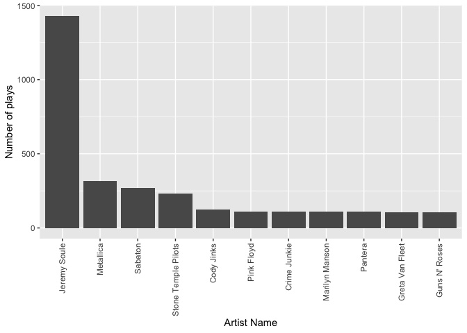
Graph top 10 songs played
top_tracks <- total_df %>% count(trackName, sort = TRUE) %>% arrange(.,desc(n), by_group=TRUE) %>% top_n(10)
ggplot(top_tracks, aes(x = reorder(trackName,(-n)), y = n)) + geom_bar(stat = 'identity') + theme(axis.text.x = element_text(angle = 90, vjust = 0.5, hjust=1)) + xlab("Track Name") + ylab("Number of plays")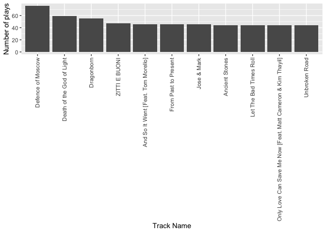
Graph top 10 songs by time played
top_time_songs <- total_df %>% group_by(trackName) %>% summarise(time_played = (sum(msPlayed)/1000)/60) %>% arrange(desc(time_played, by_group = TRUE)) %>% top_n(9)
## Selecting by time_played
top_time_songs %>% ggplot(aes(x = reorder(trackName,(-time_played)), y = time_played)) + geom_bar(stat = 'identity') + theme(axis.text.x = element_text(angle = 90, vjust = 0.5, hjust=1)) + xlab("Track Name") + ylab("Time Played (minutes)")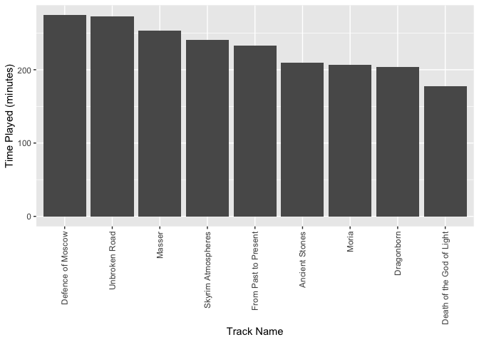
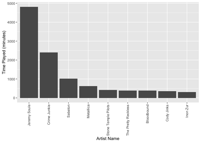
Graph top 10 artists by time played
top_time_artists <- total_df %>% group_by(artistName) %>% summarise(time_played = (sum(msPlayed)/1000)/60) %>% arrange(desc(time_played, by_group = TRUE)) %>% top_n(9)
## Selecting by time_played
top_time_artists %>% ggplot(aes(x = reorder(artistName,(-time_played)), y = time_played)) + geom_bar(stat = 'identity') + theme(axis.text.x = element_text(angle = 90, vjust = 0.5, hjust=1)) + xlab("Artist Name") + ylab("Time Played (minutes)")