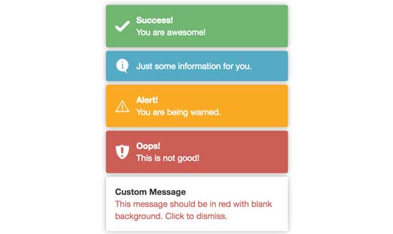
Angular Toaster Module (ng2-toastr)
The lib is inspired by [angular-toastr] (https://github.com/Foxandxss/angular-toastr), and will show bootstrap-like toasts. Please update Modern Angular (v4.0.0+) latest version to avoid any unexpected issues. We jumped version from v1.x to v4.x in order to match Angular version.
NOTE 1: In order to use animation, please include Animation Module from angular v4.x to your project:
    import {BrowserAnimationsModule} from '@angular/platform-browser/animations';

    @NgModule({
      imports: [BrowserModule, BrowserAnimationsModule, ToastModule.forRoot()],
      ...
    })
    export class AppModule {
    }
NOTE 2: Version 4.0.x and above works with Angular v4 (Tested with Angular v4.0.0 and Angular-Cli v1.0.0).
Use v1.6.0 if you are working with angular v2.x.
Usage
-
Install ng2-toastr using npm:
npm install ng2-toastr --save -
Include js and css files in html header
<link href="node_modules/ng2-toastr/bundles/ng2-toastr.min.css" rel="stylesheet" />
<script src="node_modules/ng2-toastr/bundles/ng2-toastr.min.js"></script>
NOTE: If you are using angular-cli you do not need to include 'node_modules/ng2-toastr/bundles/ng2-toastr.min.js', since adding 'import {ToastModule} from 'ng2-toastr/ng2-toastr';' to your module file (below) will allow it to be autoloaded.
-
Add ToastModule into your AppModule class.
app.module.tswould look like this:import {NgModule} from '@angular/core'; import {BrowserModule} from '@angular/platform-browser'; import {AppComponent} from './app.component'; import {ToastModule} from 'ng2-toastr/ng2-toastr'; @NgModule({ imports: [BrowserModule, ToastModule.forRoot()], declarations: [AppComponent], bootstrap: [AppComponent], }) export class AppModule { }
-
Inject 'ToastsManager' class in your component class.
    import { ToastsManager } from 'ng2-toastr/ng2-toastr';

    @Component({
      selector: 'awesome-component',
      template: '<button class="btn btn-default" (click)="showSuccess()">Toastr Tester</button>'
    })
    export class AppComponent {

      constructor(public toastr: ToastsManager, vcr: ViewContainerRef) {
         this.toastr.setRootViewContainerRef(vcr);
      }

      showSuccess() {
        this.toastr.success('You are awesome!', 'Success!');
      }

      showError() {
        this.toastr.error('This is not good!', 'Oops!');
      }

      showWarning() {
        this.toastr.warning('You are being warned.', 'Alert!');
      }

      showInfo() {
        this.toastr.info('Just some information for you.');
      }

      showCustom() {
        this.toastr.custom('<span style="color: red">Message in red.</span>', null, {enableHTML: true});
      }
    }
ToastOptions Configurations
By default, the toastr will show up at top right corner of the page view, and will automatically dismiss in 3 seconds. You can configure the toasts using ToastOptions class. Currently we support following options:
toastLife: (number)
Determines how long an auto-dismissed toast will be shown. Defaults to 5000 miliseconds.
dismiss: (string)
Determine how a displayed toaster can be dismissed. Allowed values are: 'auto', 'click', 'controlled' (value should all be lowercase).
- auto: Toaster will auto dismiss in miliseconds (value specified by
toastLife). This is default value. - click: Toaster will be dismissed when user click on it.
- controlled: Toaster will be dismissed based on specific logic.
newestOnTop: (boolean)
Determines whether new toast should show up on top of previous toast Defaults to false.
showCloseButton: (boolean)
Determines whether toast should include 'x' close button. Defaults to false.
maxShown: (number)
Determines maximum number of toasts can be shown on the page in the same time. Defaults to 5.
positionClass: (string)
Determines where on the page the toasts should be shown. Here are list of values:
- toast-top-right (Default)
- toast-top-center
- toast-top-left
- toast-top-full-width
- toast-bottom-right
- toast-bottom-center
- toast-bottom-left
- toast-bottom-full-width
messageClass: (string)
CSS class for message within toast.
titleClass: (string)
CSS class for title within toast.
animate: (string)
You have following choice: 'fade', 'flyLeft' or 'flyRight'.
- fade: makes every toast either fade in or fade out.
- flyLeft: makes every toast fly in from left side.
- flyRight: makes every toast fly in from right side.
Defaults to 'fade'. You can set
animate: nullto disable animations.
enableHTML: (boolean)
Allow input of message to be HTML. Default to false.
Use dependency inject for custom configurations. You can either inject into app.module.ts or any component class.
// custom-option.ts
import {ToastOptions} from 'ng2-toastr';

export class CustomOption extends ToastOptions {
  animate = 'flyRight'; // you can override any options available
  newestOnTop = false;
  showCloseButton = true;
}

// app.module.ts
import { CustomOption } from './custom-option';

@NgModule({
  declarations: [ ... ],
  imports: [
    ...
    ToastModule.forRoot(),
  ],
  providers: [
    {provide: ToastOptions, useClass: CustomOption},
    ...
  ],
  bootstrap: [ ... ]
})
Override global option:
You can also override dismiss, toastLife, enableHTML, titleClass, messageClass options for individual toast:
this.toastr.sucess('This toast will dismiss in 10 seconds.', null, {toastLife: 10000});
this.toastr.info('<span style="color: red">Message in red.</span>', null, {enableHTML: true});
NOTE: specify a value for toastLife overrides dismiss and always set dismiss = 'auto'.
Should you need specific logic to determine when a toaster will be dismissed you can store the displayed Toast.
Be cautious when the toaster can be dismissed in other ways such as dismiss: 'auto' or dismiss: 'click'.
    this.toastr.success('You are awesome!', 'Success!', {dismiss: 'controlled'})
        .then((toast: Toast) => {
            setTimeout(() => {
                this.toastr.dismissToast(toast);
            }, 10000);
        });
Use onClickToast observable on ToastManager instance
-
Now you can added custom data object to each toast.
Following example shows how to allow user to click on toast to navigate to new path:
this.toastr.onClickToast() .subscribe( toast => { if (toast.data && toast.data.url) { // navigate to this.router.navigate(toast.data.url); } }); this.toastr.success('You are awesome! Click to view details.', 'Success!', {data: {url: '/path/to/successUrl'}}); -
Each
Toastinstance includestimeoutId, which allows developer to stop auto-dismiss.if (toast.timeoutId) { clearTimeout(toast.timeoutId); // do something before dismiss the toast this.toastr.dismiss(toast); }
Run demo app
angular-cli
> cd demo/ngcli && npm install
> ng serve
Then navigate your browser to http://localhost:4200
webpack
> cd demo/webpack && npm run install
> npm run build
> npm start

