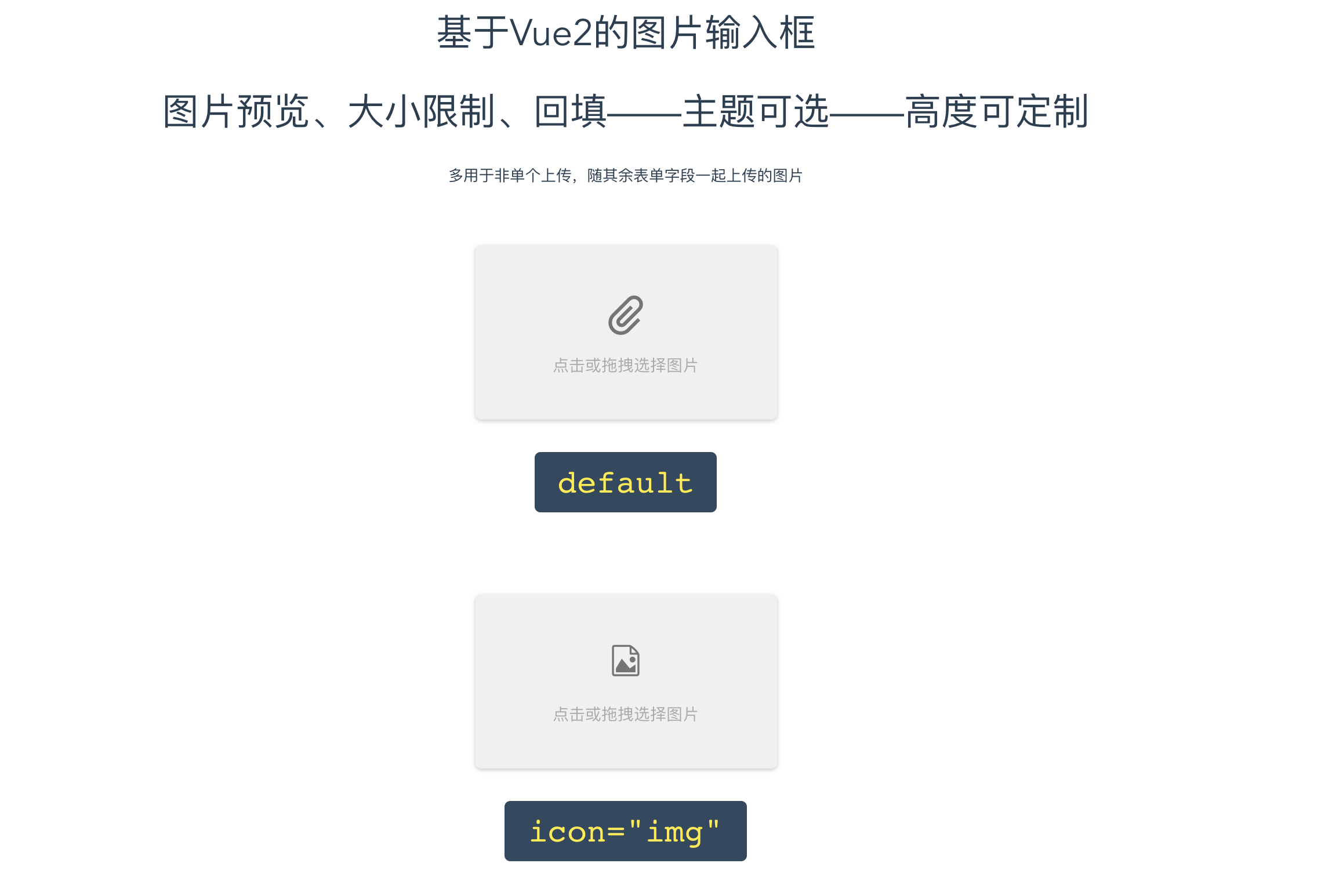
- Bind value with
v-model - Support Pic preview/drop-select/max-size
- Two themes
- Convenient custom
It's just like a <input type="file"/>
Support Vue.js 2.0+
Not support Vue.js 1.x
// for develop
npm start

// for build
npm run buildnpm install vue-img-inputer -D- As global component
// in entry file
import Vue from 'vue'
import VueImgInputer from 'vue-img-inputer'
Vue.component('VueImgInputer', VueImgInputer)- As partial component
// in some component
import VueImgInputer from 'vue-img-inputer'
export default {
  components: {
    VueImgInputer
  }
}<VueImgInputer v-model="picValue" theme="light" size="large"></VueImgInputer>| Name | Type | Description | Optional value | Default |
|---|---|---|---|---|
| v-model | — | the file was selected | — | — |
| accept | String | the same as accept in input,suggest to set a specific value like image/jpg,image/gif;, value as image/* will cause a problem that File-checkbox come out after a long time |
— | image/*,video/*; |
| onChange | Function | callback trigger after file selected,params: {file, fileName} | — | — |
| placeholder | String | placeholder | — | 点击或拖拽选择图片 |
| maxSize | Number | max-size of pic (KB) | — | 5120 |
| imgSrc | String | use VueImgInputer as img tag, you should assign a src of img :) |
— | — |
| id | String | input's unique ID,assign it when you need to operate DOM, otherwise it will automatic generate a random string in 4 length to be it's ID | — | random string in 4 length |
| theme | String | theme | light,material | material |
| size | String | size | small,large | normal |
| icon | String | icon | img,clip,img2 | clip,when theme is light, default is img |
| readonly | Boolean | readonly,it will be true while imgSrc was not empty |
— | false |
| bottomText | String | text in the bottom while select a pic && hover component | — | 点击或拖拽图片以修改 |
| readonlyTipText | String | only when readonly was true was effective,replace bottomText |
— | 不可更改 |
| customerIcon | like  |
if you use iconfont of alibaba,Congratulations! you can use this prop set any value to replace component's own icon | — | — |
| noMask | Boolean | remove info mask while hover | — | false |
| nhe | Boolean | no-hover-effect | — | false |
| name | String | name of input, the same as name in input |
- | file |
- CSS was under BEM style,so you can customize your own
size&themein an easy way
- Multi-file support
PC: IE10 +
Mobile: be happy to use
MIT
