Angular bootstrap date & time picker
================================
Native AngularJS datetime picker directive styled by Twitter Bootstrap

(Almost) Complete re-write
This project started as an AngularJS specific re-write of the bootstrap-datetimepicker project. Only the CSS file from the bootstrap-datetimepicker project was re-used.
#Dependencies
Requires:
- AngularJS 1.1.3 or higher (1.0.x will not work)
- moment.js for date parsing and formatting
- bootstrap's dropdown component (
dropdowns.less) - bootstrap's sprites (
sprites.lessand associated images) for arrows
#Testing We use karma and jshint to ensure the quality of the code. The easiest way to run these checks is to use grunt:
npm install -g grunt-cli
npm install bower grunt
The karma task will try to open Chrome as a browser in which to run the tests. Make sure this is available or change the configuration in test\test.config.js
#Usage We use bower for dependency management. Add
dependencies: {
    "angular-bootstrap-datetimepicker": "latest"
}
To your bower.json file. Then run
bower installThis will copy the angular-bootstrap-datetimepicker files into your components folder, along with its dependencies.
Add the css:
<link rel="stylesheet" href="components/bootstrap/docs/assets/css/bootstrap.css">
<link rel="stylesheet" href="components/angular-bootstrap-datetimepicker/src/css/datetimepicker.css"/>
Load the script files in your application:
<script type="text/javascript" src="components/moment/moment.js"></script>
<script type="text/javascript" src="components/bootstrap/docs/assets/js/bootstrap.js"></script>
<script type="text/javascript" src="components/angular/angular.js"></script>
<script type="text/javascript" src="components/angular-bootstrap-datetimepicker/src/js/datetimepicker.js"></script>
Add the date module as a dependency to your application module:
var myAppModule = angular.module('MyApp', ['ui.bootstrap.datetimepicker'])Apply the directive to your form elements:
<datetimepicker data-ng-model="data.date"></datetimepicker>Options
startView
String. Default: 'day'
The view that the datetimepicker should show when it is opened. Accepts values of :
- 'minute' for the minute view
- 'hour' for the hour view
- 'day' for the day view (the default)
- 'month' for the 12-month view
- 'year' for the 10-year overview. Useful for date-of-birth datetimepickers.
minView
String. 'minute'
The lowest view that the datetimepicker should show.
minuteStep
Number. Default: 5
The increment used to build the hour view. A button is created for each minuteStep minutes.
dropdownSelector
When used within a Bootstrap dropdown, the selector specified in dropdownSelector will toggle the dropdown when a date/time is selected.
Working with ng-model
The angular-bootstrap-datetimepicker directive requires ng-model and the picked date/time is automatically synchronized with the model value.
This directive also plays nicely with validation directives such as ng-required.
The angular-bootstrap-datetimepicker directive stores and expects the model value to be a standard javascript Date object.
ng-required directive
If you apply the required directive to element then the form element is invalid until a date is picked.
Note: Remember that the ng-required directive must be explicitly set, i.e. to "true".
Examples
Inline component.
<datetimepicker data-ng-model="data.date" ></datetimepicker>Inline component with data bound to the page with the format specified via date filter:
<datetimepicker data-ng-model="data.date" ></datetimepicker><p>Selected Date: {{ data.date | date:'yyyy-MM-dd HH:mm' }}</p>
Display formatting of the date field is controlled by Angular filters.
As a drop-down:
<div class="dropdown">
    <a class="dropdown-toggle" id="dLabel" role="button" data-toggle="dropdown" data-target="#" href="#">
        Click here to show calendar
    </a>
    <ul class="dropdown-menu" role="menu" aria-labelledby="dLabel">
        <datetimepicker data-ng-model="data.date"
                        data-datetimepicker-config="{ dropdownSelector: '.dropdown-toggle' }"></datetimepicker>
    </ul>
</div>
In this example, the drop-down functionality is controlled by Twitter Bootstrap.
The dropdownSelector tells the datetimepicker which element is bound to the Twitter Bootstrap drop-down so
the drop-down is toggled closed after the user selectes a date/time.
Drop-down component with associated input box.
<div class="dropdown">
    <a class="dropdown-toggle" id="dLabel" role="button" data-toggle="dropdown" data-target="#" href="#">
        <div class="input-append"><input type="text" class="input-large" data-ng-model="data.date"><span class="add-on"><i
                class="icon-calendar"></i></span>
        </div>
    </a>
    <ul class="dropdown-menu" role="menu" aria-labelledby="dLabel">
        <datetimepicker data-ng-model="data.date"
                        data-datetimepicker-config="{ dropdownSelector: '.dropdown-toggle' }"></datetimepicker>
    </ul>
</div>
In this example, the drop-down functionality is controlled by Twitter Bootstrap.
The dropdownSelector tells the datetimepicker which element is bound to the Twitter Bootstrap drop-down so
the drop-down is toggled closed after the user selectes a date/time.
I18N
All internationalization is handled by Moment.js, see Moment's documention for details.
Screenshots
Year view
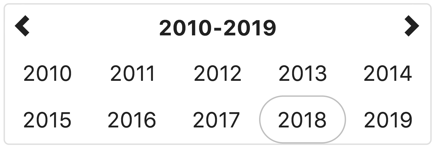
This view allows the user to select the year for the target date. If the year view is the minView, the date will be set to midnight on the first day of the year
Month view
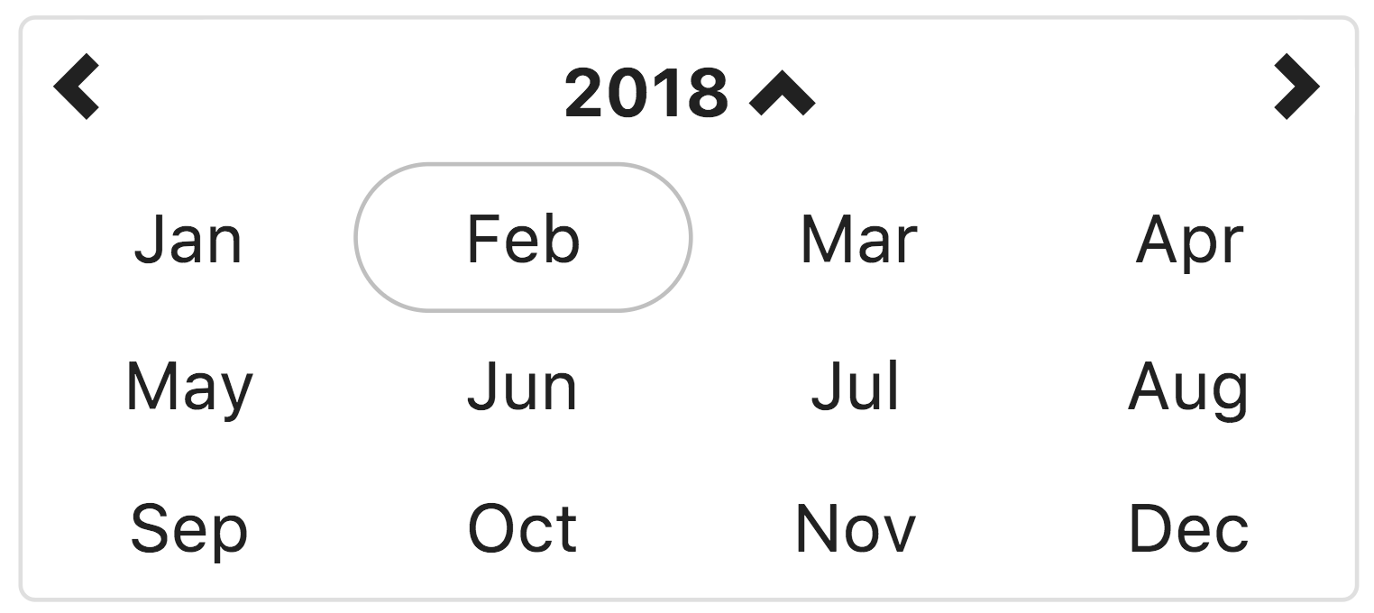
This view allows the user to select the month in the selected year. If the month view is the minView, the date will be set to midnight on the first day of the month.
Day view (Default)
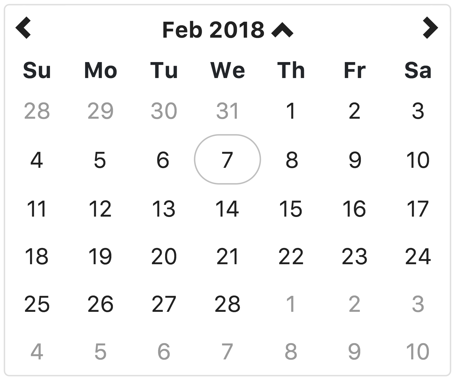
This view allows the user to select the the day of the month, in the selected month. If the day view is the minView, the date will be set to midnight on the day selected.
Hour view
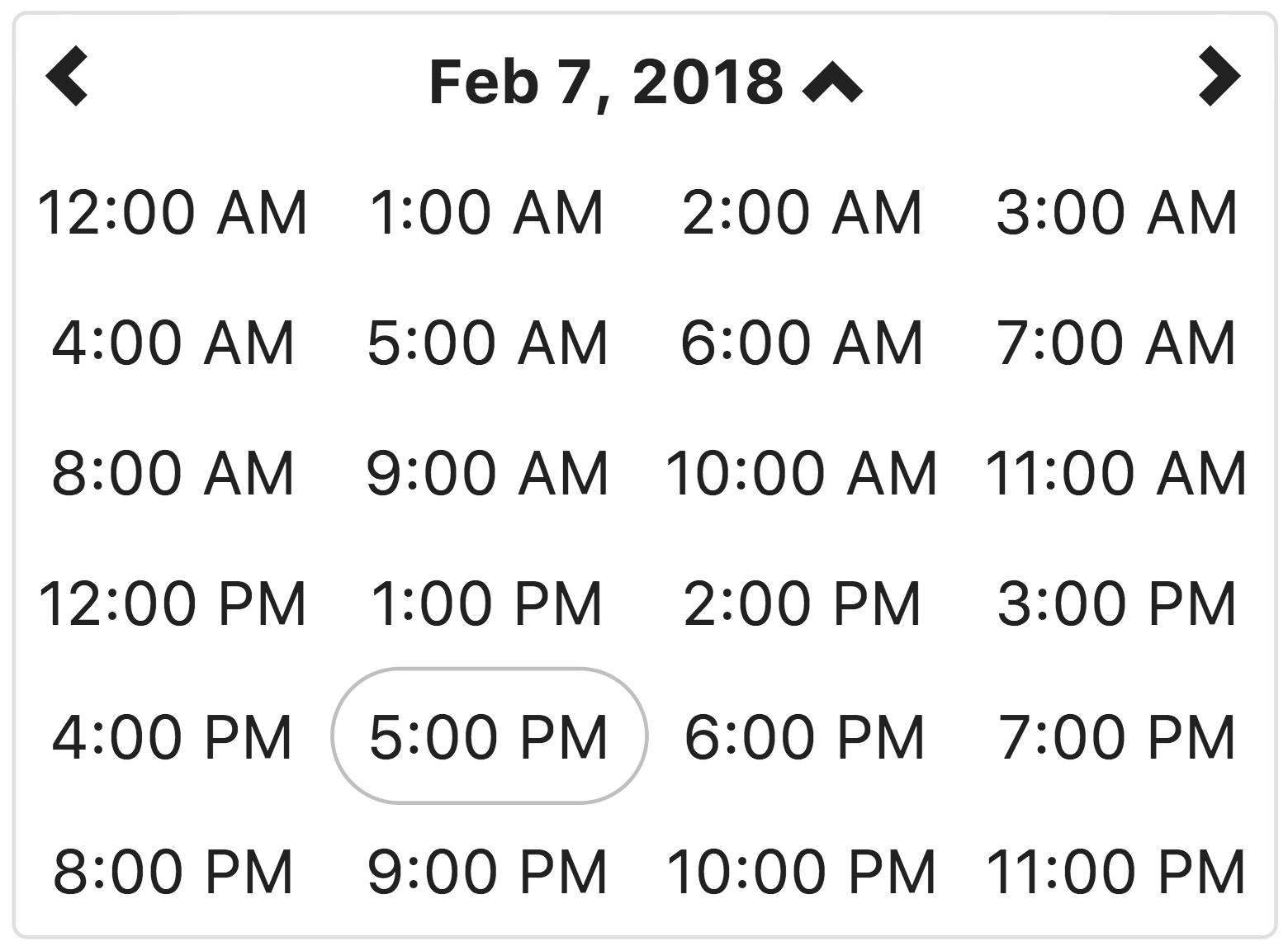
This view allows the user to select the hour of the day, on the selected day. If the hour view is the minView, the date will be set to the beginning of the hour on the day selected.
Minute view
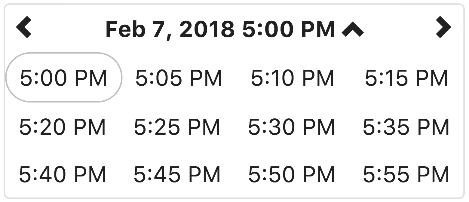
This view allows the user to select a specific time of day, in the selected hour.
By default, the time is displayed in 5 minute increments. The minuteStep property controls the increments of time displayed.
If the minute view is the minView, which is is by default, the date will be set to the beginning of the hour on the day selected.
Idea Project Directory
The .idea directory holds the IntelliJ Idea project files for this project. If you use Idea, just open the project with Idea.