| Student's name | SCIPER |
|---|---|
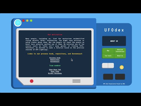
| Chun-Hung Yeh | 307068 |
| Kuan Tung | 307099 |
| Hiroki Hayakawa | 308681 |
Milestone 3 • Milestone 2 • Milestone 1
80% of the final grade
git clone https://github.com/com-480-data-visualization/com-480-project-een1.git
cd com-480-project-een1npm install
# or
yarn installnpm start
# or
yarn startYou can find our screencast by clicking on the below image.
You can find our process book by clicking on this link
10% of the final grade
We uploaded it to this repository. You can also access it using this link.
You can access our prototype website using this link.
The project attempts to find out where and when to go to see the UFOs by analyzing the UFO Sightings data obtained from Kaggle Open Datasets, which is originally scraped from National UFO Reporting Center (NUFORC) data and preprocessed by Sigmoid Axel. The dataset contains 80,000 plus sighting reports of UFOs for over a century (1906 - 2014) and each report is associated with time, duration, geological location, shape of UFOs, and description of the sighting situation. The geological information is provided in two ways: City, State, Country and Latitude and Longitude. The summary of the dataset is shown in below.
| Contents | Value |
|---|---|
| Data Size | 14 MB |
| Num of Rows | 80,332 |
| Num of Columns | 11 |
| Column List | ['datetime', 'city', 'state', 'country', 'shape', 'duration (seconds)', 'duration (hours/min)', 'comments', 'date posted', 'latitude', 'longitude '] |
| Example of the ‘comments’ columns | 'Orange light moving E to W at high altitude, red beacon visible after passing overhead' |
The data include reports issued in both 20th and 21st centuries. The older data may have more potential error. It could improve the quality of our analysis to separate the dataset into each century and treat the data from each subset with difference credibility.
Thanks to Sigmoid Axel’s work, most of the required preprocessing for the dataset has already been done. For example, time and geological information has been converted into ‘mm/dd/yyyy hh:mm’ and ‘city, state, country and latitude, longitude’ style. There, however, are still missing value in the data. Especially, around 12% rows of country column are left brank. Conversion from latitude and longitude values to country name is required for some rows. It is also necessary to check the consistency between city, state, country and latitude, longitude values.
Many people, including us, find the mysterious unidentified flying objects (UFOs) interesting. You might read articles or watch videos about them. But few people (at least the people we know) have actually spotted one of them. We believed one of the reason could be there arn't many guides of finding UFOs. Therefore, we decided to make a tutorial based on the previous records of UFO sightings.
Our focus will be where and when you will most likely to see a UFO. The structure of the website will be like this:
-
Main map:
- Show all sightings in a map.
- Change the range of time by brushing.
- Click on a sighting to show the description (shape, duration, exact date and time, comment).
- Show a tutorial of how to interact with the map when the visitor first use the website.
-
Detailed instructions:
- Where and when to do UFO hunting?
- Which states has the most sightings?
- Which states has the longest average duration of a sighting?
- Which month/day/hour has the most sightings?
-
Cool facts
- The distribution of shapes and sighting duration.
- Analysis on the comments (e.g. what are the most common words?).
-
About us
- Our motivation.
- Links to our process book, repository, and Screencast.
- Team member.
Here we present some analysis results from the dataset. For more details, you can check our Jupyter notebook.
-
From the bar chart of sighting site, the majority of the sighting places occur in USA.
-
Thus, for the rest we only focus on USA.

-
As the time goes by, we observe the increasing trend of UFOs finding, especially after 2000, it grows almost exponentially.
-
In 2012 and 2013, both sighting and posting counts reach the peak, about 7000 cases happened at that time.


-
California (CA) is the state where people spot UFOs the most. The number is 2 times more than Washington (WA).

-
Besides the chart, here is the map showing the sighting rate of all states in US.

-
Most durations that UFOs being found are within 15 seconds or less.
-
Somehow suprising, roughly 50 times people see UFOs in more than 240 seconds a time.

-
Most UFOs being witnessed are in the light shape followed by the triangle shape.
-
The number of the light shape is 2 times more than the triangle shape.

-
People mostly find the UFOs as flying and light-shaped objects, corresponding to the previous histogram that light-shaped UFOs are being found the most.
-
People describe the UFOs' colors are possibly bright, white, or red.

Some Kaggle users have already worked on basic analyses on the data and simple statistical results such as time and geological distribution of the sighting cases are now open in Kaggle in IPython Notebook format. There former works visualize their results only in statistic ways. For example, they illustrate simple bar charts to list the number of reports grouped by nation, states, seasons, etc.. Thus, the viewers can only enjoy the given sketch and they cannot change granularity of the information on their own. Our project forwards the former works and implements interactive visualization. More specifically, we provide interactive map to depict UFOs sighting cases on and users can choose time ranges to be shown. Detailed information about each case are obtained by click on it on the map. In addition, the project prepares a tutorial about the usage of the interactive map.
We take visual inspiration from the interactive refugee map created by The Refugee Project. In their world map, the number of refugees is depicted with a size of bubble and the refugees’ origin countries are correspond to the location of the bubble. Users can change the time range of the migration to be shown and move around on the map. Moreover, by clicking the bubble of refugees, detailed information about the refugees (e.g. the number of refugees and destinations) pop up in a new window. Global coal power map created by Carbon Brief could be another example to our visualization. Their tutorial for the interactive power map is concise and easy to understand although is based on a static picture.