| Student's name | SCIPER |
|---|---|
| Lena Vogel | 297026 |
| Salma Ed-dahabi | 282284 |
| Antonin Faure | 302686 |
This repository contains the code for our data visualization project, an interactive exploration of the Lausanne Transportation network. Developed by the Vizards team as part of the EPFL Data Visualization course project (COM-480).
Structure of the repo:
index.html- 📁
data- 📁
raw: raw data zip files (gitignored) - 📁
lines_delays: all csv files of the TL lines delays - 📁
lines_stops: all csv files of bus and subway TL lines activities.csv: activity per stop per day of week per hourbav_list_current_timetable.xlsx: raw data of all stops in Switzerlandchampionship.json: processed data for the lines championshipcol_bus.txt: color per line collected from https://t-l.chfinal_lines.geojson: geojson for each linelines.json: list of stops (with order) per linelines_delays.geojson: geojson of delays per stop per linestops.geojson: geojson of activity per stop
- 📁
- 📁
images: images used for diverse task besides the building of the website (milestones reports notably) - 📁
notebooks: ipynb files wrote for the milestones of the project - 📁
static- 📁
assets: css and js assets - 📁
images: all images used for the website
- 📁
Our dataset is taken from OpenTransportData.swiss, a website storing data on all public transports in Switzerland. This real data provides the effective time at which a public transport transit by a stop and the plannified one at which it should have stopped. As the actual data is zipped by month we have decided to use data from 2022-01 to 2023-03 only, and to focus exclusively on Lausanne area. In addition, we use the stops data so that we can have the latitude/longitude for each stop, and other useful data on it.
The documentation of the datasets can be found here: actual data and stops
Quick overview of the data: For the timetables, the most useful columns are the time and date, the transport line, the transport ID, its type, theoretical and effective arrival and departure times, and more.
Concerning the stops data, the main features are the name of the stop, the transport company of the stop, its GPS coordinates, its altitude, its type of transport (bus, train, boat, ...) and others.
In order to map the lines on a map we used GeoJSON data from https://openstreetmap.org, and for the color of the lines we used https://t-l.ch map's data
- Lausanne traffic depending on the day and moment:
- What is the traffic at time t?
- How usage of public transports varies depending on a given moment of the day or on which day of the week is considered?
- Where and when delays happen?
- Lausanne connectivity through the city and its suburbs:
- Are the suburbs well served? Are they reachable whitout too much difficulties at all moments of a day? Are there some specific hours with more or less availability?
- To what extent is Lausanne network well connected? What are its weak and strong edges (which would be critical in case of disruption)?
- The main target audience is people who would like to move to Lausanne in a near future.
- Another audience is the TL themselves, also for decision making purposes, for example helping to determine what are the main problematic areas, that could delay the buses. Finally, it could also be used by other experts such as geographists or sociologists to enable them to easily perform their analysis.
As said previously, our work concentrate on the city of Lausanne. We had to filter the data depending on the coordinates in order to keep Lausanne data only. To do that, we first had to import all the data (of Switzeland) to be filtered. This has been very heavy on download (~15GO per month). Moreover, in order to exploit the data, we have adapted the coordinates to latitude/longitude in the geocentric projection, because the data from https://opentransportdata.swiss is written in a format which is specific to Switzerland. More precisely, we needed to map geographic data for stops from LV95 coordinates format to WGS84 format.
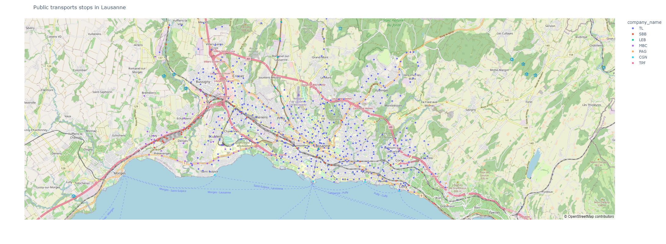
We have plotted graphs, with the public transport stops distribution, depending on their coordinates on a map, on the corresponding altitude, and on the company.
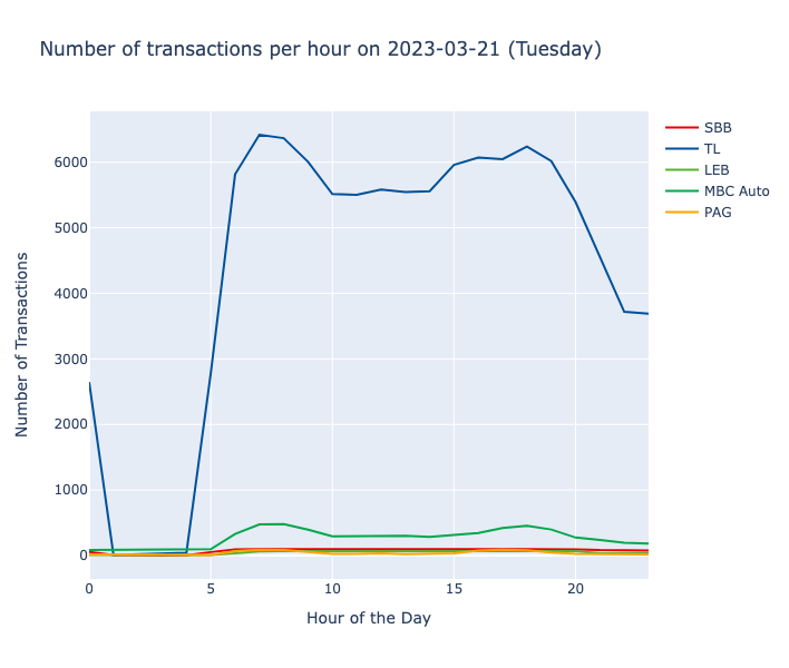
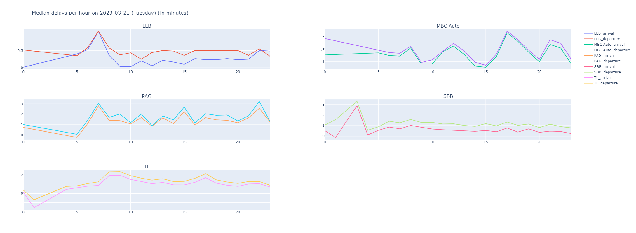
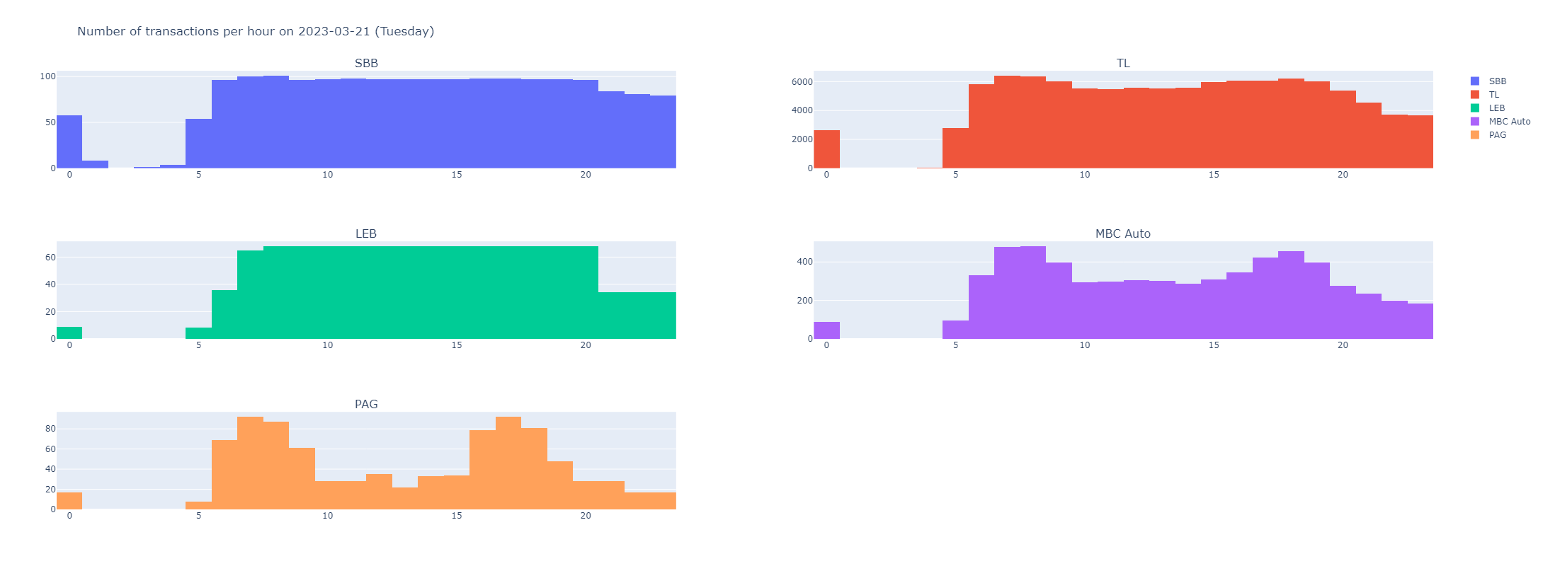
We have also plotted the delays during a period of 24hours for each transport company, and the number of transactions per day.
There are some showcases of this datasets here: https://opentransportdata.swiss/de/showcase-5/
We would like to concentrate our visualizations only on Lausanne, to allow any (or future) Lausanne residents to have access to a full view of the public transports network of the city.
Other visualisations of that type have been done, for instance for Switzerland: https://observablehq.com/@alexmasselot/mapping-swiss-trains-delays-over-one-day/2, which shows the delays of the trains in Switzerland, and https://mobility.portal.geops.io/world.geops.transit?baselayer=world.geops, which displays most of the public transports in the world and their position in real time.
For this second milestone, the task is to have a first skeleton of the website on public transports in Lausanne, as well as schemes to explain the design of the data visualisations we have chosen. We have refined the choices of the plots we would like to show on our webstite, i.e a map of the positions of the buses and stops depending on the time of the day, graphs representing the usage of the different transport companies throughout the day, and other ones measuring their respective delay. We also changed our graphic chart to another one, inspired from the TL. We created a new logo which is the inverse of the TL logo, see below:
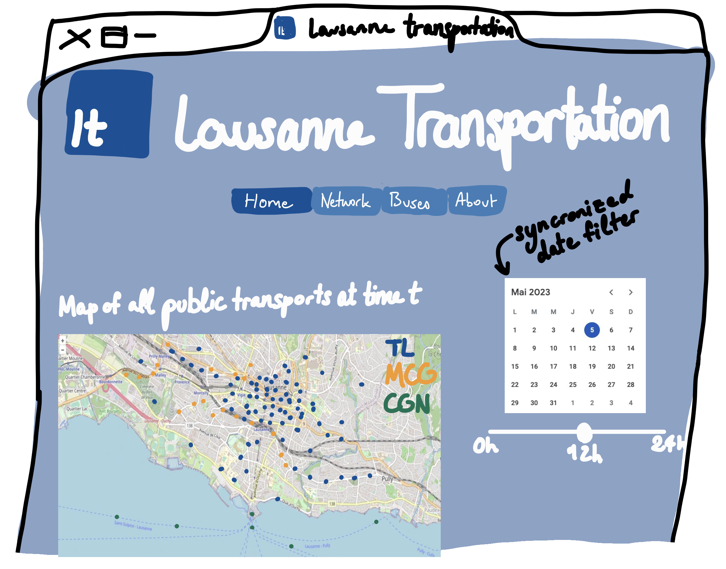
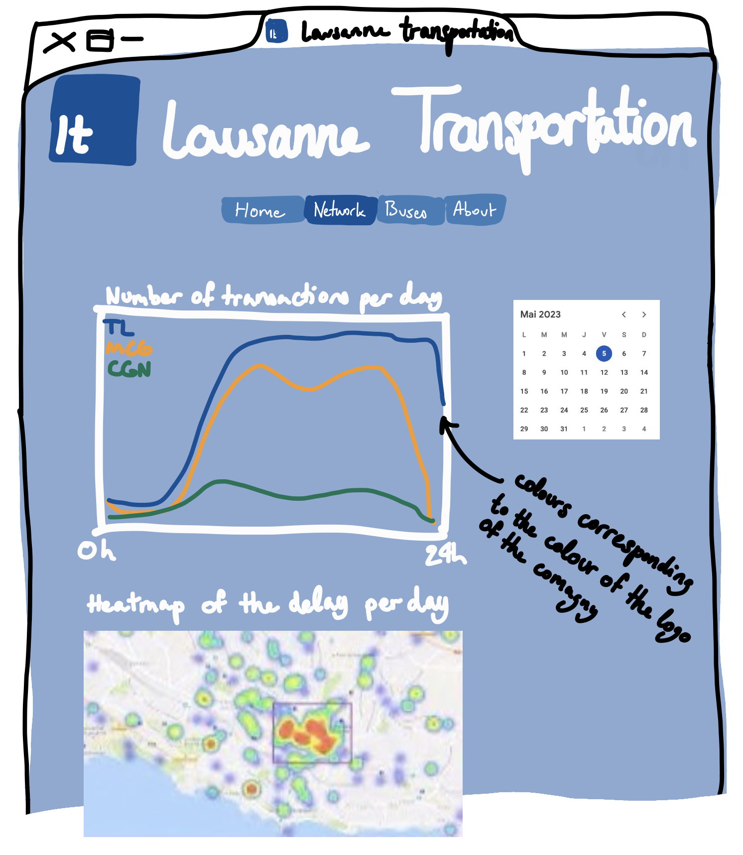
Moreover, we changed the original simple frame of the website to another one, portionized between 4 tabs, all these figuring on the same website link:
- "Home": main map with all transports located at time t of day d, chosen through filters
- "Network": statistics over a day on transactions, delays and a heatmap on the average delays over a day (chosen through a filter)
- "Buses": fun page on the championship of buses: which bus line is the latest in average over a day (chosen through a filter), a ranking and a histogram of the average delay for the selected bus line
- "About": quick description of the project
The main addition since Milestone 1 is this idea of creating a new "fun" tab with an ironic championship of the bus lines which are the latest.
The most relevant lectures we use for our project are:
- Week 4 “Data”
- Week 5 “Interactions”
- Week 6 “Perception colors” & “Mark,channels”
- Week 8 “Do and Don’t viz”
- Week 9 “Maps”
- Week 11 “Graphs”
We used the Add-on "ColorZilla" to find the colors corresponding to the companies: #EB0000 for SBB, #005198 for TL, #5AB034 for LEB and #03A84B for MBC Auto. We also used the software Figma to create the logo.
If time permits, we might consider adding a visualization of the whole public transports as a connected graph, such as a force graph, in order to highlight the main edges of public transportation in Lausanne. The goal of this visualization would be to:
- easily identify the most used edges of the circuit
- interract with the graph by desactivating edges to see how the connectivity is impacted
We might add other funny features such as an evaluator of the average delay of the transports modeled by a smiley that would become happy or angry, or even the sound of the TL when opening the website and other guidance throughout the website such as showing the question that is being answered in each tab.
Here are some sketches to show an overview of the website, with minimal text:
First tab:
Second tab:
Third tab:
The forth tab is self-explainatory
The process book explaining the whole reflexion behind the website and its intended usage can be found here, along with the final version of the website. It was inspired from the display on the bus screens, each of the next stops being chapters of the process book.
The website can be found here
You can find the screencast that shows to navigate throughout the website and what can be done with the viz here
The following libraries were used :
- Maptalks: visualize 3D maps with WebGL
- Three.js: manipulate Three.js objects on the layers of the 3D map
- Plotly.js: create bar plots for the delays of lines
- Chart.js: create bar plot for the survey There're all delivered by CDN. The structure of the repository can be found at the beginning of this README file.
This is a project on Lausanne Transportation that aims at presenting data and carry out its analysis in the form of a website in the light of the problematics stated above (see milestone 1). This git repository contains all our work on the data from the beginning to the implementation of the final website. For whom might be interested, here is the code that we wrote for that purpose.
