There will (probably) be no more active development of this library. See NavigationView which is available as part of the Android Design Support library. This widget should be sufficient for most of your needs.
http://developer.android.com/reference/android/support/design/widget/NavigationView.html
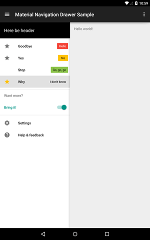
Navigation Drawer according to Material Design spec.
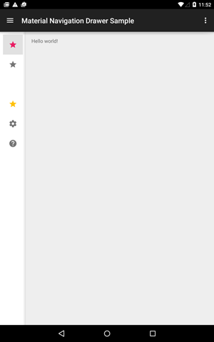
Contains native and support fragments of expanded and collapsed navigation list for use with DrawerLayout or Chiu-Ki Chan's CrossFadeSlidingPaneLayout (included).
The library is now available from API 4.
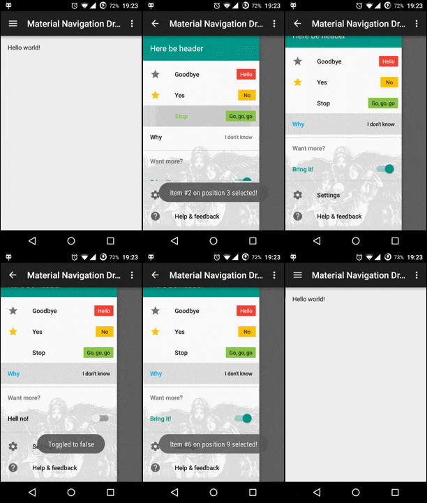
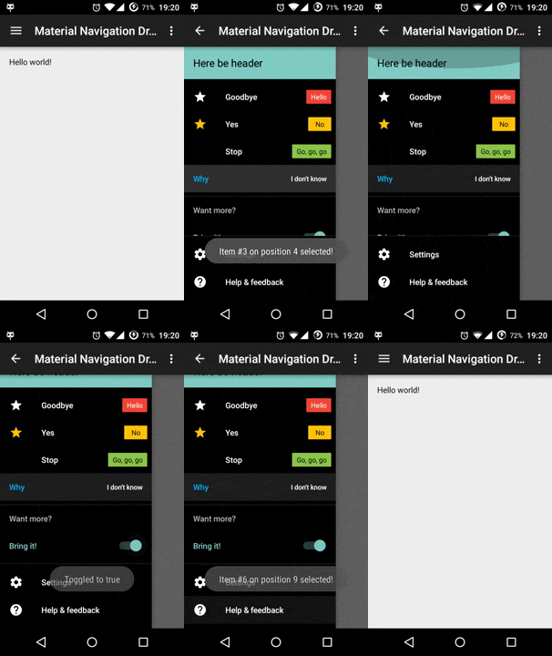
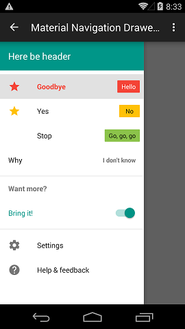
- Lollipop
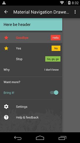
- Kitkat
- Lollipop tablet using
CrossFadeSlidingPaneLayoutexpanded and collapsed
To use this library add the following to your module's build.gradle:
dependencies {
    compile 'net.xpece.material:navigation-drawer:0.7.7@aar'
}
Additionally this library depends on
support-v4if you'll be using anything related toDrawerLayoutor support fragments,NineOldAndroidsif you'll be usingCrossFadeSlidingPaneLayoutbelow API 11.
Proguard setup:
-dontwarn net.xpece.material.navigationdrawer.**
- Icon color defaults to
android:textColorSecondarywhen not selected. SeeSimpleNavigationItemDescriptororBaseNavigationItemDescriptor. - Text color and selected icon color defaults to 100% white or 87% black based on background. See
SimpleNavigationItemDescriptororBaseNavigationItemDescriptor. - Activated background is set to 12% of
android:colorForeground.This currently limits the use to white drawer on white theme or black on black.- You can now specify
android:themeon the fragment override these values in bulk.
- List background is set to
android:colorForegroundInverseby default. Can be changed via API. - Divider color is 12% of
android:colorForeground. You cannot change this currently.
The drawer has too big right margin!
As of support-v4 library 21.0.3 22.1.1 there is a hardcoded margin of 64dp in a DrawerLayout. Use NavigationDrawerUtils.fixMinDrawerMargin(DrawerLayout) to remove this limitation. Use this right after you obtain a drawer layout instance typically in Activity.onCreate(Bundle). Why is this an issue? Specs say the margin should be only 56dp on phones.
I want the drawer to have a standard width!
To set proper drawer width according to specs call NavigationDrawerUtils.setProperNavigationDrawerWidth(View) on your instance of NavigationDrawerFragment.getView(). This is not handled automatically to allow developers to reuse the fragment outside of DrawerLayout with custom width.
The width will be one of the following:
- On phones: Smallest screen width minus 56dp, maximum 280dp (5 * 56dp). The width will be the same in both portrait and landscape.
- On tablets: Effectively always 280dp. Because it looks better (on 7" tablet the drawer has less than half screen width). Officially it should be 5 * 64dp = 320dp;
I want the drawer to have a different background!
You can modify the navigation drawer background by accessing one of NavigationDrawerFragment.setBackground*() methods. Please note that the same background will be used for the pinned section. So if you use the pinned section either use a fully opaque color for background or follow this SO post to align your bitmap to bottom. The background is not scrolling (which is not very "material design").
How do I build sections?
NavigationSectionDescriptor
- Use
heading(String)to set optional section heading. - Use
addItem(NavigationItemDescriptor)oraddItems(List<NavigationItemDescriptor>). These allow you to chain calls as opposed to standardListmethods.
How do I build items?
BaseNavigationItemDescriptor
- Use
sticky()andnotSticky()to specify whether the item should stay selected on click or not. - Use
iconResource(int)to specify a drawable resource. Typically this would be a 24dp by 24dp icon. This gets colored automatically. Width limit is 40dp. A value ofandroid.R.color.transparentwill result in navigation item with padded text (as if it had an empty icon) and a value of0will result in the text being aligned to the left side (no icon at all). - Use
iconColorAlwaysPassiveOn()to override the icon color in active state by the passive color. - Use
text(String)ortext(int)to set item label. - Use
activeColor(int)and its derivatives to specify color of selected icon and text. - Use
passiveColor(int)and its derivatives to specify color of unselected icon. Unselected text always takes color ofandroid:textColorPrimary. activatedBackground*(...)enable()anddisable()
SimpleNavigationItemDescriptor extends BaseNavigationItemDescriptor
- Use
badge(String)orbadge(int)to set badge text. Badge will be hidden when supplied value isnull; Minimum badge width is 40dp and text is center aligned. - Use
badgeColor(int)and its derivatives to specify background color of the badge. Text color is calculated automatically.
How do I make custom items?
Extend either BaseNavigationItemDescriptor or AbsNavigationItemDescriptor. Both require you to implement method getLayoutId() which returns your custom layout resource ID. You also need to implement you own loadInto(View, boolean) method which is analogous to adapter's getView(...). Optionally you may override onViewCreated(View).
AbsNavigationItemDescriptor handles only selected background. See the ToggleNavigationItemDescriptor in sample project.
BaseNavigationItemDescriptor allows you to use all the good stuff described in previous section. Your custom layout is required to have a @id/icon image view and a @id/text text view. It's intended for cases where you need a custom view on the right side of the item (such as in SimpleNavigationItemDescriptor).
How do I employ partially visible collapsed navigation (like Gmail on tablets)?
Please see the example project, mainly res/layout-sw600dp/activity_main.xml and MainActivity.java.
Only descriptors which implement GraphicNavigationItemDescriptor will be painted (both base and simple descriptors comply).
0.7.7
- Items may mark themselves as not recyclable when
isRecyclable()returnsfalse. - Updated
ToggleNavigationItemDescriptorin sample project:- Not recyclable - fixes incorrect checked state issue.
- Custom text via
text(...)andtextChecked(...).
0.7.6
- Use
activatedBackground*(...)methods to specify sticky item background color when selected.
0.7.5
setReselectEnabledon fragments - allows reselecting sticky items.
0.7.4
- FIXED: Finally fixed the annoying 1px overlap of items!
- The library core is now independent of
support-v4andNineOldAndroids.- You'll need
support-v4when working with drawers anyway. And support fragments. - You'll need
NineOldAndroidswhen working withCrossFadeSlidingPaneLayoutbelow Honeycomb. Pretty much never.
- You'll need
- Moved
CrossFadeSlidingPaneLayouttonet.xpece.material.navigationdrawer.listpackage to avoid potential clashes. - Slight change in API: Item IDs are now
intinstead oflong.
0.7.2
- FIXED: A whole lotta leaking views and recently introduced modified layout inflater.
0.7.1
- FIXED: The list now has set
android:cacheColorHint="#0000"to avoid weird background colors while scrolling on Gingerbread.
0.7.0
- NEW: Support for
android:theme- Allows completely overriding theme just for the drawer with a flick of a switch.
- Use
NavigationListFragment.getLayoutInflater2()to inflate headers. Only on API 11 and higher.Holy smoke, Dr. Jones, it works on Gingerbread as well!
0.6.0
- Cleaned up and updated dependencies
0.5.7
- FIXED:
CrossFadeSlidingPaneLayoutnow properly propagates clicks to full list below API 11 - FIXED: Pinned section background now properly overlays incoming list item views
0.5.6
- FIXED: Non-clickable headers
- FIXED: Pinned section no longer expands to accommodate background image
0.5.5
- FIXED: Icons in compact mode now get properly colored
0.5.4
- CRITICAL BUG FIX: Some items failed to set activated background. Not anymore!
- FIXED: Null icon items now have no margin as intended.
- FIXED:
ToggleNavigationItemDescriptorin sample project now behaves properly
0.5.3
- FIXED:
.aarpackaging in POM file specified - FIXED: Currently selected item does not draw selector
- FIXED:
setSelectedItemnot selecting proper item when using headers
0.5.2
- NEW! Support from API 4
0.5.1
- NEW! Introduced collapsed version of navigation list
- NEW! Included Chiu-Ki Chan's
CrossFadeSlidingPaneLayoutfor convenience (since API 11) - CRITICAL BUG FIX: Header View now works correctly before KITKAT
0.4.3
- NEW! Introduced custom view types support
- NEW! Added native fragment support by
NavigationListFragment - Support-v4 fragment accessible under
SupportNavigationListFragment - Some changes in API (e.g.
NavigationItemDescriptoris nowSimpleNavigationItemDescriptor) - Changed package name from
net.xpece.materialnavigationdrawertonet.xpece.material.navagationdrawer(so sorry!) - More changes in package names (even more sorry, this time it's final)
- Utilities made public in
net.xpece.material.navigationdrawer.internalpackage- Text color calculation based on background
- Attribute resolution to colors or drawables
- Drawable tinting
- CRITICAL BUG FIX: Certain configurations with pinned section caused the list view go apes**t rendering it unusable.
0.3.0 Deleted
- NEW! Different text style for badges without background (as in Gmail app)
- Item padding is clamped at 16dp even on tablets (everybody does this and it aligns with the back arrow)
- Badge minWidth is now 40dp instead of 24dp (as in Gmail app)
- Badge right margin is set to zero to allow the text to be 16dp from the right edge (as in Gmail app)
- Better compatibility with dark themes
- Pinned section divider is shown when shadow would not be recognizable
- Default icon color is 100% white on dark themes
- Added screenshots to
/docs
- Ability to override icon color through
BaseNavigationItemDescriptor.iconColorAlwaysPassiveOn() - Drawer width on phones is now always
smallestWidthDpminus56dp(the5 * 56dplimit still applies).
0.2.2 Deleted
- Fixed extra list view spacing when using header views
- Added
NavigationDrawerItemto callback + some minor API changes
0.2.1 Deleted
- NEW! Introduced pinned navigation list section
- Fixed NPE on inflating fragment
- Dropped appcompat-v7 dependency
- Updated sample project
- Minor API changes
- Navigation list no longer sets its width automatically to allow more control to developer
0.1.1 Deleted
- First release
- Navigation list with multiple sections with optional headings
- Items have a label, optional icon and an optional text badge
- Icon has a passive color, label and icon have an active color
- Badge has background color, text color gets calculated automatically
- Items can remain selected
- Theming API, ability to replace Material specs with something different with a flick of a switch
- Better descriptor API, factories, copying element prototypes...
Licensed under the Apache License, Version 2.0 (the "License");
you may not use this file except in compliance with the License.
You may obtain a copy of the License at

   http://www.apache.org/licenses/LICENSE-2.0

Unless required by applicable law or agreed to in writing, software
distributed under the License is distributed on an "AS IS" BASIS,
WITHOUT WARRANTIES OR CONDITIONS OF ANY KIND, either express or implied.
See the License for the specific language governing permissions and
limitations under the License.

