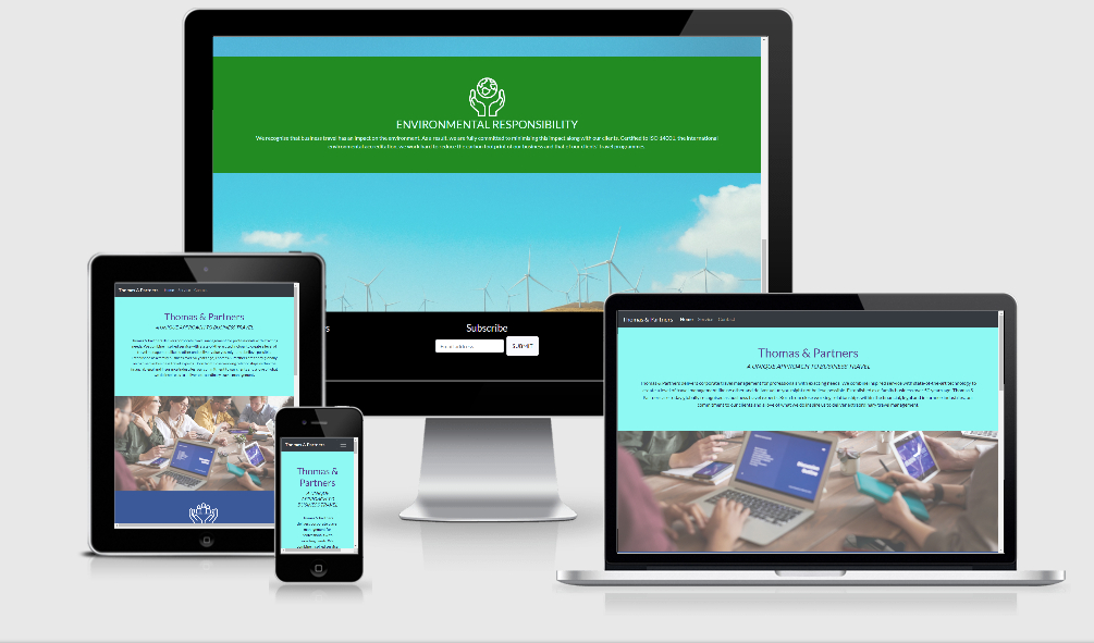
My Milestone 1 is a marketing website for my fiction travel company called Thomas and Partners. It was designed as a desktop first approach with media queries to make it responsive & accessible on all devices.
- My goal is for visitors to easily understand what Thomas & Partners does and easily scroll through and learn about the services we offer.
- Visitors should be able to navigate between pages with ease and know exactly where they are on the site.
- Visitors should be able to find all available avenues to contact us, via phone, email, social media and our physical address.
- Returning visitors should be able to find our contact information with ease
- Returning visitors should be able to find our social media links with ease
- As a businessman, I want quick concise information about the company, what services they provide, and how to contact them.
- I want to be able to find contact information and social media profiles to follow.
Black and White are the main site colors, as well as blue, green and teal.
Lato font is the main font used throughout Thomas and partners site, with Sans Serif as a backup font for any reason Lato isn't imported correctly.Lato is a humanist sans-serif typeface. The name "Lato'' is Polish for "summer". As of August 2018, Lato is the third most served font on Google Fonts making it a familiar font without defaulting to Times Roman.
Our images all have a purpose behind them,
- The first parallax image is a group of people working together around a table, reflecting the partnership of Thomas and partners bringing people together in order to fill a need or overcome a problem.
- The second image is a group of people wearing makeshift PPE reflecting that we take our role of looking after our customers and partners seriously.
- The third image is a hillside filled with windmills, reflecting how we are aware that the travel industry is detrimental to the environment and that we are committed to minimising the environmental impact our services will have on the environment with a ISO14001.
- The fourth image is a woman writing code, to reflect that through our partnership our partners will build bespoke travel programmes around the customers' needs.
- The fifth and final image is of a conference, to highlight our M.I.C.E Service offering.
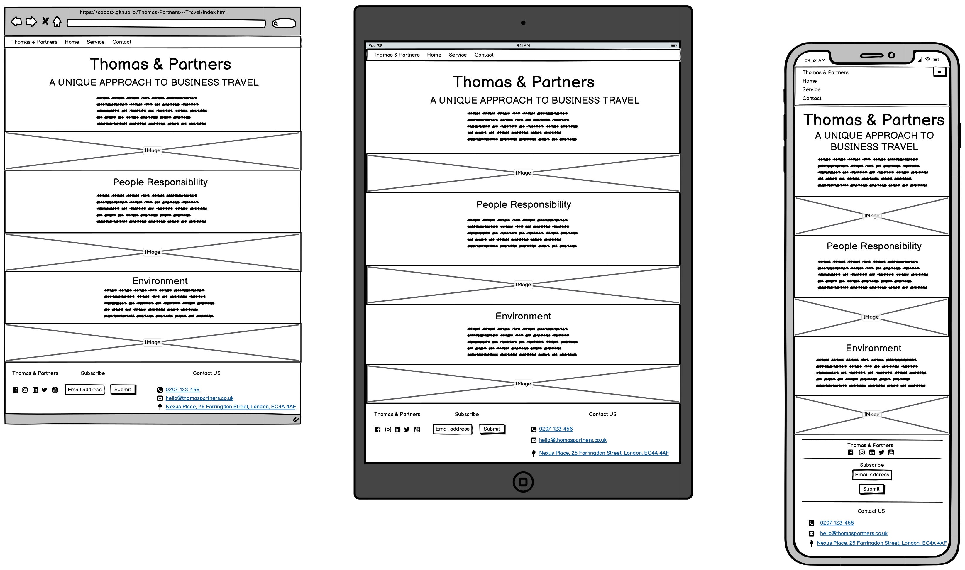
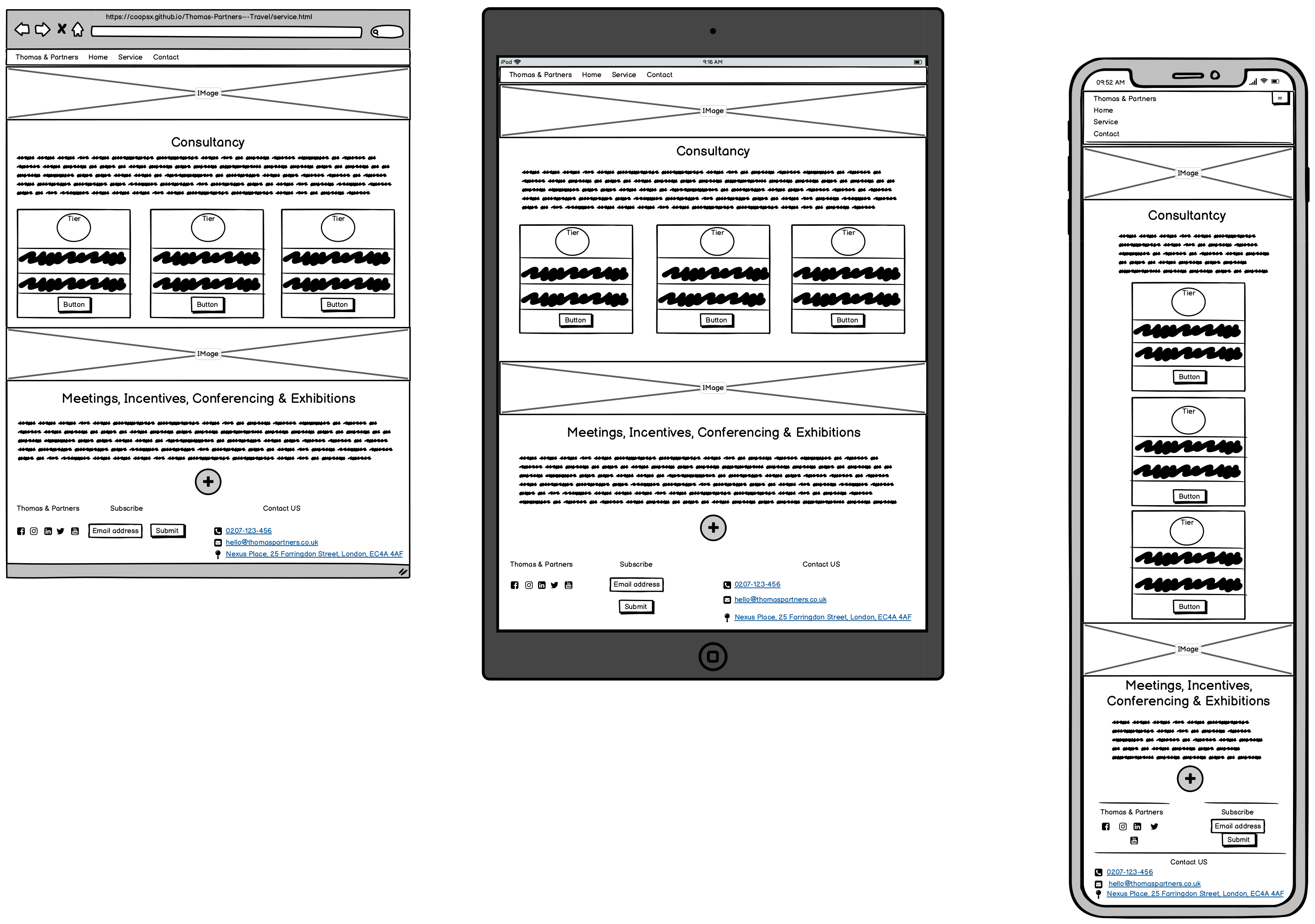
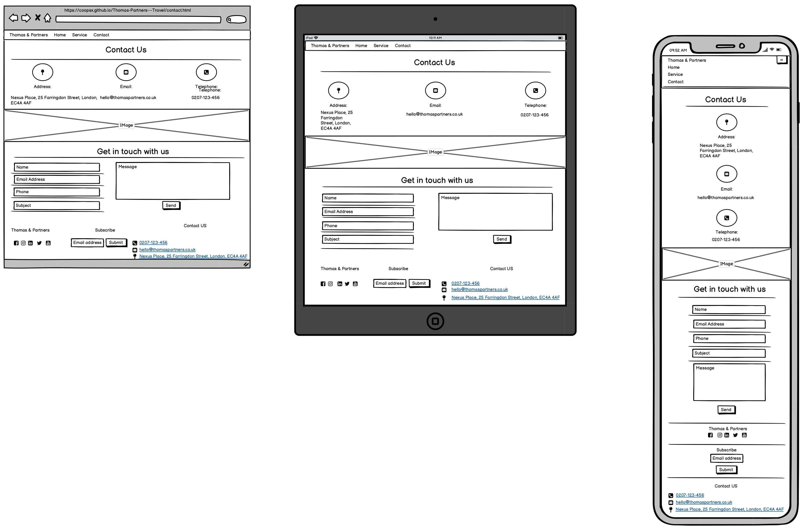
Balsamiq: was used to create the during the below wireframes
- Index Wireframe (Desktop, Tablet & Mobile)

- Service Wireframe (Desktop, Tablet & Mobile)

- Contact Us Wireframe (Desktop, Tablet & Mobile)

- Simple to use lay out
- responsive across all devices
- interactive forms, buttons
HTML - 69.7% (https://html.com/html5/) CSS - 30.3% (https://www.w3.org/TR/CSS/#css)
- Balsamiq: was used to create the during the planning stage.
- GitHub: was used to store the project code after being pushed from Git.
- Git was used for version control by utilizing the Gitpod terminal to commit to Git and Push to GitHub.
- Google Fonts: was used to import Lato font into the style.css file. Lato Font is used on all pages throughout the project.
- Bootstrap 4.4.1: was used to make the site responsive and used the grid system for it’s lay out.
- Font Awesome: was used to add icons throughout the site for aesthetic and UX purposes.
- Flaticon: was also used to add icons throughout the site for aesthetic and UX purposes.
- Parallax was used on all pages to give an animated effect. When testing I realised that this didn’t work on mobile & tablets so I have used media queries to change the pictures to static when screen size is less than 1200px
- The footer when on Mobile & Tablet was squashed together and you couldn’t tell where it started and finished. Using Media Queries I made bronze borders for when the screen size is less than 1200px to define each section of the footer.
- The Service Page image is a woman coding, however the picture was too wide for mobile, I tried to crop it using GIMP 2.1 but it wasn’t very good. I opted to change it to an image of people working from a sheet of paper and a laptop when the screen size is less than 400 px.
- On the Service page on mobile there is a white streak along the right hand side if you scroll left.
- HTML was tested using W3C-Markup-Validation-Service: and have no issues.
- CSS Was tested using W3C-CSS-Validation-Service: and has 1 parse issue.
The test results can be seen here
- I developed my project using GitPod
- I logged into GitHub and clicked New, which takes your through to the Create a new repository page.
- I selected the Code Institute Template , clicked include all branches, named my site and added a description, selected public and clicked create repository.
- I deployed to GitHub Pages by going into the repository, clicked settings, scrolled down to Github Pages, selected Branch:Main then /(root) and saved and retrieved the link Thomas & Partners Link.
Log into GitHub, Locate Thomas & Partners---Travel, on the top right of the page, click fork, and it will copy the repository into your GitHub account.
To clone you will need GitPod & GitHub.
- Log into Github,
- Find the Thomas & Partners repository,
- Click the GitPod button, this will create a new workspace with the loaded code that you can now work from.
All Code & Content was written by my Thomas Jackson.
The photos used in this site were obtained from Pexels: & Pixabay:.
I was inspired by my previous employers Reed & Mackay, Egencia, & DialAFlight for this project. A Special thanks to my mentor Nishant Kumar for his continued support, patience & mentorship. Also thank you for Jim Moran from the slack community for being there night and day (literally).
