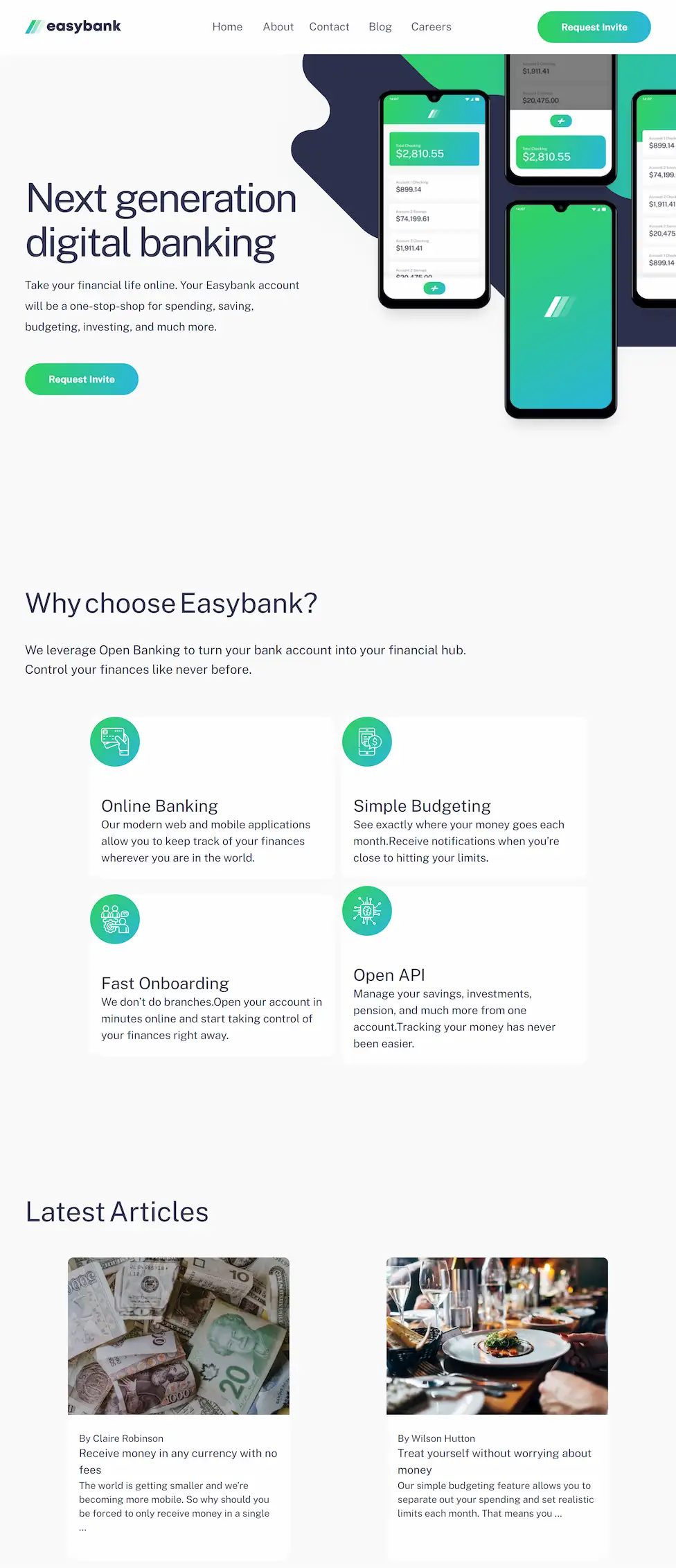
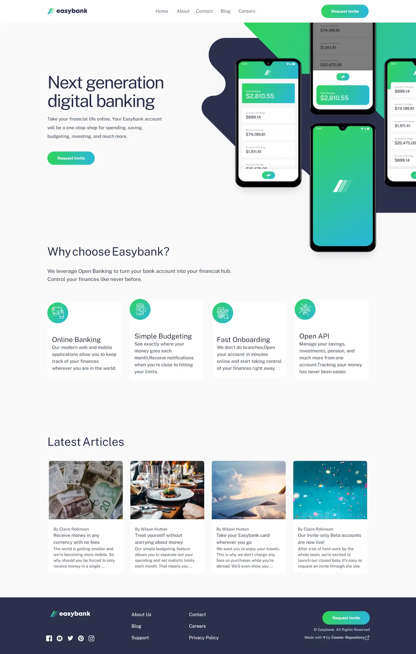
A small landing page to practice Tailwind, React and responsive. This is a solution to the Easybank landing page challenge on Frontend Mentor.
Table of contents
Users should be able to:
- View the optimal layout for the site depending on their device's screen size
- See hover states for all interactive elements on the page

|

|

|
- Semantic HTML5 markup
- Flexbox
- React - JS library
- Vite - Build Tool
- Tailwindcss - CSS framework
It was an excellent opportunity to reinforce my knowledge in React, tailwind and especially responsive.
- Instagram - @cosmo_art0
- Frontend Mentor - @CosmoArt
- Twitter - @CosmoArt0
- My website - cosmoart.vercel.app


