This repository is a companion repository to the DataPower Latency Log Entry Analyzer. Whereas the log analyzer inspects individual DP latency statements, this stats repository addresses statistical exploratory analysis on a collection of log entries.
The first step is to get the lateny log entries into a form amenable to most statistical analysis software. One normally can't go wrong with CSV files and that's what we do here - with Python. This repository comes with a sample raw latency file sample6.log on which you can test the code. Note that this log contains entries from a MultiProtocol Gateway (MPGW). Web Service Proxy (WSP) look a little different.
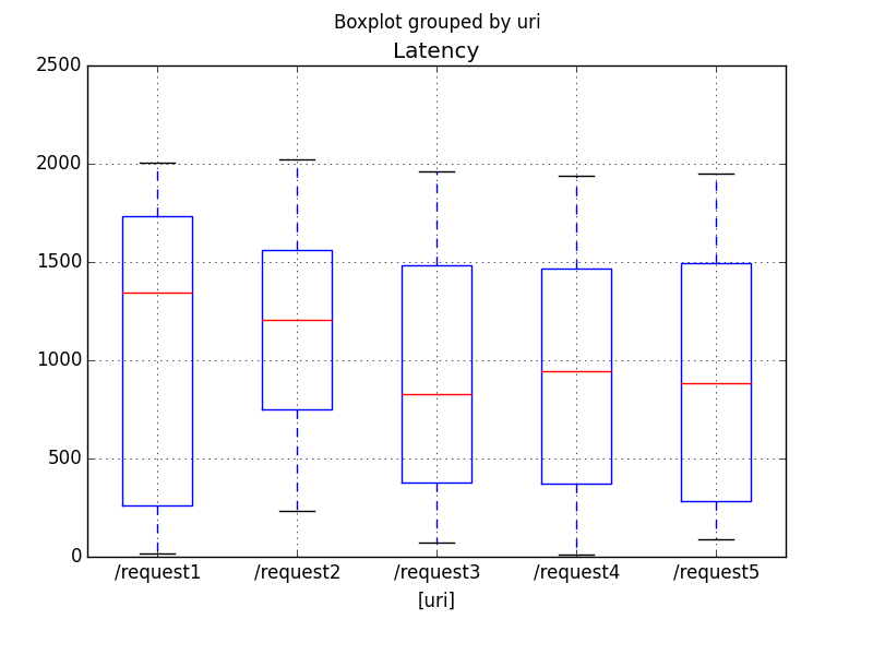
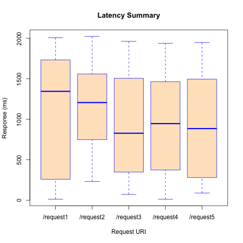
Once we have the data as a CSV file, there are a number of exploratory routes we can take. In this sample we demonstrate reading the results into a data frame and creating boxplots categorized by URI. This is demonstrated in both R and Pandas.
The Python/Pandas demo can be viewed end-to-end using a Jupyter notebook viewer. Fortunately, GitHub happens to have a very good one embedded natively (be sure your JavaScript is enabled). Just click on the link for DPLatency.ipynb.
Reading in the CSV and making a box plot is pretty easy as demonstrated in latencyBoxplot.py.
import pandas as pd
from matplotlib import pyplot as plt

# Read in the CSV data and make a new 'Latency' column
# containing the maximum of the 16 measurement columns.
#
df1 = pd.read_csv('sample6.csv', parse_dates=['Time'])
df1['Latency'] = df1.loc[:,'1':'16'].apply(max, axis=1)

# Make a boxplot of Latencies by URI.
df1.boxplot(column='Latency', by=['uri'])
plt.show()
This creates the figure saved in sample6PyPlot.png.
R can also produce a boxplot with just a few lines. The code below comes from latencyBoxplot.R.
# Read in the CSV data.
df <- read.csv('sample6.csv', stringsAsFactors=F)

# Make a latency column containing the maximum of the
# 16 measurement colummns: X1, X2, ..., X16.
#
latencyColumns <- paste(rep('X',16), 1:16, sep='')
df['Latency']  <- apply(df[,latencyColumns], 1, max)

# Send a boxplot to sample6RPlot.png.
#
png(file='sample6RPlot.png')
boxplot(df$Latency ~ df$uri, col='bisque', border='blue',
        xlab='Request URI', ylab='Response (ms)', main='Latency Summary')
dev.off()
This R sample produced the plot in sample6RPlot.png.
How significant are the differences in medians listed on the boxplots?
They did, after all, come from the same distribution. Let's see what
ANOVA has to say.
> latency.lm <- lm(Latency ~ uri, data=df)
> anova(latency.lm)
Analysis of Variance Table

Response: Latency
           Df    Sum Sq Mean Sq F value Pr(>F)
uri         4   2316107  579027  1.4928 0.2043
Residuals 295 114421644  387870
The F value is pretty low, which means, as we should expect, that these differences are not significant.
Note the ANOVA "sniffed this out" despite the fact that the ANOVA assumptions were poorly fulfilled. In particular, the variance within each group was not normal (I used a JMeter uniform distribution sampler). The Shapiro-Wilk normality test applied to each uri gives the following.
> tapply(residuals(latency.lm), df$uri, shapiro.test)
$`/request1`

	Shapiro-Wilk normality test

data:  X[[i]]
W = 0.85181, p-value = 3.447e-06


$`/request2`

	Shapiro-Wilk normality test

data:  X[[i]]
W = 0.94034, p-value = 0.006704


$`/request3`

	Shapiro-Wilk normality test

data:  X[[i]]
W = 0.91738, p-value = 0.000387


$`/request4`

	Shapiro-Wilk normality test

data:  X[[i]]
W = 0.91801, p-value = 0.0007981


$`/request5`

	Shapiro-Wilk normality test

data:  X[[i]]
W = 0.91067, p-value = 0.0003297
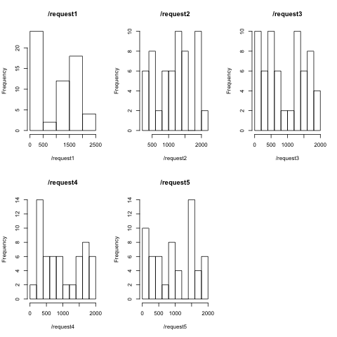
I didn't expect such high Shapiro-Wilk scores for distributions which are clearly not normal, much less with such extreme p-values. Check out the histograms that I produced with
laturi <- split(df$Latency, dfuri)
for (uriStr in names(laturi)) {
  hist(laturi[[uriStr]], main=uriStr, xlab=uriStr)
}
Perhaps this is because of the small data sample. I intend to run this experiment later with 1,000s of samples rather than just a few dozen.


