Winner of Obsidian's official Best Theme award ✨
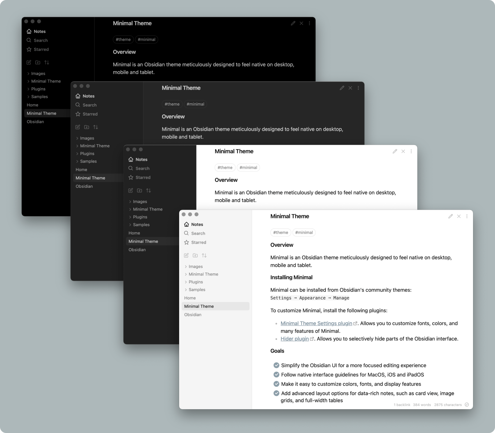
Minimal is an Obsidian interface replacement meticulously designed to feel native on desktop, mobile and tablet. You can customize colors, fonts and more with the companion plugins Minimal Theme Settings and Hider.
Support development: @kepano on Twitter or Buy me a coffee
- Goals
- Screenshots
- Features
- Installation
- Companion plugins
- Plugin support
- Helper classes
- Hotkeys
- Developers
- Disclaimer
- Simplify the Obsidian UI for a more focused editing experience
- Follow native interface guidelines for MacOS, iOS and iPadOS
- Make it easy to customize colors, fonts, and display features
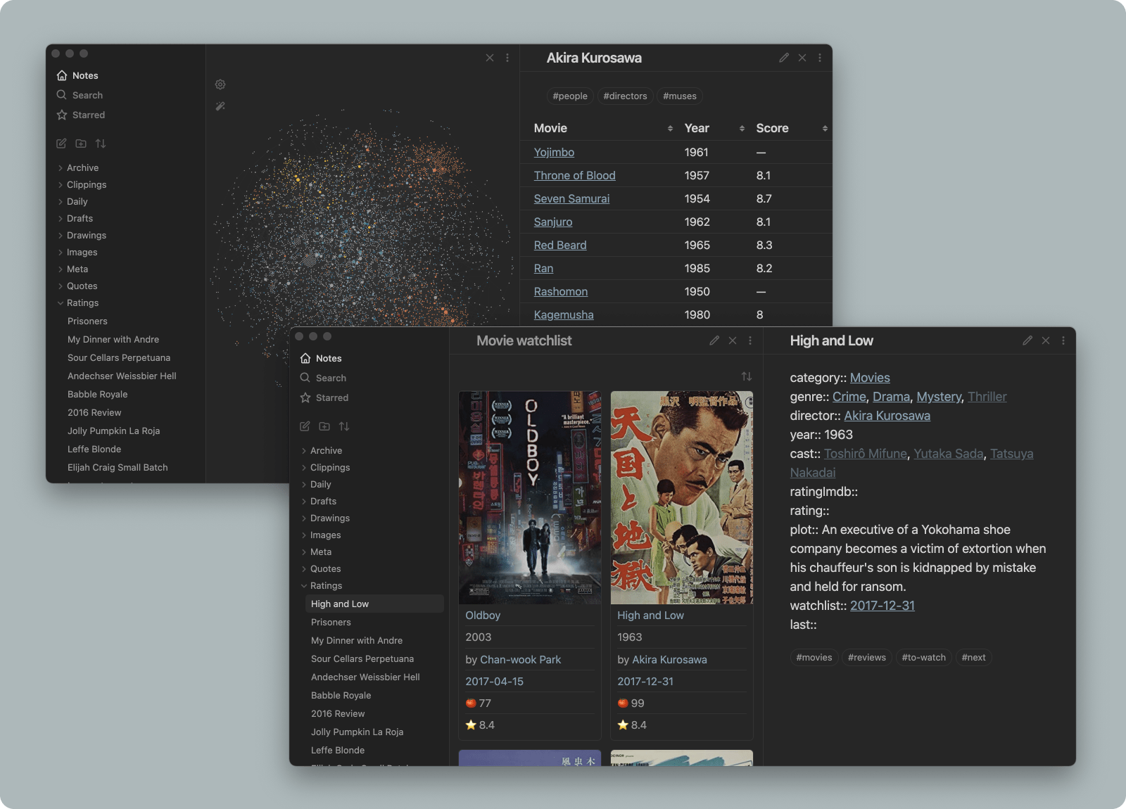
- Add advanced layout options for data-rich notes, such as card view, image grids, and full-width tables
Background styles include low contrast, high contrast, and a true black option ideal for OLED devices
Helper classes for tables and card layouts allow you to create powerful workflows
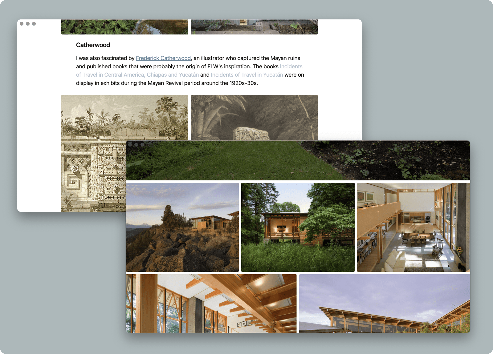
Combining focus mode with image grid and image width options allows you to immerse yourself in visual projects
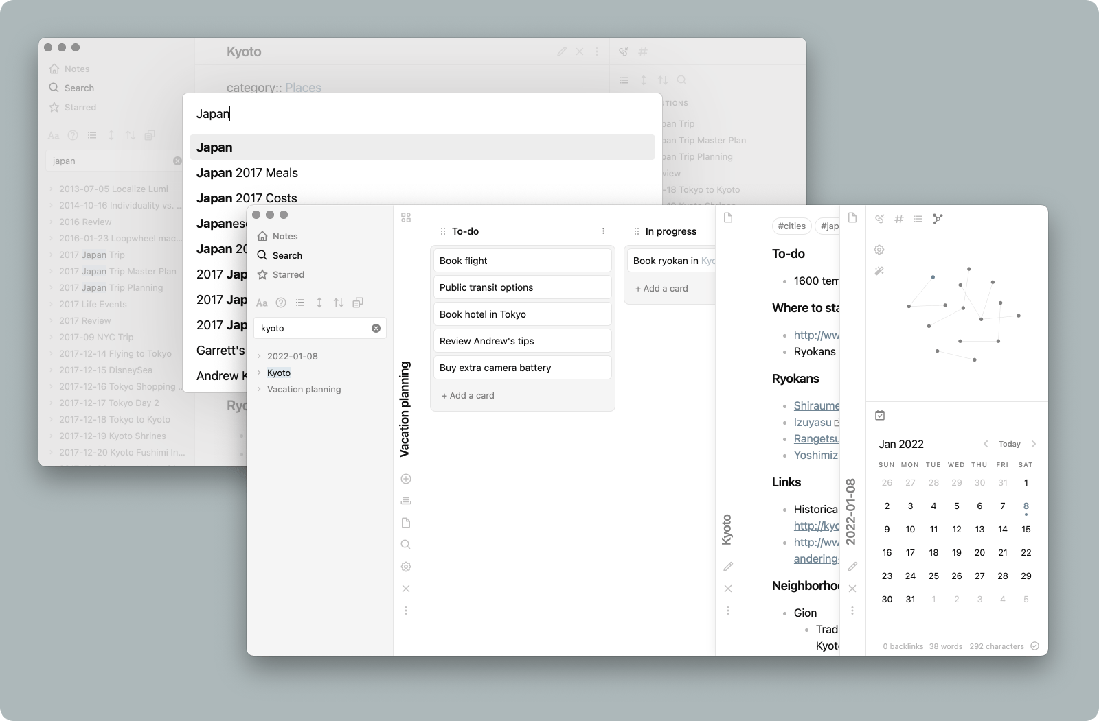
Minimal includes support for dozens of popular plugins like Calendar, Kanban, Dataview, Outliner, Excalidraw, Sliding Panes, and more
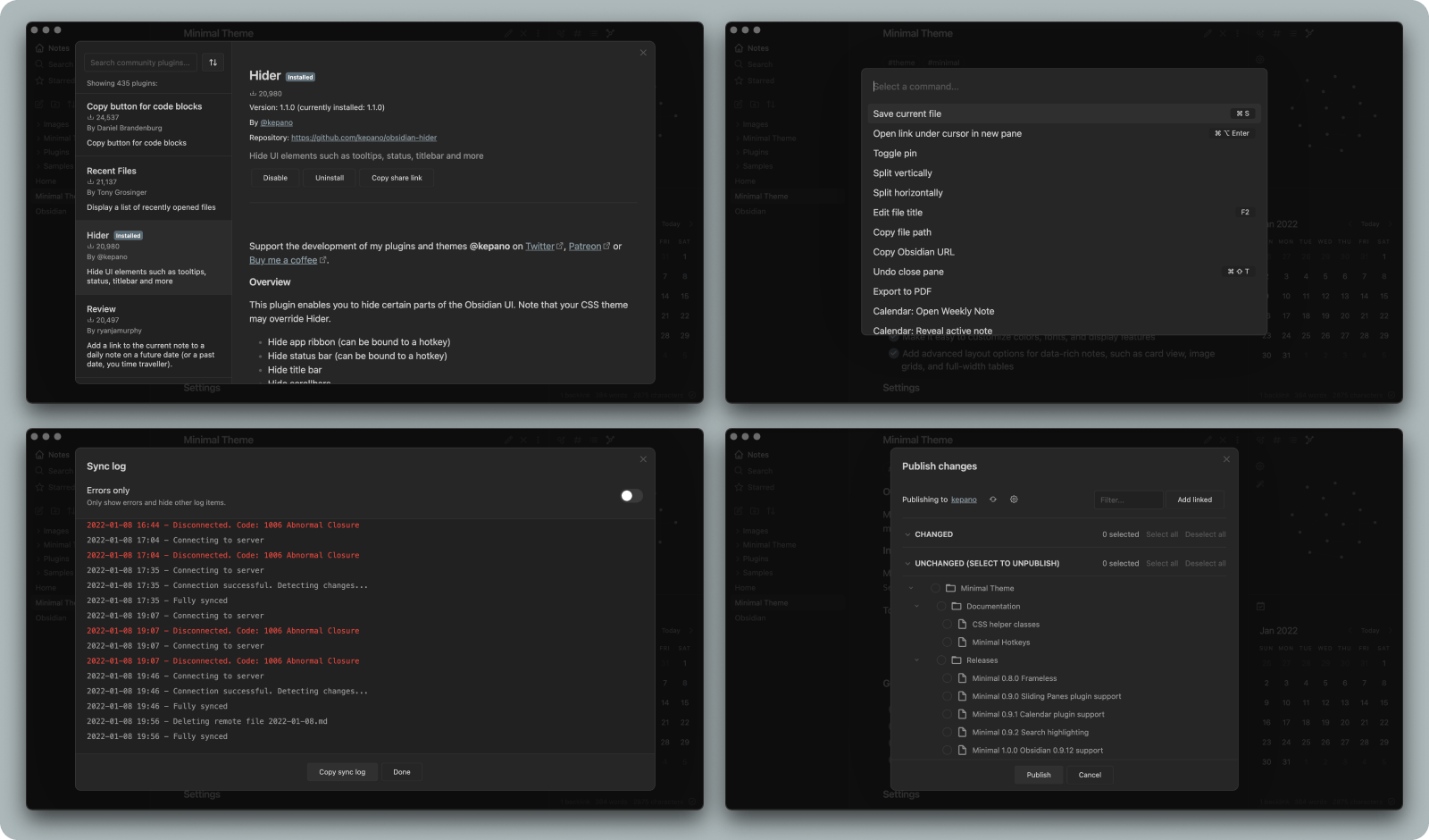
Every screen in the Obsidian app has been revised to create a cohesive experience, including settings, plugin browser, sync, publish, and file recovery
The following features can be accessed using Minimal Theme Settings plugin or Style Settings plugin (see companion plugins instructions below)
- Background styles for light and dark mode, including true black ideal for OLED devices
- Focus mode — hides everything but the text when sidebars are collapsed
- Custom icons
- Fancy cursor — uses accent color for the cursor
- Hide sidebar borders
- Trim filenames
- Cursor options
- Click and hold to expand images
- Open Obsidian Settings
- Go to
Appearanceand clickManage - Under community themes search for Minimal and click
Use
To customize Minimal, install the Minimal Theme Settings plugin or Style Settings plugin. Minimal Theme Settings is best if you want to use hotkeys, while Style Settings has a few extra granular settings for headings and advanced features. Running both simultaneously is not suggested as this will lead to conflicts.
Hider plugin is recommended to hide Obsidian UI elements such as window frame, scrollbars, tooltips, etc. When using Hider to turn off the main toolbar (AKA app ribbon), it can be accessed by hovering over the bottom left edge of the window.
Contextual Typography is required for advanced layout features such as image grids and block width options.
Most plugins work well with Minimal, but the following plugins have received special love and attention:
- Calendar
- Checklist
- Contextual Typography — required for image grids and layout control
- Dataview
- Dictionary
- Excalidraw
- Git
- Hider
- Kanban
- Outliner
- QuickAdd
- Sliding Panes — recommended spine width 36px
- Sortable — recommended for cards and tables
Additional documentation can be found at publish.obsdian.md/kepano
Image filters can be added to create the following effects. Use them by adding the filter name at the end of the image link, e.g. ![[image.jpeg#invert]]
| Filter | Description |
|---|---|
#invert |
Invert images in dark mode — ideal for charts and handwriting |
#circle |
Crop image to a circle |
CSS helper classes can be added on a per-file basis using the cssClasses YAML front matter key. These classes are composable, so you can include more than one to combine effects.
For example, use the following code at the top of your file to enable cards layout:
---
cssClasses: cards
---
Turns consecutive images into columns. To make a new row, add an extra line break between images. Learn more.
| Class | Description |
|---|---|
img-grid |
Activate image grids |
Controls the width of elements by type. Learn more.
| Class | Description |
|---|---|
table-100, img-100, iframe-100 |
Fill 100% of the pane width |
table-max, img-max, iframe-max |
Fill the max line width (default 88%) |
table-wide, img-wide, iframe-wide |
Fill the wide line width |
Using cards transforms Dataview tables cards that can be sorted using the Sortable plugin. Compatible with table width classes. Note that cards must be present for the other classes to work.
| Class | Description |
|---|---|
cards |
Set all Dataview tables to card layout |
cards-align-bottom |
Align the last element of a card to the bottom |
cards-cover |
Images are resized to fill the defined space |
cards-16-9 |
Fit images in cards to 16:9 ratio |
cards-1-1 |
Fit images in cards to 1:1 ratio (square) |
cards-2-1 |
Fit images in cards to 2:1 ratio |
cards-2-3 |
Fit images in cards to 2:3 ratio |
Controls the row and column styling for tables. Learn more.
| Class | Description |
|---|---|
table-nowrap |
Disable line wrapping in table cells |
table-tabular |
Use tabular figures in tables |
table-small |
Use small font size in tables |
table-tiny |
Use tiny font size in tables |
table-lines |
Add borders around all table cells |
row-lines |
Add borders between table rows |
col-lines |
Add borders between table columns |
row-alt |
Add striped background to alternating table rows |
col-alt |
Add striped background to alternating table columns |
| Class | Description |
|---|---|
embed-strict |
Transclusions appear seamlessly in the flow of text |
Hotkeys are only available when using the Minimal Theme Settings plugin.
- Switch between light and dark mode
- Cycle between light mode styles
- Cycle between dark mode styles
- Toggle sidebar borders
- Toggle image grids
- Cycle between image width options
- Cycle between table width options
- Cycle between iframe width options
- Toggle focus mode
- Increase and decrease body font size
If you would like add support for a plugin, or have found a bug you'd like to help fix, don't hesitate to open a pull request.
Set up
sudo gem install sass
npm install -g grunt-cli
npm install
Define local path
To build directly into your Obsidian vault rename .env.example to .env and update OBSIDIAN_PATH to the local path of your Obsidian theme folder.
To run
npx grunt
This builds two files, the obsidian.css distribution file (for the community themes store) which is minified and also copied to your vault for live reload, and the Minimal.css file which is an unminified copy saved to the project root.
Minimal is licensed under the MIT License which allows you to modify and redistribute the code, however you must preserve the copyright and license notice in your CSS file. This includes any code you may extract as standalone snippets.
If you would like to distribute a fork of Minimal please keep my Buy me a coffee link present in your Readme.
Minimal is frequently updated to stay current with the latest version of Obsidian. To make it easy to stay current with the latest improvements, I recommend using Github's fork feature so that you can merge the latest changes into your fork. If you have any questions don't hesitate to reach me in the Obsidian Discord group.
This theme is provided as is, and is designed for my personal use of Obsidian on Mac OS. As such it is not thoroughly tested across all operating systems and use cases.
This theme modifies significant parts of the Obsidian interface, so it may break with future updates. It may also be incompatible with other bits of custom CSS you have.


