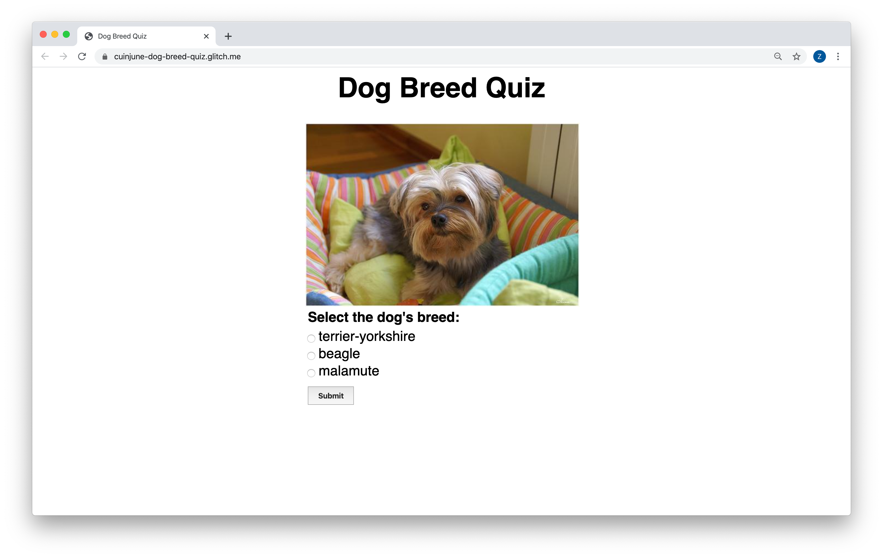
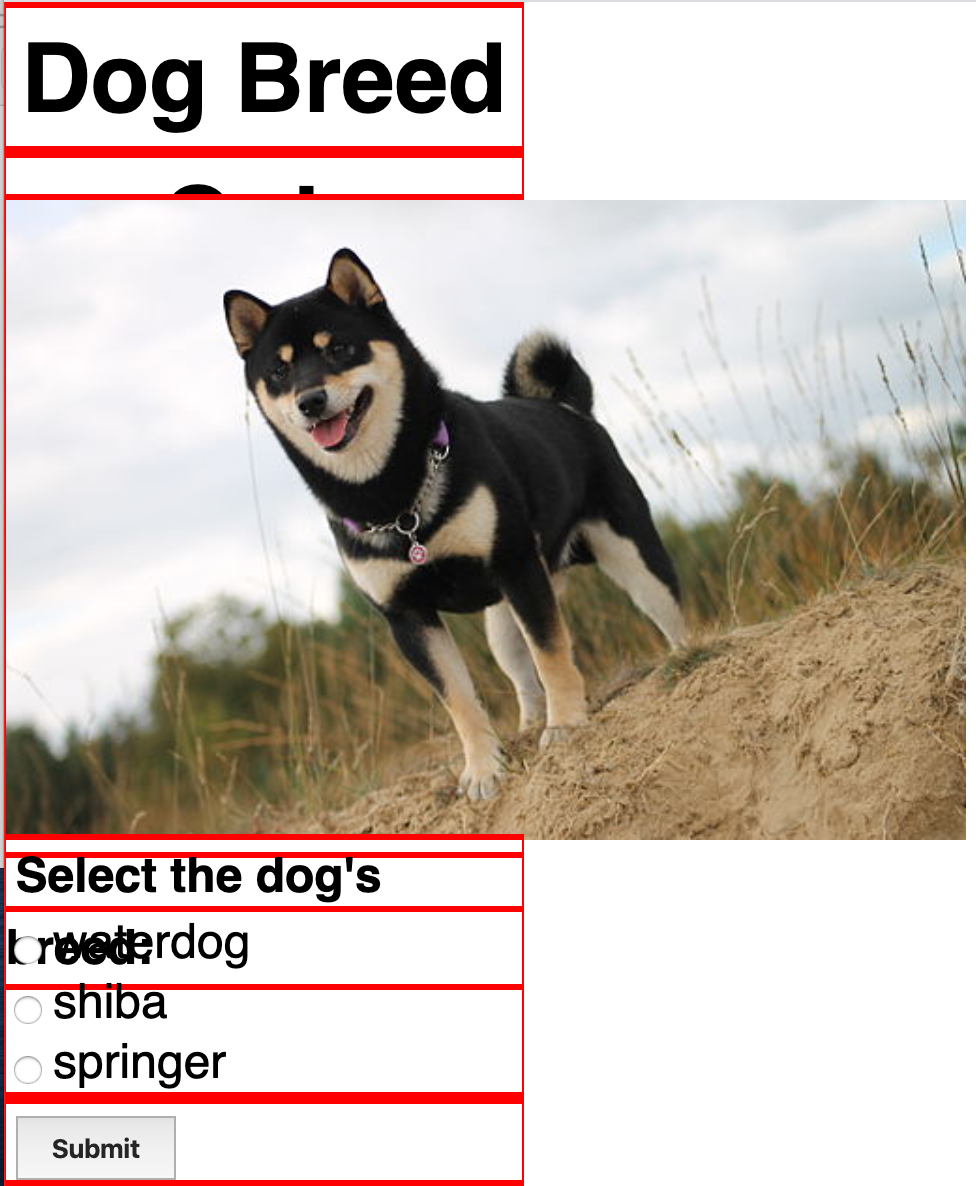
This week, the assignment was to created a dynamic front end web application. This means that it must:
- Connect with an API (e.g. weather, time)
- Include an interactive element that responds to an event (e.g. click, scroll, mouseover, etc.)
- Be responsive to the screen size
I decided to create a simple educational quiz app to test the user's knowledge in dog breed using the Dog API.
Here's the Live Demo on Glitch
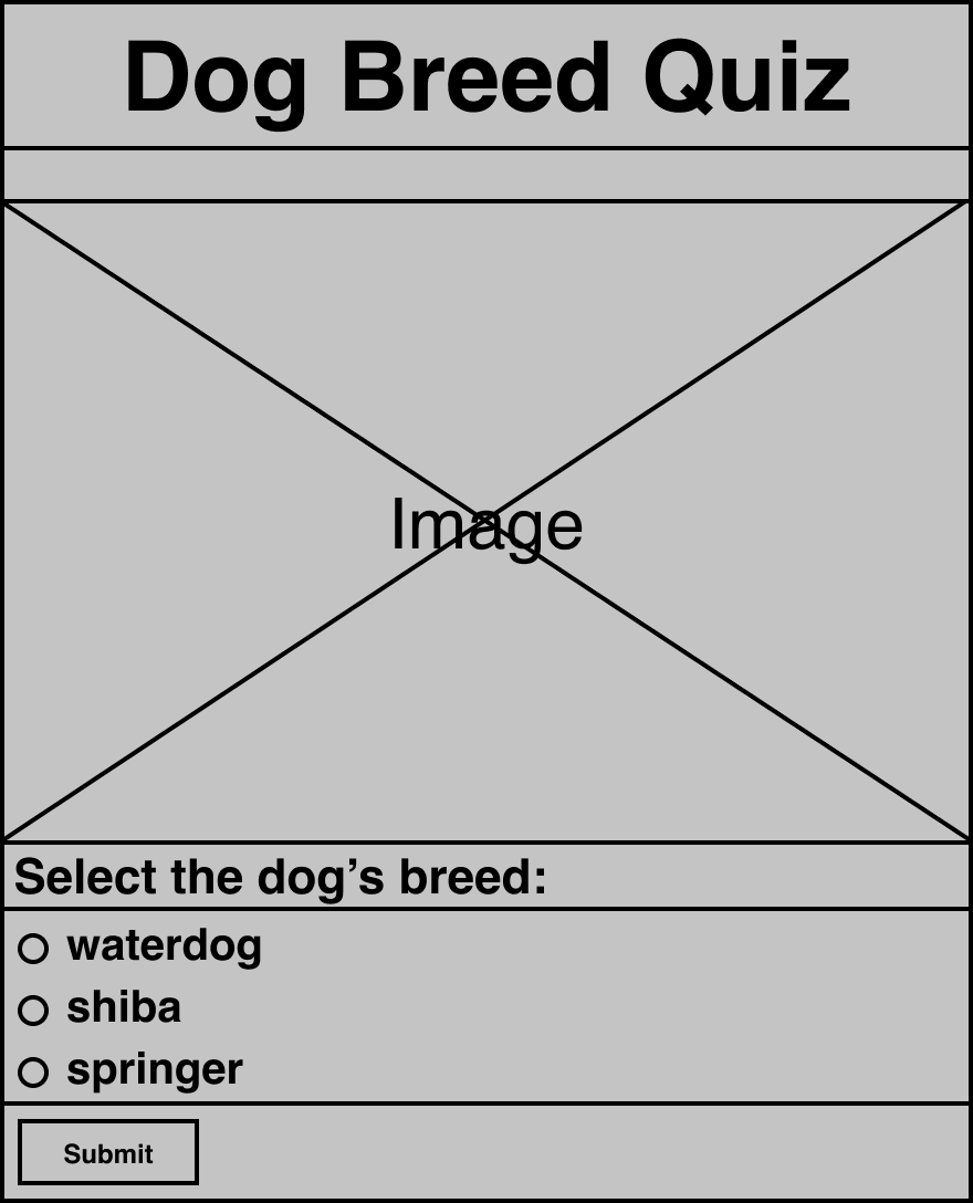
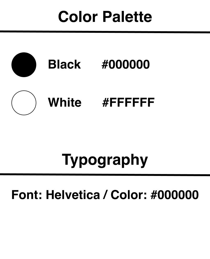
I started with drawing a rough sketch to determine how the contents should be placed and then I used Figma to create wireframe, visual design, and style guide.
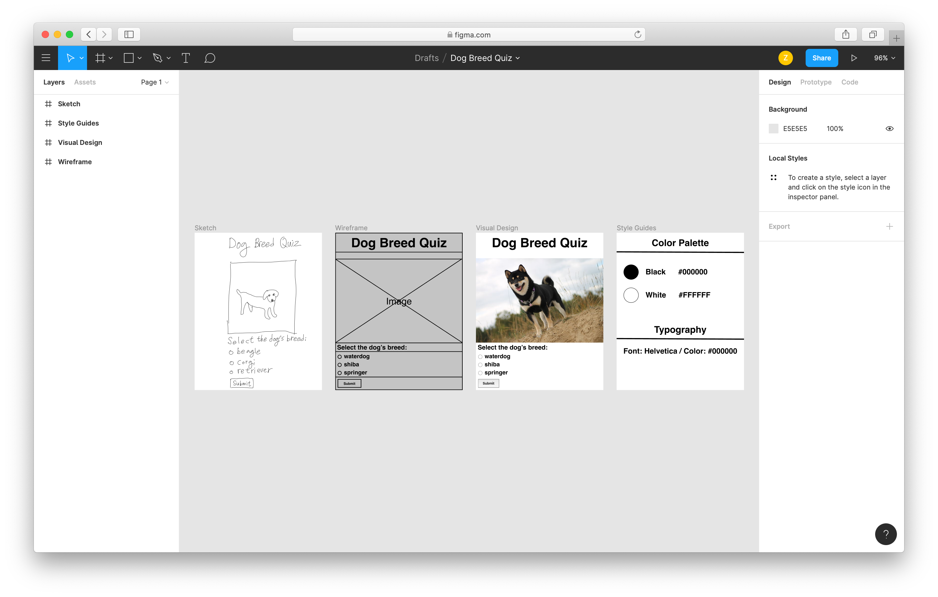
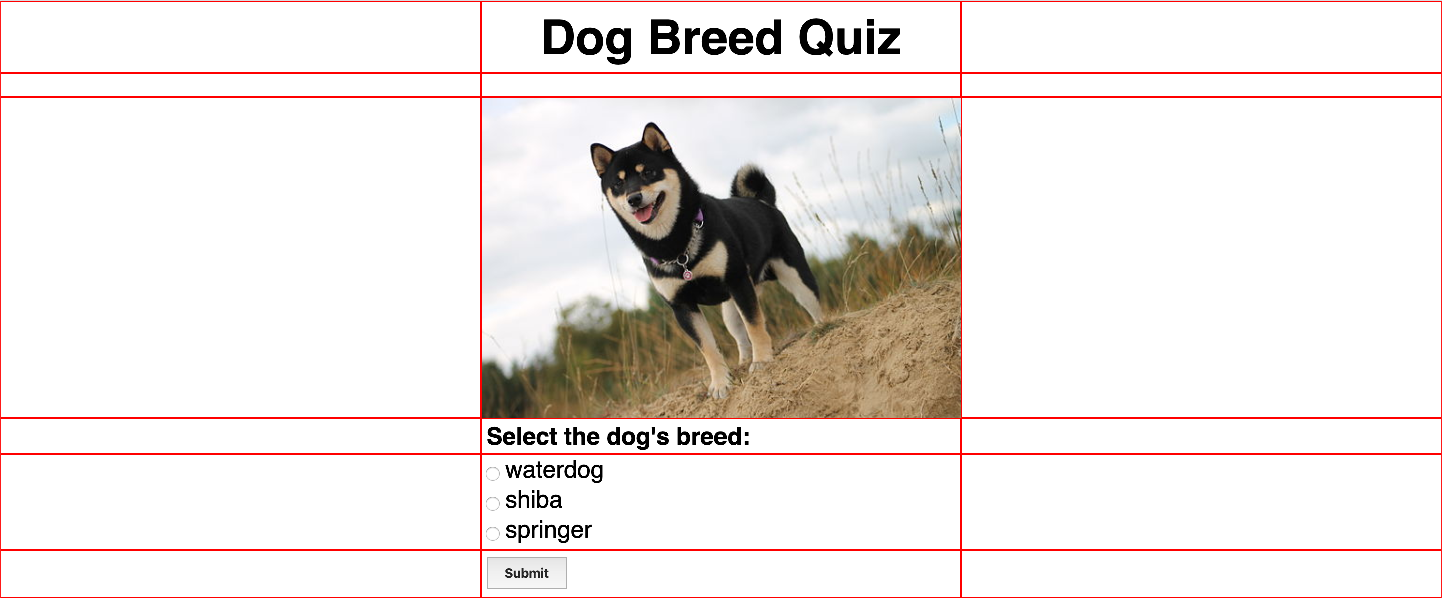
I structured the HTML page with flex boxes that are essentially made of rows and columns and based on the wireframe sketch.
I tried to make the page responsive to the page size by changing the flex-direction.
@media screen and (max-width: 800px) {
    .row1 {
        flex-direction: column;
    }
}
But it didn't seem to work properly for some reason. I need to ask and learn how to fix this.
