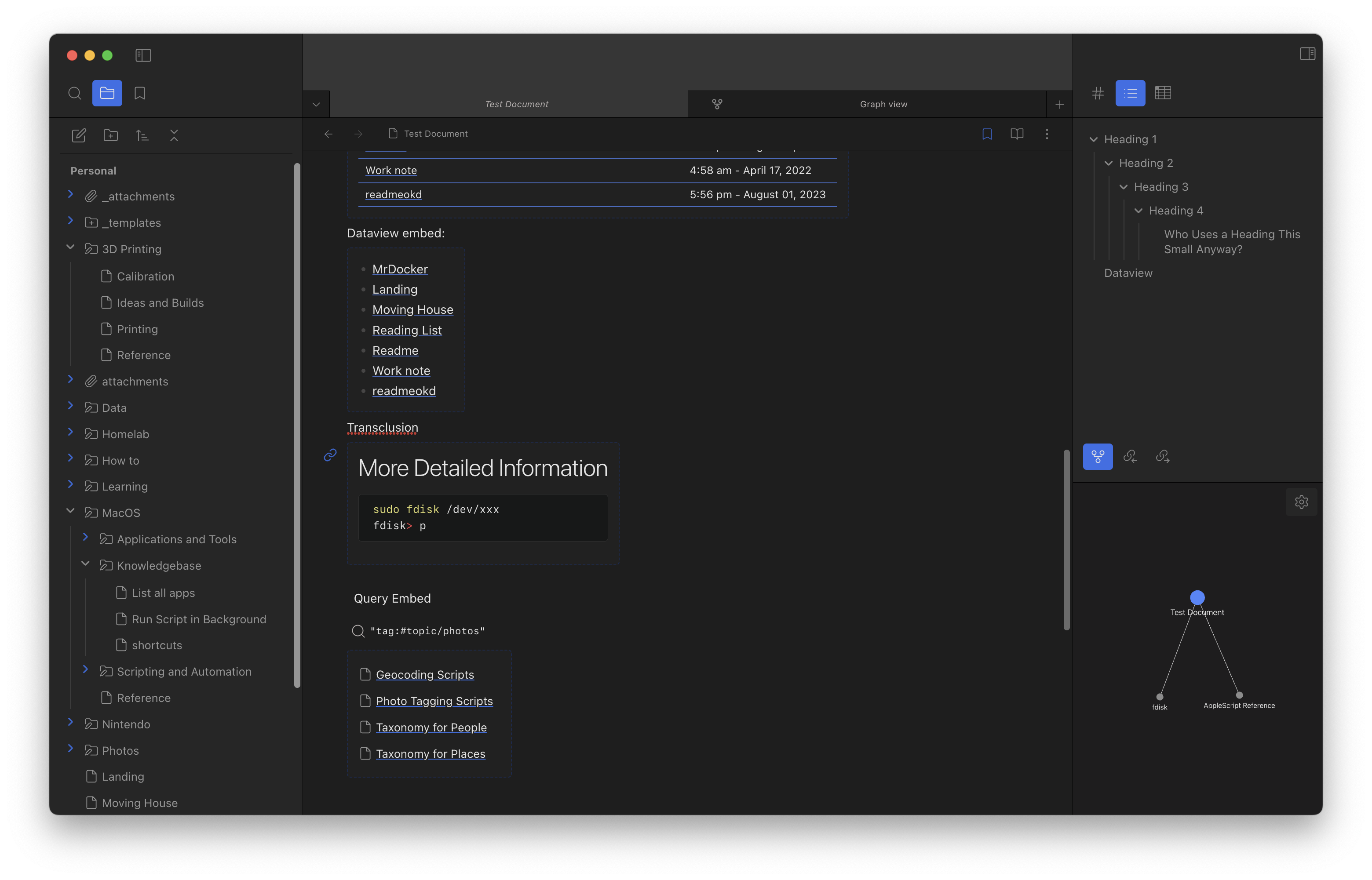
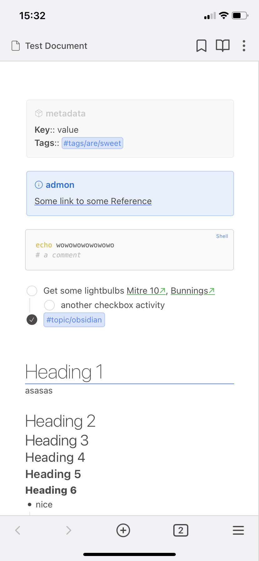
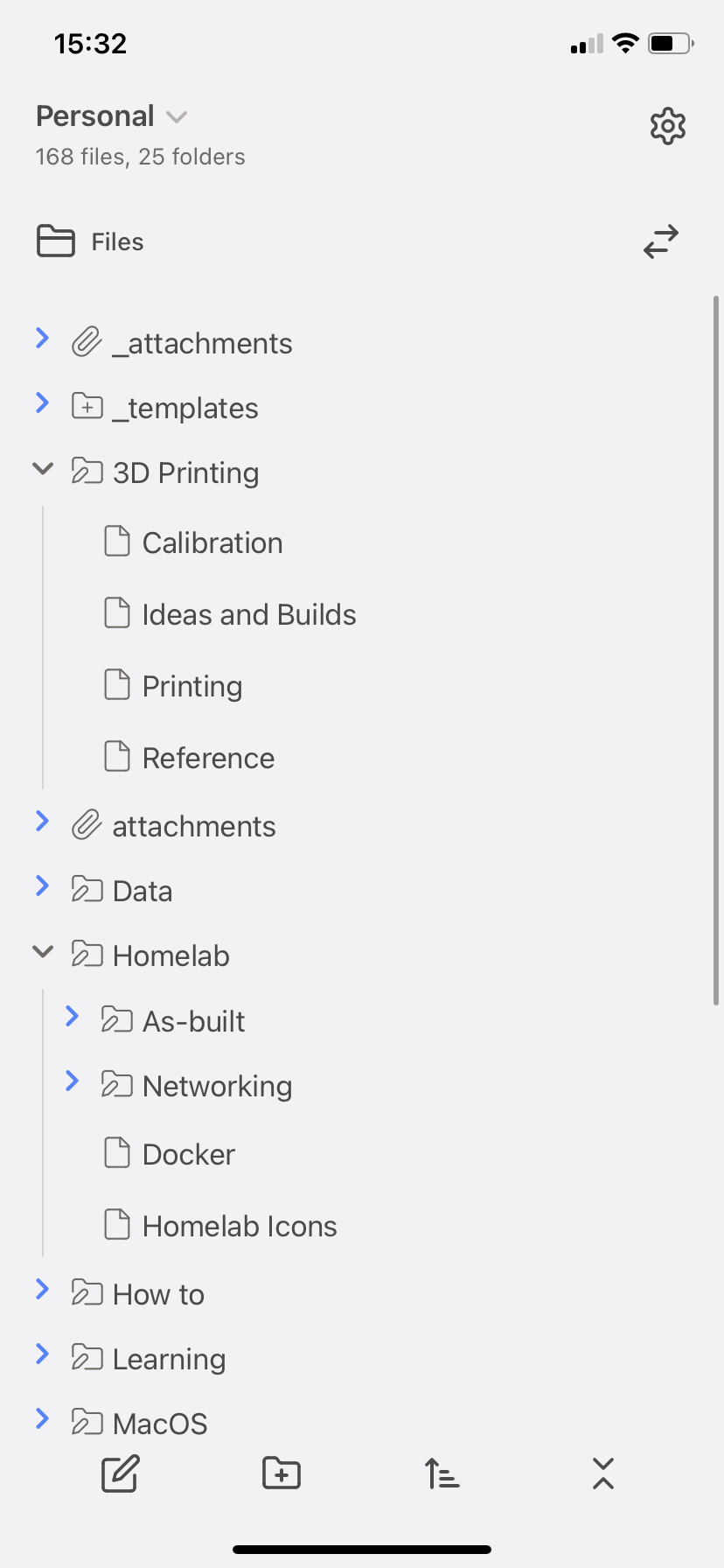
With Big Sur Aesthetic and California Coast dead I was unhappy with the general options for Obsidian fitting in with MacOS. This is my attempt at styling Obsidian the best I can to look Mac-native. Key aspects of the interface just don't work as I'd like (e.g. the Ribbon generally and the Back/Forward buttons being in the wrong place entirely), but it's good enough for me to release publicly. It's based on me looking at Mail.app, Finder and Notes.app and winging it - don't quote the Apple style guides at me - I didn't and won't read them :)
Note: Requires Apple San Francisco (SF) Pro and Mono fonts installed as they are specified in the CSS (https://developer.apple.com/fonts/)
Some specific features to improve nativeness:
- Colours (light and dark)
- Fat Header bar with sidebar toggle buttons in the right place
- File Tabs
- Square
- close button on left, visible on hover
- dropdown moved to left
- expand to fill width
- Fake red close circle in settings/dialogs
- resized and recoloured Toggles
- Settings buttons styled
- Setting Dropdowns styled and dropdown icon changed
- Checkbox size and tick shape match Notes.app
- Bullet size and colour match Notes.app
- Stacked tabs look… as best I can get them but it's never going to be very "Mac"
- Scrollbars are as good as I can get them
- Added a bunch of missing borders in the sidebars
- Replaced slash with Chevron in the breadcrumbs
- Ribbon is hidden, gone, kaput. I couldn't get it to not look ugly and it's useless and doesn't fit and I don't use it anyway (just use the command pane!)
Some stuff I've included in here because I wanted to make my life easier/less hard to see what is going on:
- improving visibility of collapsed items so I don't forget they are there
- Visual representation of which (if any) file tab is active, including the weird concept where there is more than one 'active' tab across the different tab groups:
- Tab styling
- Main header highlighting
- Scroll bar highlighting
- Local graph in the sidebar fits in better as part of the sidebar
- YAML nicer looking and the
---autohide - Custom 'metadata' callout that is just grey that (I'll use until YAML supports links natively)
- (Lucide-based) folder and file icons for:
- Folders with Folder Notes (https://github.com/LostPaul/obsidian-folder-notes)
- Template Folders (any folder containing "template" in the name)
- Files within template folders above
- Attachment Folders (any folder containing "attachment" in the name)
- Images (png/jpg/jpeg)
- Documents (pdf/docx)
- Added file and folder icons to Breadcrumbs:
- Folders and Folders with Folder Notes (https://github.com/LostPaul/obsidian-folder-notes)
- 'Normal' files (didn't bother with attachments/images/pdfs etc.)
- Link styling to make them more subtle but still discernable (including internal vs external)
Recommended Accent colour is rgb(75 135 253) as that's what I've tweaked the highlights to work best with, but the default Purple looks nice also! (rgb(252 186 1) if you want to match Notes.app but the contrast isn't great on dark mode)
I'd fully expect things to break outside of my existing use cases as:
- I'm not a web developer, I have a tenuous grasp of what I'm doing, I hate CSS and built this from scratch off the sample theme
- I've had to put some pretty big margins and paddings in to shift things around to get the 'fat' top bar to match MacOS generally - see a. above for why that might cause you trouble
- I've done everything by pixels on a 5K iMac screen (and tested on a M2 Macbook Air), so I have no idea if custom display scaling will break things (again, see a. above)
Prioritisation is based on my general use of Obsidian, so if something is broken or hidden it's because I don't use it.
I've tried to Document the CSS but it's probably like 70% done and the really weird modifications are the least clearly documented… also note Color is spelt Colour in the CSS comments if you're looking for it
-
Sidebar toggle buttons look janky during animations -
Add templates folder and file icons to Breadcrumbs
-
Reader mode formatting is probably at like 95% where want it and it's unlikely to change unless I find problems - Mobile has been tested on my iPhone
1113, YMMV! - I want to get support for Style Settings top allow people to undo some of my (what may be controversial) decisions (e.g. Ribbon and Status bar are hard-hidden), but also it's MacOS so you get what you get :)
- Translucent window - I can't really get it to look or behave even remotely like the native MacOS style so it doesn't work at all - don't use it!
- Window Frame styles that aren't "Hidden" - I tried to get "Native Frame" to work, but the line across the top was untenable
Supported here means that I've got it installed and made some specific tweaks to accomodate it - other plugins will probably also work ok but who knows
- Quiet Outline (https://github.com/guopenghui/obsidian-quiet-outline)
- Folder Notes (https://github.com/LostPaul/obsidian-folder-notes)
Plugins I no longer use (i.e. accomodations may break)
- Advanced Tables (https://github.com/tgrosinger/advanced-tables-obsidian)
- Dataview (https://github.com/blacksmithgu/obsidian-dataview)
- Templater (https://github.com/SilentVoid13/Templater)
I use Linter (https://github.com/platers/obsidian-linter) to put line breaks between things automatically, so some padding might be a bit tight if you are not in the habit of spacing things manually (the recently added post-heading spacer CSS variables have been zerod out) Slowly striking a good balance here
Please raise issues or feel free to Fork and improve to your liking


