An awesome library with thousands of customizations for React components
Explore the docs »
View Demo | WIP
·
Report Bug
·
Request Feature
Table of Contents
There are many great button libraries and component libraries on Github; however, We tried to gather all functionality we think can be useful for a button in one library.
Here's why:
- Your will save thousands of kilobytes for just the feature you want.
- You can customize almost everything.
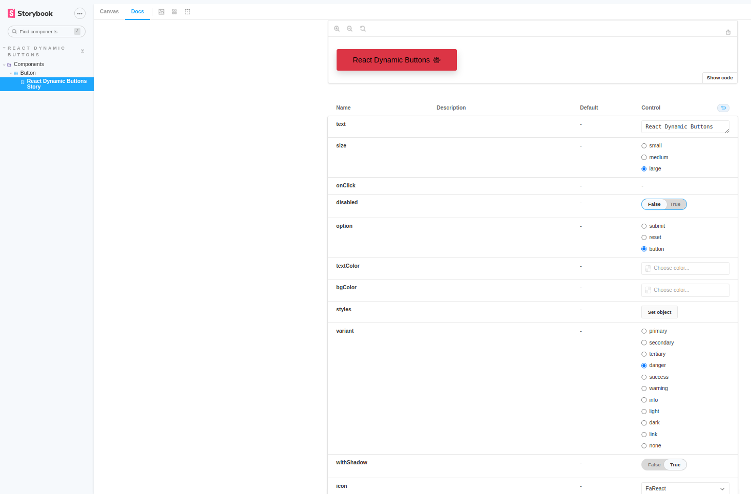
- size: ['small', 'medium', 'large'] // default: "large"
- onClick: () => void
- variant: ['primary', 'secondary', 'tertiary', 'danger', 'success', 'warning', 'info', 'light', 'dark', 'link'] // default: "primary"
- withShadow?: boolean // default: false
- disabled?: boolean // default: false
- option: ['button', 'submit', 'reset'] // default: "button"
- styles?: React.CSSProperties
- bgColor?: string // default: ""
- textColor?: string // default: ""
- text?: string // default: "Button"
- faIcon?: string | null // default: null "Font Awesome Icons"
- colorIcon: string | null // default: null "Flat Colors Icons"
- iconPosition?: ['left', 'right', 'none'] // default: "none"
- className?: string // default: ""
- children?: React.ReactNode // default: "Button"
import { Button } from "dynamic-react-components";

function App() {

  return (
    <div className="App">

        <Button
          text={"React Dynamic Button"}
          variant={"danger"}
          faIcon={"FaReact"}
          iconPosition={"right"}
          size={"large"}
        />

    </div>
  );
}

export default App;
Contributions are what make the open source community such an amazing place to learn, inspire, and create. Any contributions you make are greatly appreciated.
If you have a suggestion that would make this better, please fork the repo and create a pull request. You can also simply open an issue with the tag "enhancement". Don't forget to give the project a star! Thanks again!
Please refer to the Contributing guide
Distributed under the MIT License. See LICENSE.txt for more information.


