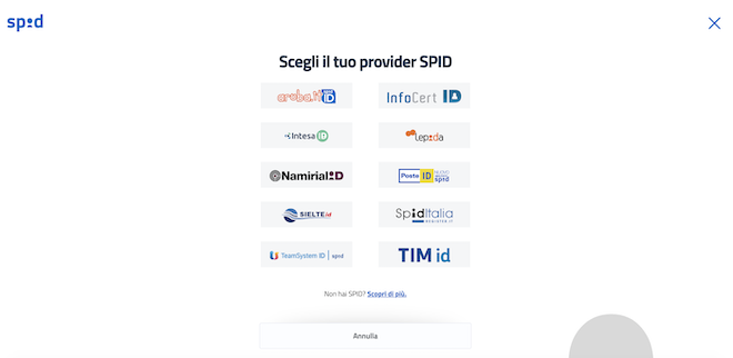
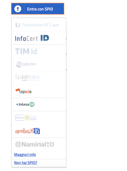
Pulsante SSO per SPID in React
| Modal | Dropdown |
|---|---|
 |
 |
npm install --save @dej611/spid-react-button typeface-titillium-webThe package depends on the Titillium font.
An alternative to installing the local package is to use it via CDN, adding this line to your css file:
@import url(https://fonts.googleapis.com/css?family=Titillium+Web:400,600,700,900);import React from 'react'
// Import it via package or in your CSS file via the CDN @import
import 'typeface-titillium-web';
import {SPIDReactButton} from '@dej611/spid-react-button'
import '@dej611/spid-react-button/dist/index.css'
function Example(){
return <SPIDReactButton url="/myLogin/{{idp}}"/>
}Note: the providers list has no particular sorting order and is shuffled at every page load.
In general using the POST version of this component makes it usable for the most wide audience, as the GET version uses links which may have issues. To know more read below.
The component tries its best to provide the best a11y practices implemented, but there are some specific browser behaviours that may still keep it hard to use with keyboard.
In particular in OSX Safari and Firefox have some issues with focus and the behaviour of tab: please read about it when using this component.
To get up and running with the development of the project you can follow these steps.
To see the component in action, useful to test it manually after some changes, open a terminal window and type:
cd example
npm start
This will start the create-react-app project and open a new browser tab with the example application in it.
At this point it is possible to perform changes to the component/library, open a new terminal in the project folder and use this command when done with changes:
npm buildTo run the test do:
npm testThe readme file is autogenerated from a template located in script/readme.template: the template contains everything but the API which is generated from the Typescript source.
No need to touch the API part (which will be overwritten anyway).
Next.js 11 has some issues with the imported SVGs in this package, therefore it requires some configuration tweak and some additional dependencies to make it work correctly.
First step, install some additional dependencies:
npm i @svgr/webpack url-loader next-transpile-modules --save-devThese three dependencies should be added to the Next.js configuration to enable SVG import as URLs (used in this package for the buttons.)
// next.config.js
const withTM = require('next-transpile-modules')(['@dej611/spid-react-button']);

module.exports = withTM({
  reactStrictMode: true,
  webpack(config) {
    const fileLoaderRule = config.module.rules.find(rule => rule.test && rule.test.test('.svg'))
    fileLoaderRule.exclude = /\.svg$/
    config.module.rules.push({
      test: /\.svg$/,
      loader: require.resolve('@svgr/webpack')
    },
    {
      test: /\.svg$/,
      loader: require.resolve('url-loader')
    })
    return config
  }
})Type: Component
Props: SPIDButtonProps
The main component for the button.
Use this component with the type prop to select the version you prefer.
The SPIDButtonProps object contains the following properties:
Possible values: { method : "GET" } | { extraFields ?: Record<string , string>, fieldName : string, method : "POST" }
Type: ConfigurationGET | ConfigurationPOST
Required: No
Default value: {"method": "GET"}
Each Provider button will use this configuration for its button.
The default value is {"method": "GET"}
Possible values: "rounded" | "sharp"
Type: CornerType
Required: No
Default value: "rounded"
The type of corner for the button: rounded or sharp.
The default value is "rounded".
Type: ProviderRecord[]
Required: No
Used for testing. Do not use in production
Type: boolean
Required: No
Default value: false
This controls the width of the button: when fluid it will fill all the available space.
It applies only to the modal version.
The default value is false.
Possible values: "it" | "en" | "de" | "es" | "fr"
Type: Languages
Required: No
Default value: "it"
The language used for the UI. The default value is "it".
Type: Record<string , string>
Required: No
An object containing the mapping for the providers.
This is useful when a Service Provider identifies the IDP with a different string than the entityID
Type: ( providerEntry : ProviderRecord, loginURL : string | undefined, event : React.MouseEvent<HTMLAnchorElement , MouseEvent> | React.MouseEvent<HTMLButtonElement , MouseEvent>) => void
Required: No
This is called when a user clicks on a provider button.
providerEntry: The full entry of the provider clicked is passed, together with the eventloginURL: The final URL for the specific Identity Provider. It returns undefined if the button is disabledevent: React original MouseEvent
onProvidersHidden
Type: () => void
Required: No
This is called when the providers are hidden on the screen (as soon as the animation starts)
Type: () => void
Required: No
This is called when the providers are shown on the screen (as soon as the animation starts)
Possible values: "SAML" | "OIDC"
Type: Protocols
Required: No
Default value: "SAML"
The protocol to use for the current instance.
Only Providers who support the declared protocol are enabled.
The default value is "SAML".
Possible values: "sm" | "md" | "l" | "xl"
Type: Sizes
Required: No
Default value: "md"
The size of the button. Options are: "sm" (small), "md" (medium), "l" (large) and "xl" (extra large - dropdown only).
The modal version does not support the "xl" size and will fallback to "l" if passed.
The default value is "md".
Type: boolean
Required: No
Default value: false
It forces an ascending order (A->Z) of the providers, based on the entityName string.
Note that this will sort with no distictions between official and extraProviders in the list.
Possible values: string[]
Type: ProviderRecord["entityID"][]
Required: No
Default value: All providers
The list of entityID supported by the button instance.
The default value is all the official providers.
Possible values: "positive" | "negative"
Type: ColorTheme
Required: No
Default value: "positive"
The theme used for the button:
- "positive" has a blue background with white text,
- "negative" has a white background and blue text.
The default value is"positive".
Possible values: "modal" | "dropdown"
Type: Types
Required: No
Default value: "modal"
The way to present the providers once clicked. The default value is "modal".
Type: string
Required: Yes
The URL used by the buttons.
It can be either absolute or relative.
It must contains the "{{idp}}" string in it, which will be replaced by the entityID of each provider
(unless specified otherwise with the mapping prop - see below).
This props is mandatory.
Type: Component
Props: SPIDButtonProps
The specific component button with the dropdown.
Use this component when you want to minimize the footprint in your project.
It accepts the same props as the main component. The type prop is ignored in this case.
Type: Component
Props: SPIDButtonProps
The specific component button with the modal.
Use this component when you want to minimize the footprint in your project.
It accepts the same props as the main component. The type prop is ignored in this case.
ColorTheme: "positive" | "negative"
The theme used for the button:
- "positive" has a blue background with white text,
- "negative" has a white background and blue text.
ConfigurationGET: {method: "GET"}
Each Provider button will use this configuration for its button.
This is the specific GET type.
ConfigurationPOST: {extraFields: Record<string , string>, fieldName: string, method: "POST"}
Each Provider button will use this configuration for its button.
This is the specific POST type
CornerType: "rounded" | "sharp"
The type of corner for the button: rounded or sharp.
Languages: "it" | "en" | "de" | "es" | "fr"
The language used for the UI.
Protocols: "SAML" | "OIDC"
The protocol to use for the current instance.
Only Providers who support the declared protocol are enabled.
Sizes: "sm" | "md" | "l" | "xl"
The size of the button. Options are: "sm" (small), "md" (medium), "l" (large) and "xl" (extra large - dropdown only).
The modal version does not support the "xl" size and will fallback to "l" if passed.
Types: "modal" | "dropdown"
The way to present the providers once clicked.
ProviderRecord
The object format of a Identity Provider object.
-
entityID:
string -
entityName:
string -
logo:
string- Optional -
protocols:
Protocols[]- Optional
getShuffledProviders() => RegisteredProviderRecord[]
Returns a copy of the list of the official providers, already shuffled
getSupportedLanguages() => Languages[]
Returns the list of supported languages for the UI
EUPL 1.2 © dej611
