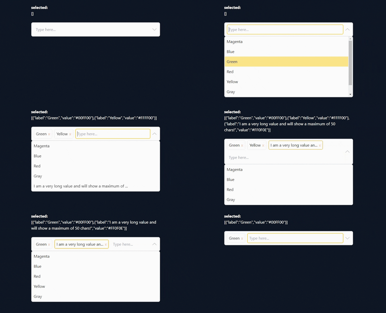
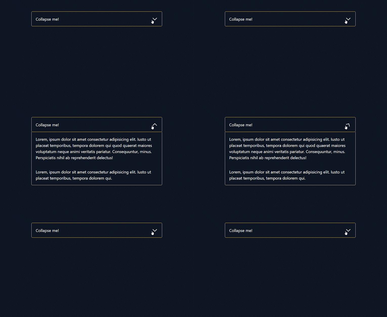
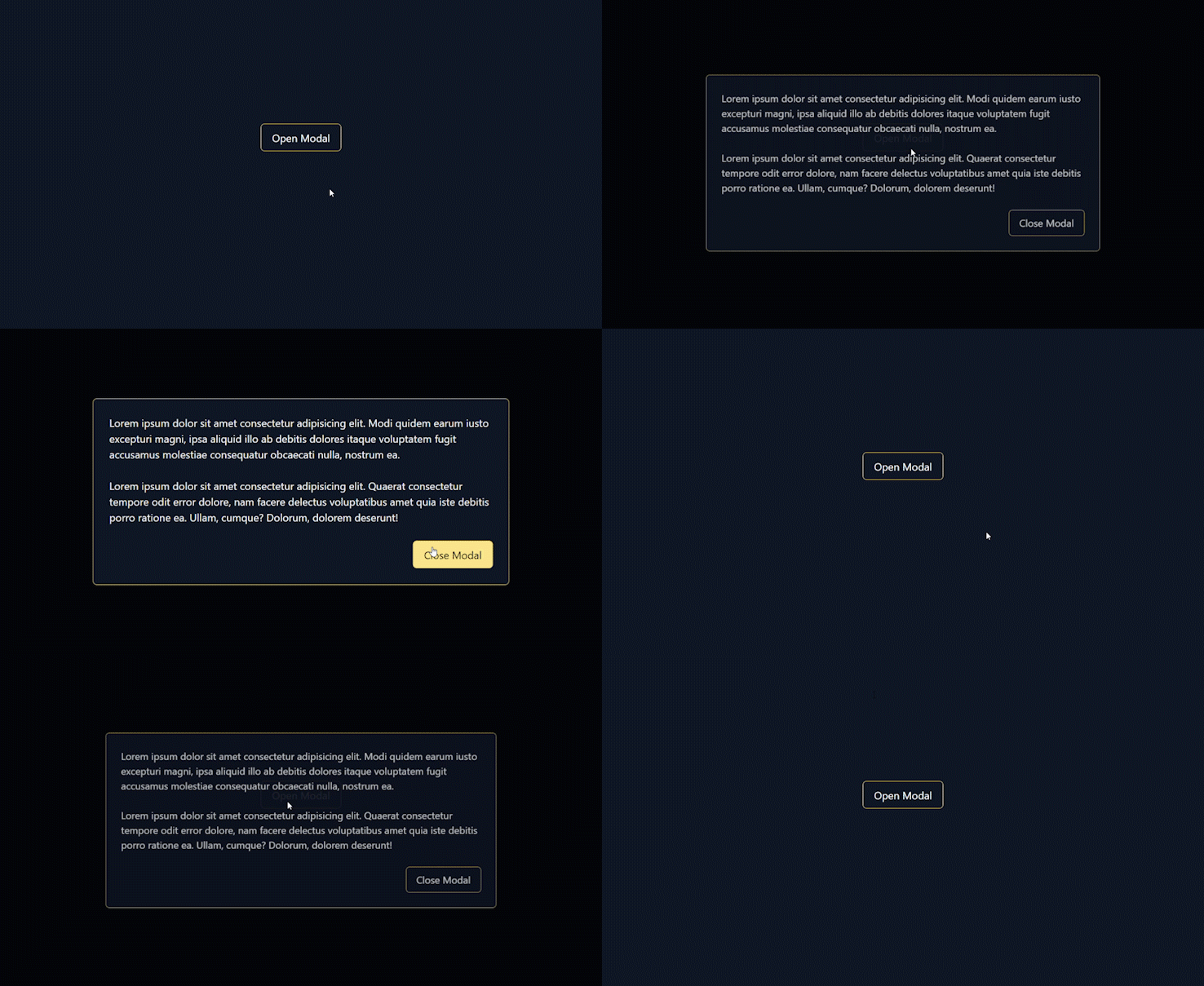
This will be a collection of custom components built with alpineJS and tailwindCSS.
This repository was created with the intention to create youtube tutorials and therefore each component includes a starter and a final version.
This list will be expanded gradually.
- Multi-Select (watch youtube tutorial)
- Accordion (watch youtube tutorial)
- Modal (watch youtube tutorial)
This dropdown component allows you to select multiple elements and renders selected items as tags. You can also allow duplicates.
| Property | Description | Structure | Default |
|---|---|---|---|
| items | The options array should be an array of objects where each one should include a label, value and optionally a selected property |
items: [{ label: 'Blue', value: '#0000FF' }, { label: 'Green', value: '#00FF00' }] |
[] |
| search | Initial value for the search-input field | search: 'Green' |
'' |
| searchPlaceholder | Placeholder for the search-input field | searchPlaceholder: 'Search here...' |
'Type here...' |
| expanded | Defines whether the dropdown is expanded or not | expanded: false |
false |
| emptyText | Defines the text for an empty message which will be visible if there are no items | emptyText: 'Nothing found' |
'No items found' |
| allowDuplicates | Defines if duplicate selections are allowed | allowDuplicates: true |
false |
| size | Defines how much items should be visible and therefore the dropdown size | size: 2 |
4 |
| itemHeight | Defines the height of a dropdown element in px | itemHeight: 100 |
40 |
| maxItemChars | Defines the maximum amount of characters of a dropdown element (creates a substring and appends three dots) | maxItemChars: 100 |
50 |
| maxTagChars | Defines the maximum amount of characters of a tag element (creates a substring and appends three dots) | maxItemChars: 10 |
25 |
A simple accordion component which uses the alpineJS collapse plugin.
| Property | Description | Structure | Default |
|---|---|---|---|
| expanded | Defines whether the accordion is expanded or not | expanded: false |
false |
An easy built modal component with nice animations. The animations are independent from each other - one is applied to the background-overlay and another to the modal itself.
| Property | Description | Structure | Default |
|---|---|---|---|
| isOpen | Defines whether the modal is open or not | isOpen: false |
false |


