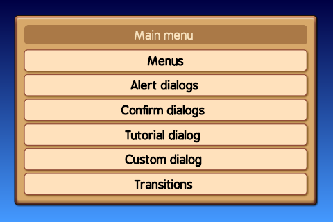
One of the basic things most games need is a menu and dialog system. This repository provides a set of classes to handle the basic menus.
The menus can be displayed in game or on top of a dedicated menu background, the demo uses a simple gradient as a background.
A modal is a menu which is shown on top of another view, if a menu is shown as a model then the user is required to take action. Usually the backgound is darkened to signify that the only available options are on the active modal.
Every menu can be shown as a modal or a standard menu.
There are several different buttons to navigate trough the menus. On the title bar there can be a back button on the left side or a close button on the right side.
The close button is usually displayed when the menus is shown as a modal, the back button is usually used to navigate through a menu tree.
Dialogs -like confirm or alert- have one or more buttons on the bottom of the dialog.
Menus have a list of options. The standard behaviour is to hide the menu when a menu option is clicked however it's possible to overrule this bahaviour and let the menu persist when an option is selected. This could be used for example to let the user select a background which could be displayed behind the menu when an option is selected.
This demo offsers several transitions to show or hide menus: sliding, scaling and fading.
All element which make up the menus and dialogs are based on 9-slice images.
Many of the look and behaviour properties can be configured with a global configuration file,
src.constants.menuConstants.js.
All images names and paths which are used in the menu system are defined here.
The DialogBackgroundView class is the super class for all dialogs listed here. It's purpose is to handle
transitions, create an opaque background and prevent clicks on items behind the dialog.
Parameters
superview {View}---The view which contains this menu, could be a menu background or the game view.showTransitionMethod {number} = menuConstants.transitionMethod.SLIDE---Optional, method to use for showingshowTransitionTime {number} = menuConstants.DIALOG.SHOW_TRANSITION_TIME---Optional, transition duration for showinghideTransitionMethod {number} = menuConstants.transitionMethod.SLIDE---Optional, method to use for hidinghideTransitionTime {number} = menuConstants.DIALOG.HIDE_TRANSITION_TIME---Optional, transition duration for hiding
show([cb])
Parameters
cb {function}---Optional, a callback invoked when the menu is visible. Returns {object} ---Returns the reference to the menu.
hide([cb])
Parameters
cb {function}---Optional, a callback invoked when the menu is hidden. Returns {object} ---Returns the reference to the menu.
extends DialogBackgroundView
Parameters
superview {View}---The view which contains this menu, could be a menu background or the game view.title {string}---The title displayed in the title bar of the menuitems {array}---A list of menu items, the structure of the item is:item {string}---The display title of the itemaction {string|function}---If it's a string then the value will be emitted else the function is invoked on clicking.persist {boolean}---Optional, If this values istruethen the menu will not be hidden when the option is clicked.text {string}---Optional, display a text instead of a clickable option.image {string}---Optional, the path to an image to display instead of a clickable option.width {number} = 70---Optional, the width of the image.height {number} = 70---Optional, the height of the image.align {string}---Optional, the horizontal alignment of the text or image, the default iscenteroptions are:left,centerandright.
import menus.views.MenuView as MenuView;

new MenuView({
	superview: this,
	title: 'Main menu',
	items: [
		{item: 'Menus', action: 'Menus'},
		{item: 'Setup', action: bind(this, 'onSetup')}
	]
}).show();
extends DialogBackgroundView
If the action is a string then that string is emitted when the option is clicked.
Hide
Emitted then the menu is hidden.
The TextDialogView class is a generic dialog which can be used to create a confirm or alert dialog.
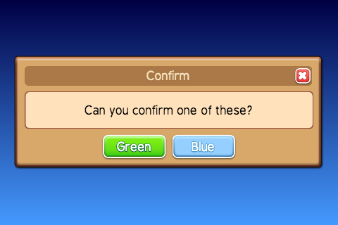
A screenshot of a confirm dialog using the TextDialogView class
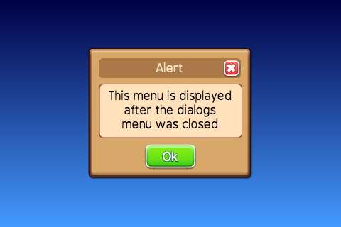
A screenshot of an alert dialog using the TextDialogView class
Parameters
superview {View}---The view which contains this menu, could be a menu background or the game view.title {string}---The title displayed in the title bar of the menu.text {string}---The text displayed.width {number}---Optional, the default value is the available screen width minus 80 pixels.height {number} = 400---Optional, the width of the dialog.modal {boolean}---Optional, if true then the background will be darkened.buttons {array}---A list of buttons displayed at the bottom of the dialog, the structure of the button item is:title {string}---The title of the button.width {number}---The horizontal size of the button.style {string}---A string representing the style of the button, the styles are configured insrc.constants.menuConstants.cb {function}---A callback to be invoked when the button is pressed, it will be called after the dialog hide animation.
import menus.views.TextDialogView as TextDialogView;

new TextDialogView({
	superview: this,
	title: 'Alert modal',
	text: 'This menu is displayed on top of the dialogs menu',
	modal: true,
	buttons: [
		{
			title: 'Ok',
			width: 160,
			style: 'GREEN'
		}
	]
}).show();
setText(text)
Parameters
text {string}---Sets the text of the dialog
setTitle(text)
Parameters
text {string}---Sets the title of the dialog
extends DialogBackgroundView
The TutorialAnimationView is a dialog to display a short animation.
The SpriteView class is used to play the animation.
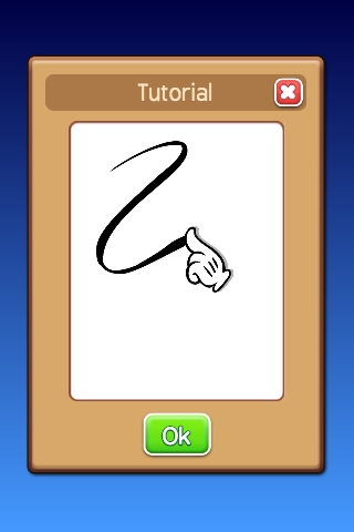
A screenshot of a tutorial dialog
Parameters
superview {View}---The view which contains this menu, could be a menu background or the game view.title {string}---The title displayed in the title bar of the menu.url {string}---The path to the animation.animation {string}---The animation which is played.
The DocumentView class allows you to display texts and images. You can define a single or multiple
pages. When the text is too long to fit on a single page then scrolling is enabled. There are a number
of options to style the text by selecting a background color, font family, font size, font color or alignment.

A screenshot of a dialog with text and images
Parameters
superview {View}---The view which contains this menu, could be a menu background or the game view.title {string}---The title displayed in the title bar of the menu.style {object}---Optional, the default style for texts and titles, the structure is as follows:title {object}---Optional, the default title style.fontFamily {string}---Optional, the font family of the title.size {number}---Optional, the font size of the title.color {string}---Optional, the color of the title.align {string}---Optional, the alignment of the title, valid values are: 'left', 'center' or 'right'text {object}---Optional, the default text style.fontFamily {string}---Optional, the font family of the text.size {number}---Optional, the font size of the text.color {string}---Optional, the color of the text.align {string}---Optional, the alignment of the text, valid values are: 'left', 'center', 'justify' or 'right'items {array}---Optional, a list of settings objects for the page select buttons with the following structure:type {string}---The type valid values are: 'prev', 'next', 'info' where 'info' shows the current and number of pages.title {string}---If the type is 'prev' or 'next' then this is used as button title.width {number}---The width of the items.style {string}---The styling to apply to the button based on the associated value inmenuConstants.padding {array}---The padding to apply to the text on the button if the type is 'prev' or 'next'.closeCB {function}---Optional, if set then a close button will be shown at the right top of the window.backCB {function}---Optional, if set then a back button will be shown at the left top of the window.pages {array}---See examples below.
The DocumentView class allows you to show basic texts with multiple pages. The pages property is an array.
Each page is an object with the following properties:
backgroundColor {string}---Optional, the background color for the page.image {string}---Optional, the path to an images which is used as background for the page.align {string}---Optional, the alignment for all items on the page.color {string}---Optional, the color for all texts on the page.fontFamily {string}---Optional, the font family for all texts on the page.size {number}---Optional, the size of all texts on the page.content {array}---Texts, views or images shown on the page.
The content array can contain several different types of object, there are a few key properties which define it's type:
text: If a text string is set then it's handled as a basic text.title: If a title string is set then it's handled as a title text.view: Ifviewis set to true then it's handled as a view, see below for more information.image: If an image location string is set then it's handled as an image.
All items can handle the following optional properties:
align {string}---'left', 'right', 'center'marginTop {number}---Margin size above the item.marginBottom {number}---Margin size below the item.
If the title property is set:
title {string}---The title text.align {string}---Optional, the alignment the title, defaults to the page title alignment.color {string}---Optional, the color the title, defaults to the page title color.fontFamily {string}---Optional, the font family, defaults to the page title font family.size {number}---Optional, the size of the title, defaults to the page title font size.
If the text property is set:
text {string}---The text.align {string}---Optional, the alignment the text, defaults to the page text alignment.color {string}---Optional, the color the text, defaults to the page text color.fontFamily {string}---Optional, the font family, defaults to the page text font family.size {number}---Optional, the size of the text, defaults to the page text font size.
If the image property is set:
image {string}---The location of the image.align {string}---Optional, the alignment for the image.width {number} = 50---Optional, the width of the image.height {number} = 50---Optional, the height of the image.backgroundColor {string}---Optional, the background color of the image.
If the view property is set:
view {view}---Has to betrueto use item as view.align {string}---Optional, the alignment for the image.width {number} = 50---Optional, the width of the image.height {number} = 50---Optional, the height of the image.backgroundColor {string}---Optional, the background color of the view.children {array}---Optional, an array of images to with the following -recursive- format:image {string}---The location of the image.x {number} = 0---Optional, the x-position relative to the parent view.y {number} = 0---Optional, the y-position relative to the parent view.width {number} = 50---Optional, the width of the image.height {number} = 50---Optional, the height of the image.backgroundColor {string}---Optional, the background color of the image.children {array}---Optional, an array of images.
The following example shows the most basic use of the DocumentView, it displays a title and some text:
import menus.views.DocumentView as DocumentView;

this._textDocumentView = new DocumentView({
	superview: this,
	width: 500,
	title: 'Single page demo',
	closeCB: doSomethingWhenClosedCB,
	pages: [
		{
			content: [
				{
					title: 'Displaying some text'
				},
				{
					text: 'This is some text which is displayed in this DocumentView class instance.',
				}
			]
		}
	]
});
Note: If you want to run this example you're going to have to implement doSomethingWhenClosedCB.
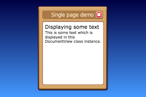
A screenshot of the dialog with one page
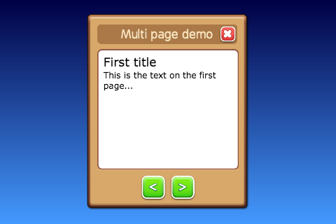
The next example shows a DocumentView dialog with two pages and a previous and next button:
import menus.views.DocumentView as DocumentView;

this._textDocumentView = new DocumentView({
	superview: this,
	width: 500,
	title: 'Multi page demo',
	closeCB: bind(this, 'showMenu', '_mainMenu'),
	pages: [
		{
			content: [
				{
					title: 'First title'
				},
				{
					text: 'This is the text on the first page...',
				}
			]
		},
		{
			content: [
				{
					title: 'Second page'
				},
				{
					text: 'And this is the other text which is displayed on the second page...',
				}
			]
		}
	],
	items: [
		{
			type: 'prev',
			title: '<',
			width: 80,
			style: 'GREEN',
			padding: [0, 0, 12, 0]
		},
		{
			type: 'next',
			title: '>',
			width: 80,
			style: 'GREEN',
			padding: [0, 0, 12, 0]
		}
	]
});
Note: If you want to run this example you're going to have to implement doSomethingWhenClosedCB.
A screenshot of the dialog with two pages and page select buttons


