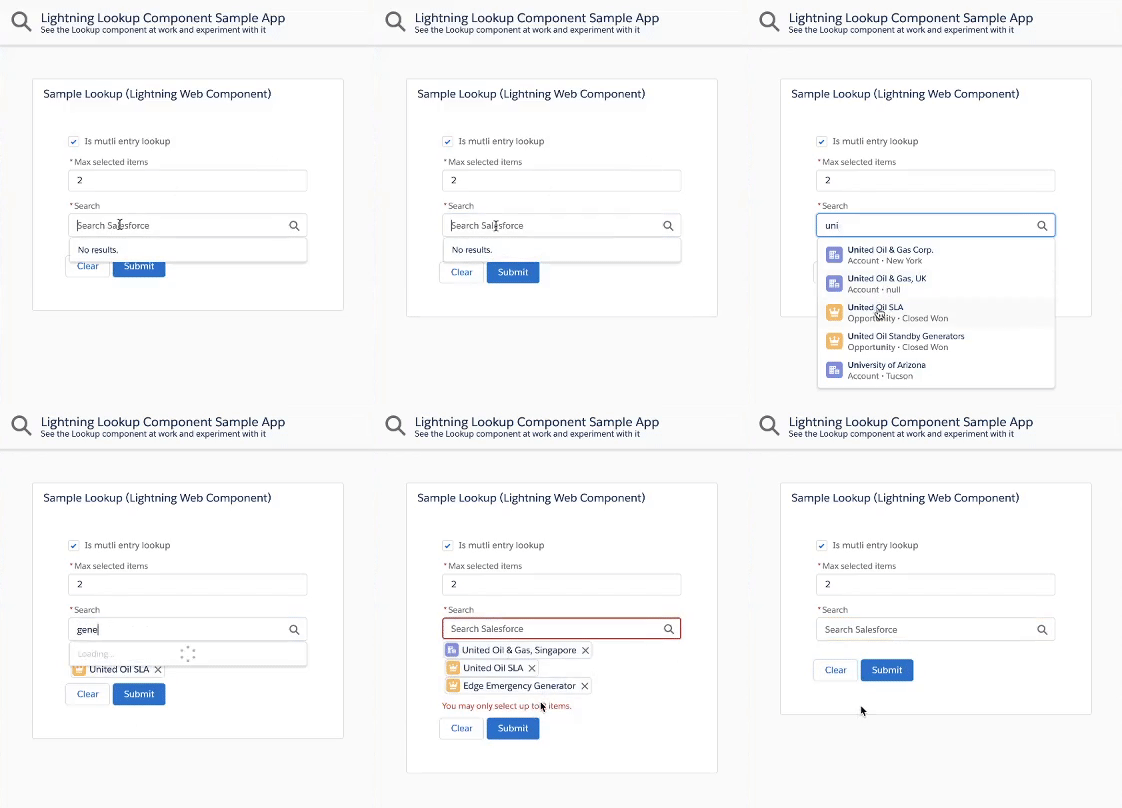
Aura version is available here (deprecated).
This is a generic & customizable lookup component built using Salesforce Lightning Web Components and SLDS style.
It does not rely on third party libraries and you have full control over its datasource.
Features
The lookup component provides the following features:
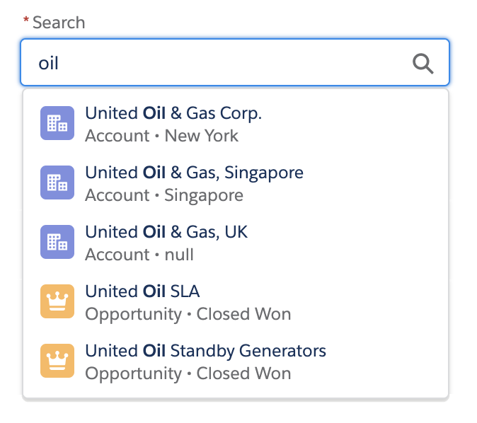
- customizable data source that can return mixed sObject types
- single or multiple selection mode
- client-side caching & request throttling
- built-in server request rate limit mechanism
- project is unit tested
The default installation installs the lookup component and a sample application available under this URL (replace the domain):
https://YOUR_DOMAIN.lightning.force.com/c/SampleLookupApp.app
If you wish to install the project without the sample application, edit sfdx-project.json and remove the src-sample path.
Install the sample app by running this script:
MacOS or Linux
./install-dev.sh
Windows
install-dev.bat
Follow these steps in order to use the lookup component:
Implement an Apex @AuraEnabled(Cacheable=true) method (SampleLookupController.search in our samples) that returns the search results as a List<LookupSearchResult>.
The method name can be different but it needs to match this signature:
@AuraEnabled(Cacheable=true)
public static List<LookupSearchResult> search(String searchTerm, List<String> selectedIds) {}Import a reference to the search Apex method in the lookup parent component's JS:
import apexSearch from '@salesforce/apex/SampleLookupController.search';The lookup component exposes a search event that is fired when a search needs to be performed on the server-side.
The parent component that contains the lookup must handle the search event:
<c-lookup onsearch={handleSearch} label="Search" placeholder="Search Salesforce">
</c-lookup>
The search event handler calls the Apex search method and passes the results back to the lookup using the setSearchResults function:
handleSearch(event) {
    const target = event.target;
    apexSearch(event.detail)
        .then(results => {
            target.setSearchResults(results);
        })
        .catch(error => {
            // TODO: handle error
        });
}The lookup component exposes a selectionchange event that is fired when the selection of the lookup changes.
The parent component that contains the lookup can handle the selectionchange event:
<c-lookup onsearch={handleSearch} onselectionchange={handleSelectionChange}
    label="Search" placeholder="Search Salesforce">
</c-lookup>
The selectionchange event handler can then get the current selection by calling the getSelection function:
handleSelectionChange(event) {
    const selection = event.target.getSelection();
    // TODO: do something with the lookup selection
}
getSelection always return a list of selected items.
That list contains a maximum of one elements if the lookup is a single entry lookup.
| Attribute | Type | Description |
|---|---|---|
label |
String |
Optional lookup label. Label is hidden if attribute is omitted. |
selection |
[LookupSearchResult] OR LookupSearchResult |
Lookup initial selection if any. Array for multi-entry lookup or an Object for single entry lookup. |
placeholder |
String |
Lookup placeholder text |
isMultiEntry |
Boolean |
Whether the lookup is single (default) or multi entry. |
required |
Boolean |
Whether the lookup is a required field. Note: Property can be set with <c-lookup required>. |
errors |
[{ "id": String, "message": String }] |
List of errors that are displayed under the lookup. |
scrollAfterNItems |
Number |
A null or integer value used to force overflow scroll on the result listbox after N number of items. Valid values are null, 5, 7, or 10. Use null to disable overflow scrolling. |
customKey |
String |
Custom key that can be used to identify this lookup when placed in a collection of similar components. |
| Function | Description |
|---|---|
setSearchResults(results) |
Passes a search results array back to the lookup so that they are displayed in the dropdown whereresults is an array of LookupSearchResult. |
getSelection() |
Gets the current lookup selection as an array of LookupSearchResult. |
getkey() |
Retrieves the value of the customKey attribute. |
| Event | Description | Data |
|---|---|---|
search |
Event fired when a search needs to be performed on the server-side. | { searchTerm: String, selectedIds: [ String ] } |
selectionchange |
Event fired when the selection of the lookup changes. This event holds no data, use the getSelection function to retrieve the current selection. |
none |


