A handmade collection of pro css tips tricks 🌟
Make sure to subscribe to our youtube channel channel and also don't forget to star 🌟 the open-source portfolio-template I created for anyone to use for free.
- Create Documentation Styled Layout
- Make Webpages Scroll Smoothly
- Adding Stroke to Text
- Check If Selector Is Supported
- Check If Property Is Supported
- Play and Pause Animations
- Improve Media Defaults
- Make text readable on images
- Style Optional Form Elements
- The Custom Cursors
- Move Table Caption to the bottom
- Create Text Columns
- Styling video states via :paused and :playing pseudo classes
- Change Writing Mode
- Providing Fallback Values for Variables
- Zooming Images on Hover
- Emphasizing Text Content
- Create Gradient Shadows
- Five Ways of Centering Divs
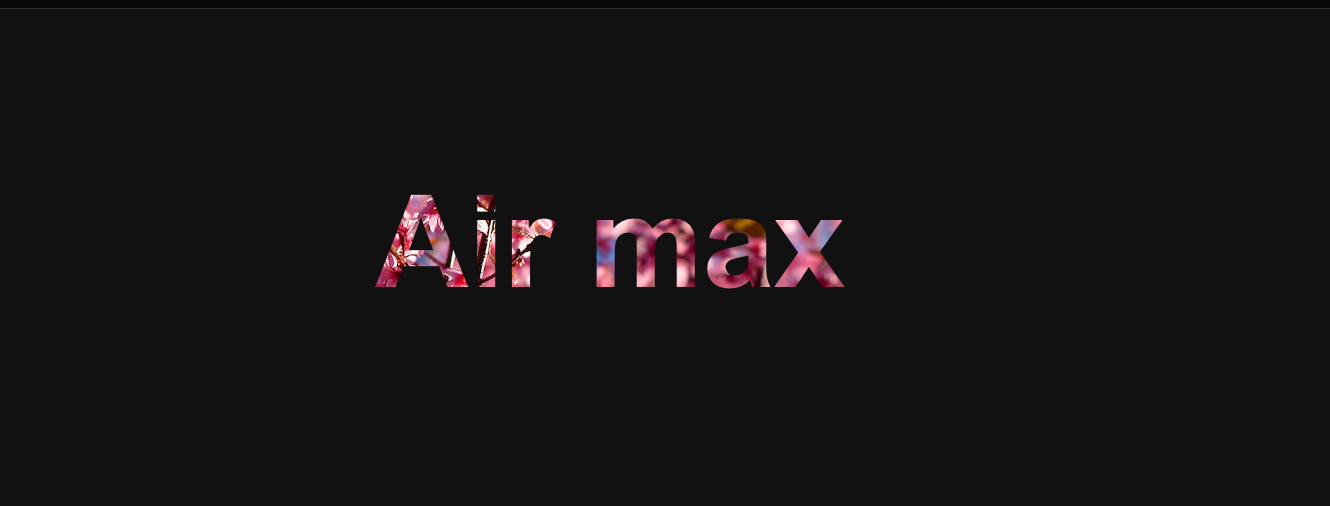
- Fill Text With Images
- Style Drop Caps
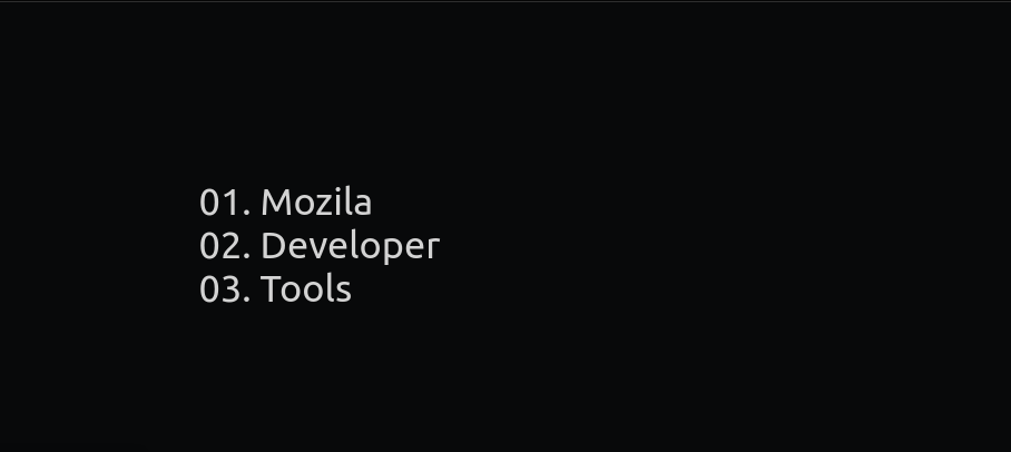
- Add Leading Zeros to Ordered Lists
- Using Emoji as List Style Type
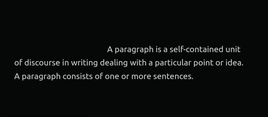
- Adding Indentation to Text
- Add Dark Mode Support on Your Website
- Disable Textarea Resizing
- Rainbow Animation
- Use clamp() for Responsive Typography
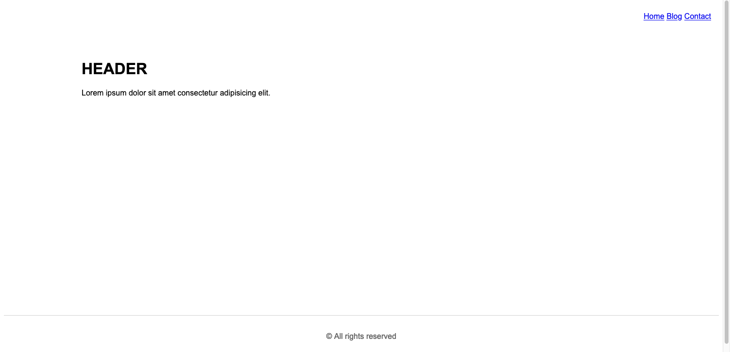
- Create A Sticky Footer
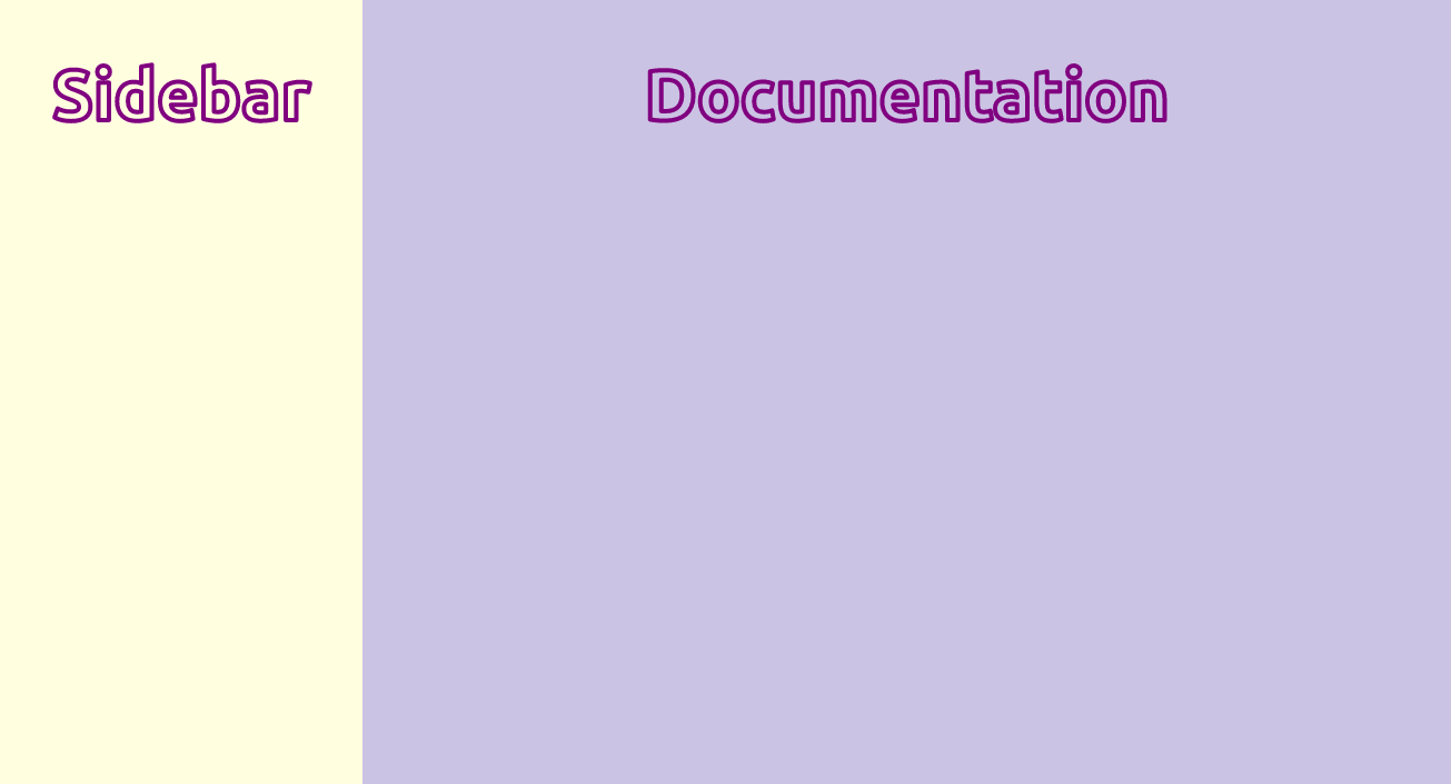
You can craft a responsive documentation-styled layout using CSS grid with only two lines of CSS.
<div class="parent">
    <aside>Sidebar</aside>
    <main>Documentation</main>
</div>.parent{
display: grid;
grid-template-columns: minmax(150px, 25%) 1fr;
}For implementing smooth scrolling for a page add scroll-behavior: smooth to the html element.
 html {
  scroll-behavior: smooth;
}Use text-stroke property it adds a stroke or outline to the text elements.
/* Width and color values */
h1 {
  -webkit-text-stroke: 5px crimson;
  text-stroke: 5px crimson;
}You can check if a selector is supported by your browser or not using the selector() within the @supports rule.
@supports (selector(div:has(pre))) {
/* Code that will only run if the selector is supported */
  p {
    color: crimson;
  }
}You can also detect properties support using the CSS @supports rule.
@supports (display: grid) {
   main {
    display: grid;
  }
}
Chris Coyier has done an exceptional job of providing valuable insights and information on the @supports rule, Also Known as Feature queries. Read here.
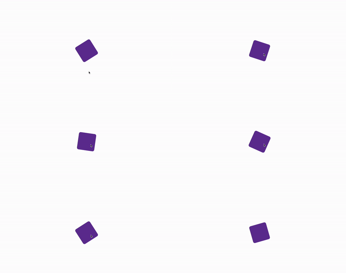
Use the animation-play-state property to play and pause an animation.
For example: Playing an animation on hover.
/* By default animation is paused */
.box {
  animation-name: rotate;
  animation-duration: 0.7s;
  animation-iteration-count: infinite;
  animation-play-state: paused;
}

/* Play animation on hover */
.box:hover {
  animation-play-state: running;
}

@keyframes rotate {
  0% {
    transform: rotate(0);
  }
  100% {
    transform: rotate(360deg);
  }
}Images are inline elements, and by setting the default value to display:block; we can avoid many potential issues. Setting max-width:100%; we prevent images from overflowing when they are in a container that is not wide enough to contain them.
img, picture, video, svg {
  display: block;
  max-width: 100%;
  object-fit: contain;
}
Additionally, I have set object-fit:contain; to ensure that images preserve a nice aspect ratio.
Add linear-gradient overlay on your images to make your text content readable and accessible for users.
.header {
  background-image: linear-gradient(#ffffffa2, #ffffffe6),url("images/hero-bg.jpg");
}You can style form fields like input, select, and textarea that do not have a required attribute on them using the :optional pseudo-class.
/* Selects all optional form fields */
*:optional{
  background-color: green;
}
Note: Use :required pseudo-class to select required form fields.
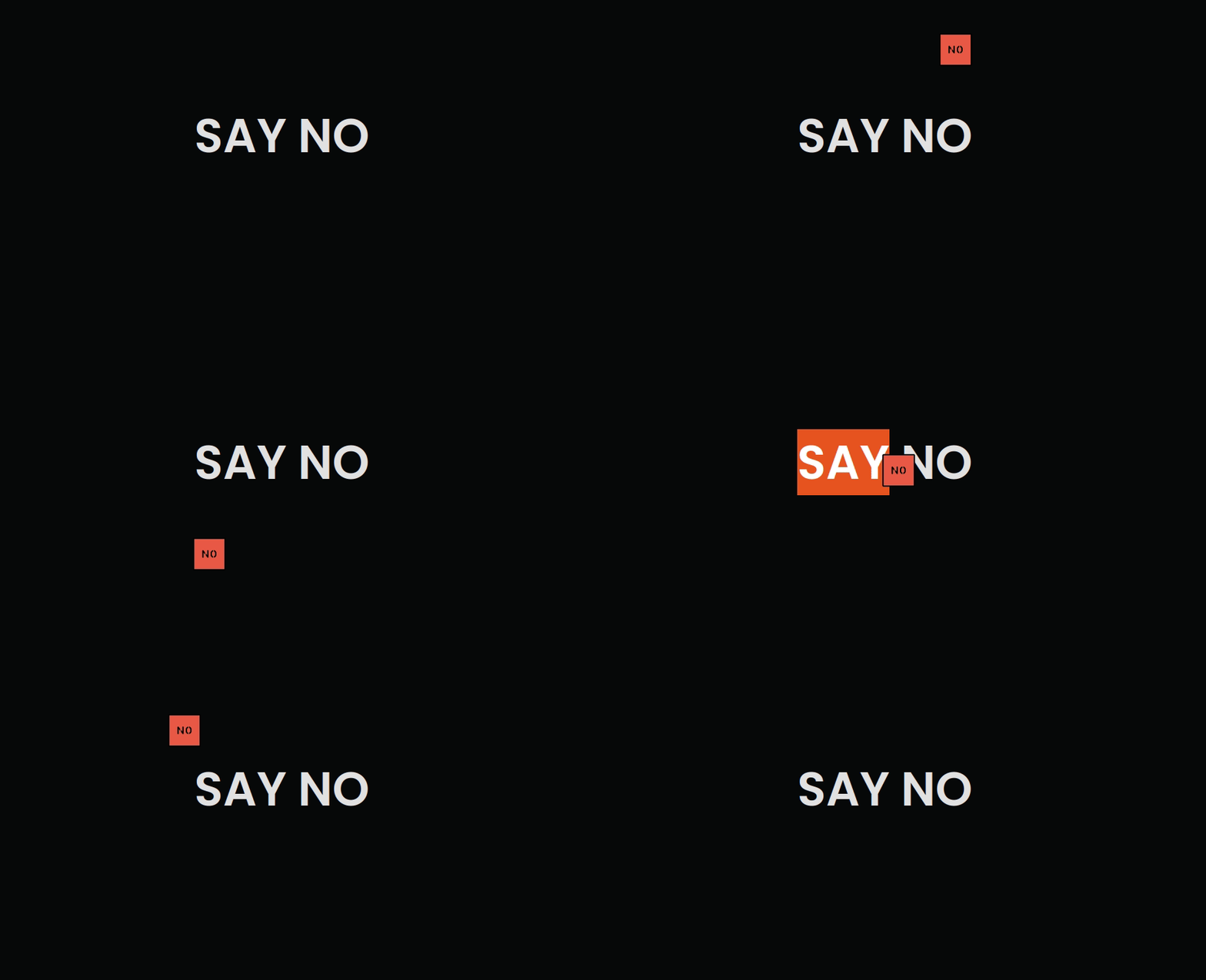
You can customize your cursor from an arrow pointer to a custom image.
html{
  cursor: url('images/no.jpg'), auto;
}
Note: auto will be used as fallback value in case image does not load for some reason.
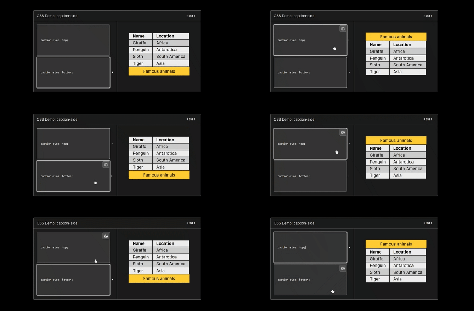
Use the caption-side property to place the table caption or table title on a specified side of the table.
table{
  caption-side: bottom;
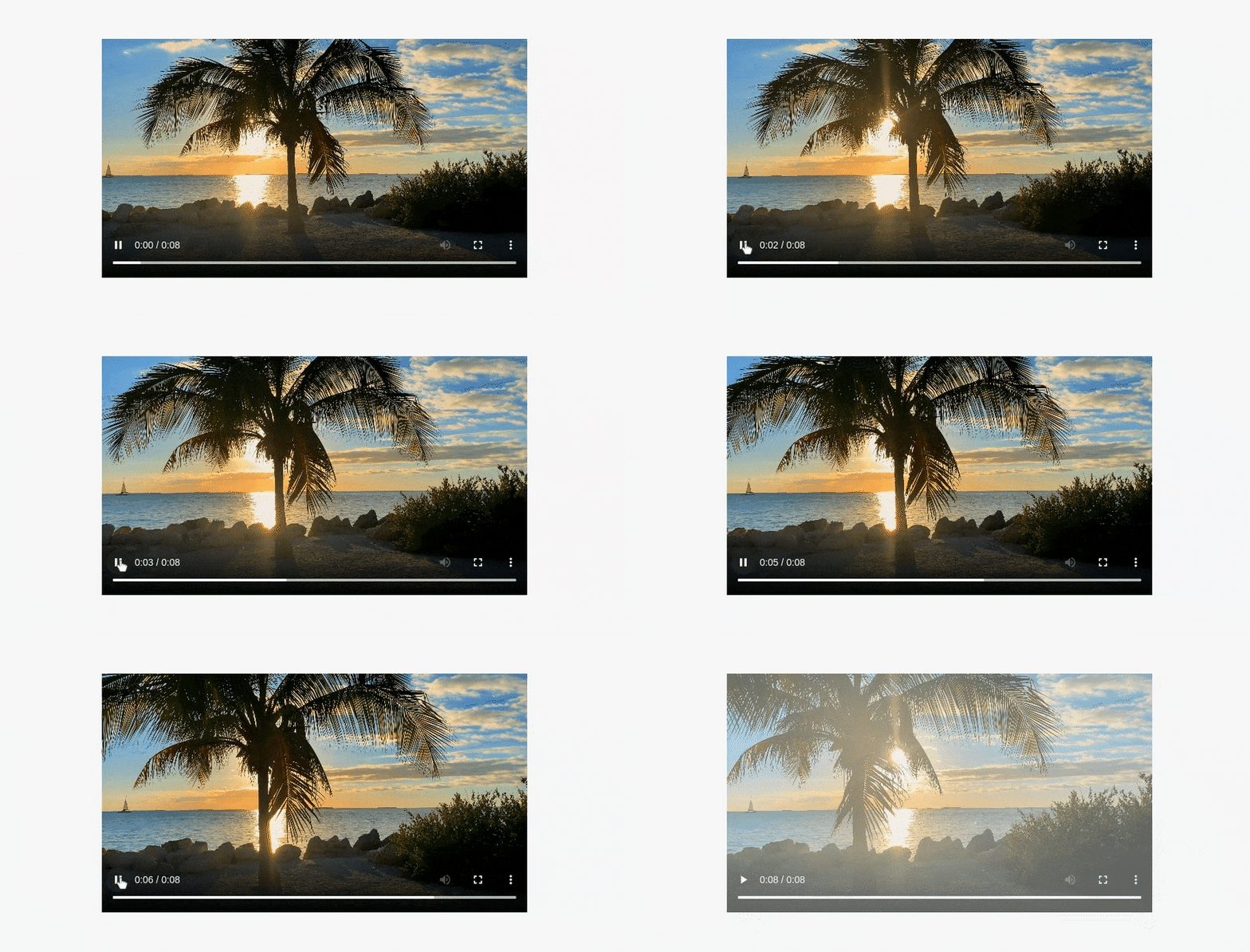
}Use :paused selector to style media elements like audio, and video when in paused state likewise paused we also have :palying pseudo-class selector.
video:paused {
  opacity: 0.6;
}
Note: At the moment, this feature is only supported in Safari, but you can use this helpful tool to check for the latest support across different browsers.
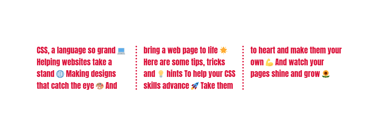
Craft nice column layouts for text elements using column properties.
p{
  column-count: 3;
  column-gap: 4.45rem;
  column-rule: 2px dotted crimson;
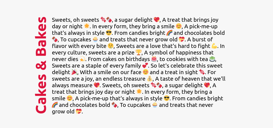
}You can use the writing-mode property to specify how text should be laid out on your website.
/* Specifies the text layout direction to sideways-lr  */
h1 {
  writing-mode: sideways-lr;
}

/* Keyword values (Reference: MDN)  */
writing-mode: horizontal-tb;
writing-mode: vertical-rl;
writing-mode: vertical-lr;Specify fallback values for custom properties. In case a variable is not defined or found for some reason the fallback value will be used.
/* Purple color will be applied as var(--black) is not defined */
:root {
  --orange: orange;
  --coral: coral;
}

h1 {
  color: var(--black, purple);
}You can create a zoom-in effect when hovering over an image, this is a technique commonly used on e-commerce websites.
/* Define the height and width of the image container & hide overflow */
.img-container {
  height: 250px; width: 250px; overflow: hidden;
 }

/* Make the image inside the container fill the container */
.img-container img {
  height: 100%;
  width: 100%;
  object-fit: cover;
  transition: transform 200ms ease-in;
 }

 img:hover{
  transform: scale(1.2);
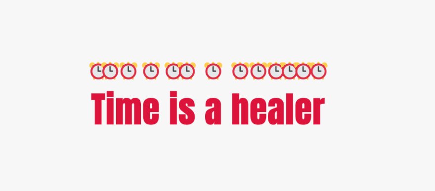
}Use text-emphasis property to apply emphasis marks to text elements.You can specify any string including emojis as its value.
h1 {
  text-emphasis: "⏰";
}
Note: Please refer to MDN docs to learn more about this property.
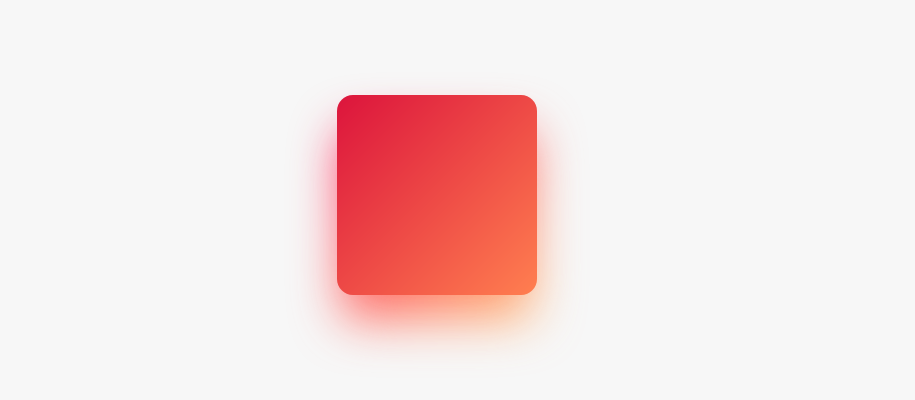
This is how you can create gradient shadows for an exclusive user experience.
:root{
  --gradient: linear-gradient(to bottom right, crimson, coral);
}

div {
  height: 200px;
  width: 200px;
  background-image: var(--gradient);
  border-radius: 1rem;
  position: relative;
}

div::after {
  content: "";
  position: absolute;
  inset: 0;
  background-image: var(--gradient);
  border-radius: inherit;
  filter: blur(25px) brightness(1.5);
  transform: translateY(15%) scale(0.95);
  z-index: -1;
}Center a div both vertically and horizontally.
/* 1.Centering with grid */
.parent{
  height: 100vh;
  display: grid;
  place-items: center;
}

/* 2.Centering with grid & margins */
.parent{
  display: grid;
}
.child{
  margin: auto;
}
/* 3.Centering with positioning */
div{
position: absolute;
top: 50%;
left: 50%;
transform: translate(-50%,-50%);
}/* 4.Centering with flexbox */
.parent{
height: 100vh;
display: flex;
justify-content: center;
align-items: center;
}
/* 5.Centering with flexbox & margins */
.parent{
display: flex;
}
.child{
margin: auto;
}Note: When using layout tools like grid, flexbox or positioning elements are centered relative to the height of the parent element which is 100vh here in our case, Also check out this great article by @bramus on using new viewport units.
You can fill your text content with a beautiful image with a few lines of CSS.
h1{
  background-image: url('images/flower.jpg');
  background-clip: text;
  color: transparent;
  background-color: white;
}
Note: Always specify background-color when using this technique as this will be used as a fallback value in case the image does not load for some reason.
Avoid unnecessary spans and use pseudo elements instead to style your content likewise first-letter pseudo-element we also have first-line pseudo-element.
 h1::first-letter{
  font-size: 2rem;
  color:#ff8A00;
}Enhance visual consistency and readability by adding leading zeros to the numbers in your ordered list items.
li{
  list-style-type:decimal-leading-zero;
}You can use emojis as list style types It's a fun way to add some personality to your lists.
li{
  list-style-type: '🐶';
}Use the text-indent property to indent the first line of a text block. Negative values are also allowed.
p{
  text-indent:2.6rem;
}You can add dark mode support to your website using CSS variables and the prefers-color-scheme media query.
:root {
  --bg-color: white;
  --text-color: black;
}

body {
  background-color: var(--bg-color);
  color: var(--text-color);
}

@media (prefers-color-scheme: dark) {
  :root {
    --bg-color: black;
    --text-color: white;
  }
}Prevent textarea resizing by setting the resize property to none.
textarea{
  resize:none;
}Creates a continuously looping color animation for elements.
button{
  animation: rainbow-animation 200ms linear infinite;
}

@keyframes rainbow-animation {
  to{
    filter: hue-rotate(0deg);
  }
 from{
    filter: hue-rotate(360deg);
  }
}
/* If the user prefers reduced motion, then don't use any animations on button */
@media (prefers-reduced-motion: reduce) {
button {
animation: none;
}
}Note: When working with animations make use of prefers-reduced-motion media feature to make sure that your website is accessible for the users who may have any vestibular disorders. Give this gem a read written by @tomayac.
Instead of using media queries for responsive and fluid typography use the clamp() function.
/* Syntax: clamp(minimum, preferred, maximum) */
h1{
  font-size: clamp(2.25rem,6vw,4rem);
}You can create a footer that always stick to the bottom of the browser window with only a few lines of CSS.
<div class='layout'>

  <main>
     <!-- your content here -->
  </main>

  <footer>
     <!-- your footer content here -->
  </footer>

</div>.layout{
height: 100vh;
display: flex;
flex-direction: column;
}
footer{
margin-top: auto;
}If you have a CSS tip or trick that you'd like to share with the community, I'd love to hear from you!
When submitting a pull request, please be sure to include a detailed description of the tip or trick, along with a code snippet and any relevant images.
Please consider supporting this project. Your support enables me to continue working on this project and creating more resources in the future.
If you encounter any issues or have questions about this project, please feel free to reach out to me for support. You can contact me via email at devsyedmohsin@gmail.com.
This project is licensed under the MIT License.

