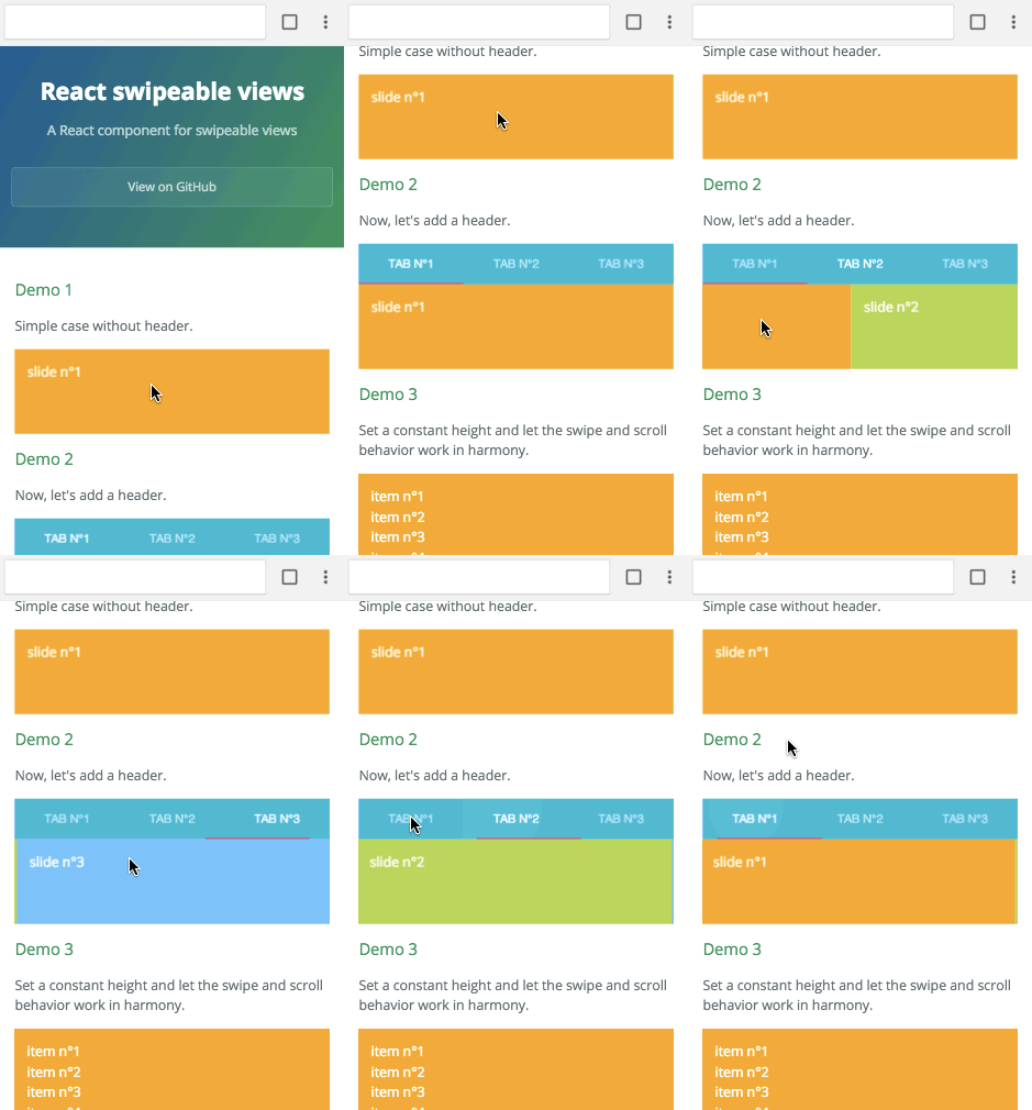
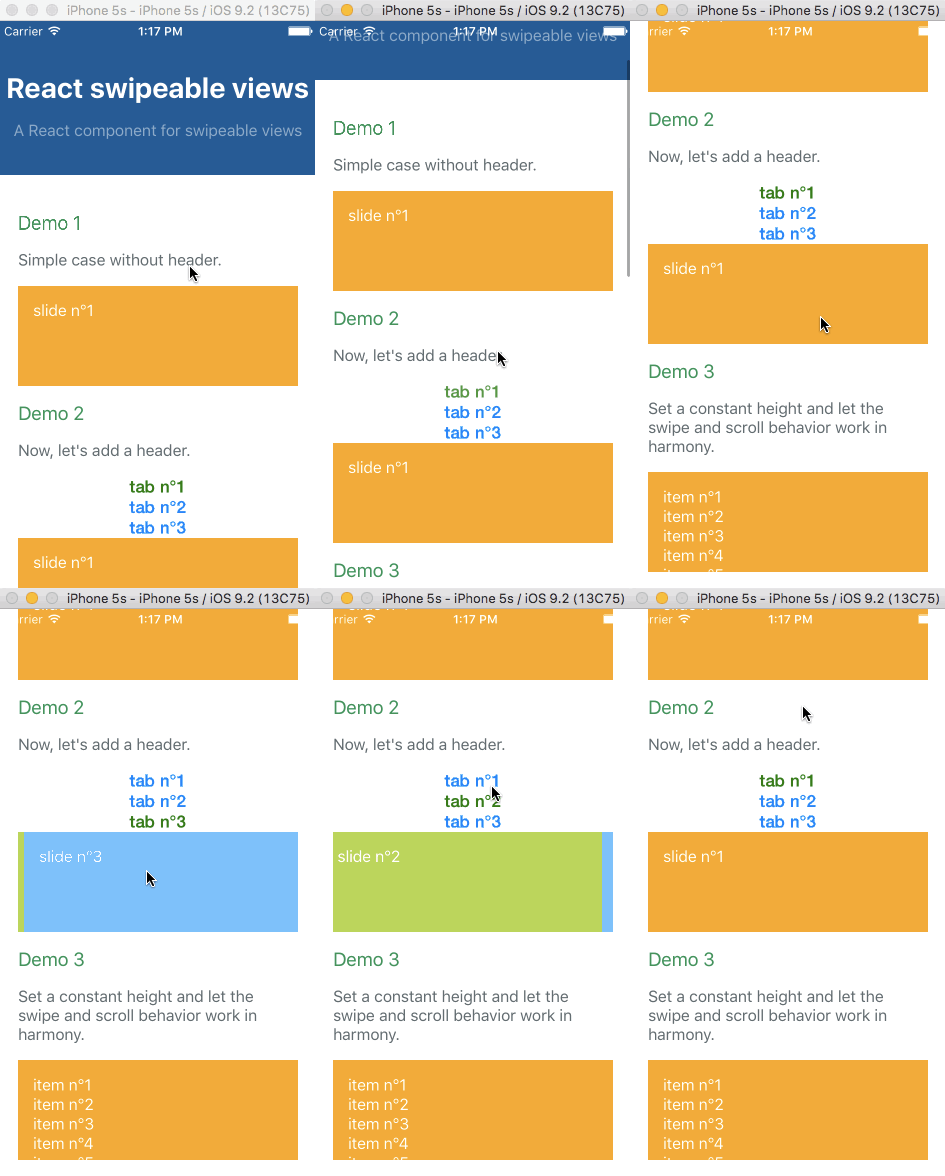
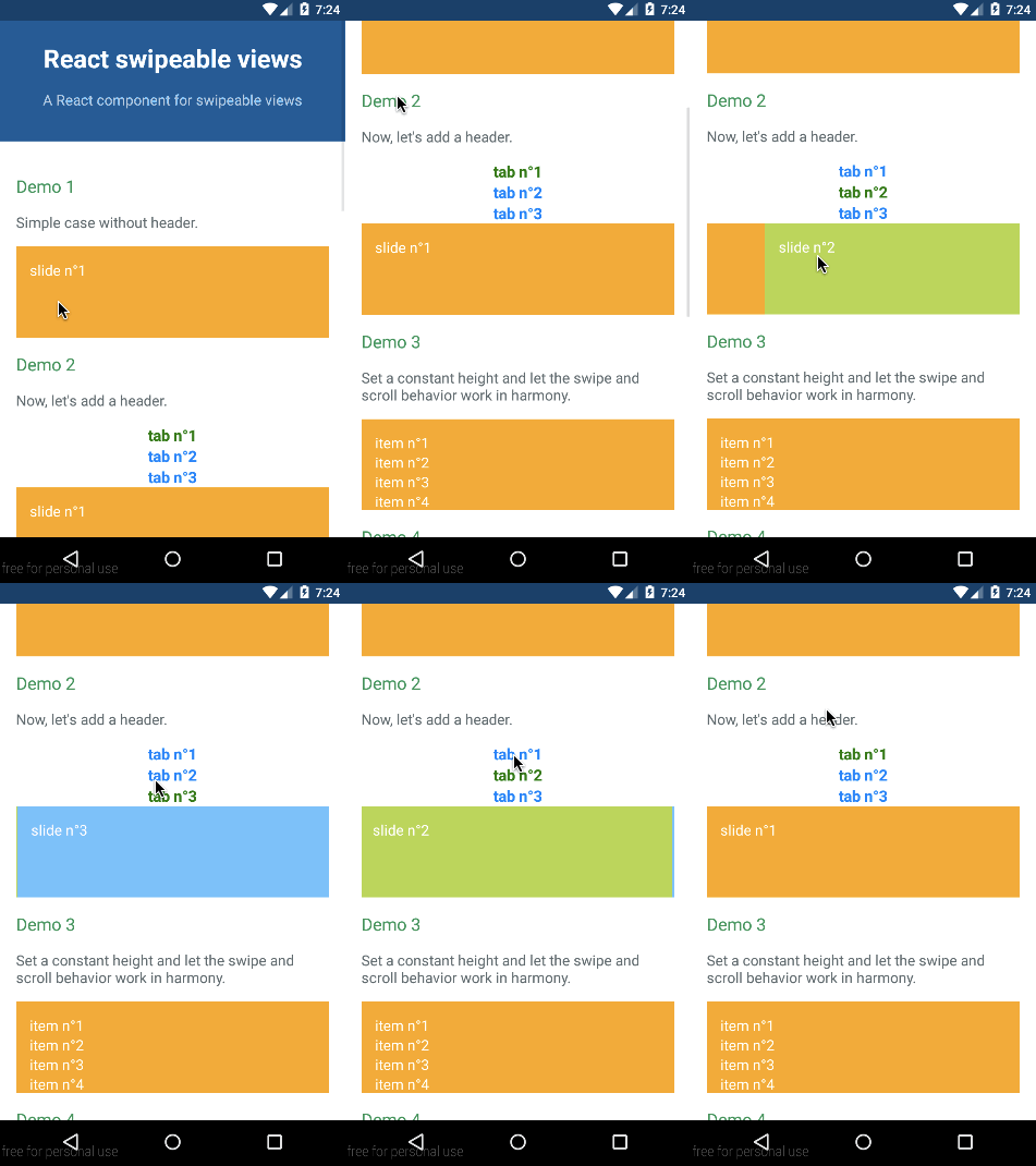
A React component for swipeable views.
Check out the demos from a mobile device (real or emulated). It is tiny (<4kB) and quickly render the first slide then lasy-load the other.
npm install react-swipeable-viewsimport React from 'react';
import SwipeableViews from 'react-swipeable-views';
const MyComponent = () => (
<SwipeableViews>
<div style={Object.assign({}, styles.slide, styles.slide1)}>
slide n°1
</div>
<div style={Object.assign({}, styles.slide, styles.slide2)}>
slide n°2
</div>
<div style={Object.assign({}, styles.slide, styles.slide3)}>
slide n°3
</div>
</SwipeableViews>
);
const styles = {
slide: {
padding: 15,
minHeight: 100,
color: '#fff',
},
slide1: {
background: '#FEA900',
},
slide2: {
background: '#B3DC4A',
},
slide3: {
background: '#6AC0FF',
},
};
export default MyComponent;import React, {
StyleSheet,
Text,
View,
} from 'react-native';
import Button from 'react-native-button';
import SwipeableViews from 'react-swipeable-views/lib/index.native.animated';
// There is another version. I'm unsure which one give the best UX.
// import SwipeableViews from 'react-swipeable-views/lib/index.native.scroll';
const MyComponent = () => (
<SwipeableViews style={slideContainer}>
<View style={[styles.slide, styles.slide1]}>
<Text style={styles.text}>
slide n°1
</Text>
</View>
<View style={[styles.slide, styles.slide2]}>
<Text style={styles.text}>
slide n°2
</Text>
</View>
<View style={[styles.slide, styles.slide3]}>
<Text style={styles.text}>
slide n°3
</Text>
</View>
</SwipeableViews>
);
const styles = StyleSheet.create({
slideContainer: {
height: 100,
},
slide: {
padding: 15,
height: 100,
},
slide1: {
backgroundColor: '#FEA900',
},
slide2: {
backgroundColor: '#B3DC4A',
},
slide3: {
backgroundColor: '#6AC0FF',
},
text: {
color: '#fff',
fontSize: 16,
},
});
export default MyComponent;The API is as consistent as possible between the three platforms so the same component can be used independently on where it's running.
| Name | Type | Default | Platform | Description |
|---|---|---|---|---|
| children | node | Use this property to provide your slides. | ||
| containerStyle | object | {} | Whether or not the auto complete is animated as it is toggled. | |
| disabled | bool | false |
If true, it will disable touch events. This is useful when you want to prohibit the user from changing slides. |
|
| index | integer | 0 | This is the index of the slide to show. This is useful when you want to change the default slide shown. Or when you have tabs linked to each slide. | |
| onChangeIndex | function(index, fromIndex) | This is callback prop. It's call by the component when the shown slide change after a swipe made by the user. This is useful when you have tabs linked to each slide. | ||
| onSwitching | function(index, type) | This is callback prop. It's called by the component when the slide switching. This is useful when you want to implement something corresponding to the current slide position. | ||
| resistance | bool | false |
If true, it will add bounds effect on the edges. | |
| style | object | {} | This is the inlined style that will be applied on the root component. | |
| slideStyle | object | {} | This is the inlined style that will be applied on the slide component. | |
| springConfig | object | {stiffness: 300, damping: 30} | Browser | This is the config given to react-motion for the spring. This is useful to change the dynamic of the transition. |
| threshold | integer | 5 | This is the threshold used for detectinga quick swipe. If the computed speed is above this value, the index change. |
Any other properties like className will be applied to the root component.
Extends the properties of <SwipeableViews /> and add the following ones:
| Name | Type | Default | Description |
|---|---|---|---|
| autoplay | bool | true | If false, the auto play behavior is disabled. |
| direction | enum: 'incremental' 'decremental' |
'incremental' | This is the auto play direction. |
| interval | integer | 3000 | Delay between auto play transitions (in ms). |
MIT


