SimpleToolkit is a .NET MAUI library of helpers and simple, easily customizable controls.
The library consists of three NuGet packages:
-
SimpleToolkit.Core - set of simple .NET MAUI controls and helpers
-
SimpleToolkit.SimpleShell - simplified implementation of .NET MAUI
Shell -
SimpleToolkit.SimpleShell.Controls - collection of ready-to-use, navigation-related controls


I have split the content of this library into three NuGet packages because there may be people who want to use only the SimpleShell control, for example, and do not want to use other controls.
⚠ Warning: Long-term support is not guaranteed. Use at your own risk.
Here are some of my samples that were built using this library:


The SimpleToolkit.Core package is a set of simple .NET MAUI controls and helpers.
In order to use SimpleToolkit.Core, you need to call the UseSimpleToolkit() extension method in your MauiProgram.cs file:
builder.UseSimpleToolkit();Thanks to the Icon control, you are able to display a tinted image:
<simpleCore:Icon Source="star.png"/>
<simpleCore:Icon Source="star.png" TintColor="Gray"/>
<simpleCore:Icon Source="star.png" TintColor="Orange"/>
Output:

The Icon class is inherited from the .NET MAUI Image class, but behind the scenes it is implemented in the same way as .NET MAUI Image only on Android and iOS. WinUI implementation is based on BitmapIcon and FontIcon controls. Because of that, the control supports only these image sources on Windows:
FileImageSourceUriImageSourceFontImageSource
These Image properties are not supported at all:
Aspect- the default behavior isAspectFitIsAnimationPlayingIsLoadingIsOpaque
ContentButton is just a button that can hold whatever content you want:
<simpleCore:ContentButton Clicked="StarButtonClicked">
    <Border Background="Orange">
        <Border.StrokeShape>
            <RoundRectangle CornerRadius="6"/>
        </Border.StrokeShape>
        <HorizontalStackLayout Padding="12,10" Spacing="10">
            <simpleCore:Icon
                Source="star.png" TintColor="White"
                VerticalOptions="Center"
                HeightRequest="18" WidthRequest="18"/>
            <Label
                Text="Star this repo" TextColor="White"
                FontAttributes="Bold"
                VerticalOptions="Center"/>
        </HorizontalStackLayout>
    </Border>
</simpleCore:ContentButton>
Output:

The ContentButton class is inherited from the .NET MAUI ContentView control. ContentButton has these events in addition to ContentViews events and properties:
Clicked- an event that fires when the button is clickedPressed- an event that fires when the button is pressedReleased- an event that fires when the button is released
Popover allows you to display custom popovers (flyouts) anchored to any control:
<Button
    VerticalOptions="Center" HorizontalOptions="Center"
    Clicked="ButtonClicked"
    Text="Show popover"
    Background="Orange">
    <simpleCore:Popover.AttachedPopover>
        <simpleCore:Popover>
            <Border
                Background="DarkOrange">
                <Border.StrokeShape>
                    <RoundRectangle CornerRadius="6"/>
                </Border.StrokeShape>

                <VerticalStackLayout Padding="12,10" Spacing="10">
                    <simpleCore:Icon
                        Source="star.png" TintColor="White"
                        VerticalOptions="Center"
                        HeightRequest="25" WidthRequest="25"/>
                    <Label
                        Text="Star this repo" TextColor="White"
                        FontAttributes="Bold"
                        VerticalOptions="Center"/>
                </VerticalStackLayout>
            </Border>
        </simpleCore:Popover>
    </simpleCore:Popover.AttachedPopover>
</Button>
Code behind:
private void ButtonClicked(object sender, EventArgs e)
{
    var button = sender as Button;

    button.ShowAttachedPopover();
}
Output:
|
Android |
iOS |
Windows |
|---|---|---|

|

|

|
The Popover class is inherited from the .NET MAUI Element class. Popover offers these properties and methods in addition to Elements properties and methods:
Content- the popover content of typeViewShow()- shows the popover anchored to a view you pass as a parameterHide()- hides the popover
Use of the methods mentioned above:
popover.Show(anchorView);
popover.Hide();
Popover can be attached to a view using the AttachedPopover attached property. Such a popover can be displayed or hidden (dismissed) by calling the ShowAttachedPopover() and HideAttachedPopover() extension methods on the view:
button.ShowAttachedPopover();
button.HideAttachedPopover();
The SimpleToolkit.SimpleShell package provides you with a simplified implementation of .NET MAUI Shell that lets you easily create a custom navigation experience in your .NET MAUI applications.
In order to use SimpleToolkit.SimpleShell, you need to call the UseSimpleShell() extension method in your MauiProgram.cs file:
builder.UseSimpleShell();SimpleShell is a simplified implementation of .NET MAUI Shell. All SimpleShell is is just a simple container for your content with the ability to put the hosting area for pages wherever you want. Thanks to that, you are able to add custom tab bars, navigation bars, flyouts, etc. to your Shell application while using great Shell URI-based navigation.
<simpleShell:SimpleShell
    x:Class="SimpleSample.AppShell"
    xmlns="http://schemas.microsoft.com/dotnet/2021/maui"
    xmlns:x="http://schemas.microsoft.com/winfx/2009/xaml"
    xmlns:simpleShell="clr-namespace:SimpleToolkit.SimpleShell;assembly=SimpleToolkit.SimpleShell"
    xmlns:pages="clr-namespace:SimpleSample.Views.Pages"
    x:Name="thisShell">

    <ShellContent
        Title="Icons"
        Icon="icon.png"
        ContentTemplate="{DataTemplate pages:IconPage}"
        Route="IconPage"/>

    <ShellContent
        Title="Buttons"
        Icon="button.png"
        ContentTemplate="{DataTemplate pages:ContentButtonPage}"
        Route="ContentButtonPage"/>

    <ShellContent
        Title="Popovers"
        Icon="popover.png"
        ContentTemplate="{DataTemplate pages:PopoverPage}"
        Route="PopoverPage"/>

    <simpleShell:SimpleShell.Content>
        <Grid
            RowDefinitions="50, *, 50">
            <Button
                x:Name="backButton"
                Clicked="BackButtonClicked"
                Text="Back"
                Margin="20,5"
                HorizontalOptions="Start"
                Background="DarkOrange"/>
            <Label
                Margin="20,5"
                HorizontalOptions="Center" VerticalOptions="Center"
                Text="{Binding CurrentShellContent.Title, Source={x:Reference thisShell}}"
                FontAttributes="Bold" FontSize="18"/>
            <simpleShell:SimpleNavigationHost
                Grid.Row="1"/>
            <HorizontalStackLayout
                x:Name="tabBar"
                Grid.Row="2"
                Margin="20,5"
                HorizontalOptions="Center" Spacing="10"
                BindableLayout.ItemsSource="{Binding ShellContents, Source={x:Reference thisShell}}">
                <BindableLayout.ItemTemplate>
                    <DataTemplate
                        x:DataType="BaseShellItem">
                        <Button
                            Clicked="TabButtonClicked"
                            Background="DarkOrange"
                            Text="{Binding Title}"/>
                    </DataTemplate>
                </BindableLayout.ItemTemplate>
            </HorizontalStackLayout>
        </Grid>
    </simpleShell:SimpleShell.Content>
</simpleShell:SimpleShell>
As you can see, the logical navigation structure is defined with ShellContent, Tab, etc. as in normal .NET MAUI Shell. However, visual structure has to be defined manually using the Content property. The hosting area for pages is represented by the SimpleNavigationHost view that can occur in the visual hierarchy just once.
SimpleShell provides you with some bindable properties which simplify the creation of custom navigation controls:
CurrentPage- the currently selectedPageCurrentShellSection- the currently selectedShellSection(Tab)CurrentShellContent- the currently selectedShellContentShellSections- read-only list of allShellSections in the shellShellContents- read-only list of allShellContents in the shell
The code behind of the XAML sample above:
private async void TabButtonClicked(object sender, EventArgs e)
{
    var button = sender as Button;
    var shellItem = button.BindingContext as BaseShellItem;

    // Navigate to a new tab if it is not the current tab
    if (!CurrentState.Location.OriginalString.Contains(shellItem.Route))
        await this.GoToAsync($"///{shellItem.Route}");
}
Navigation between pages works exactly the same as in .NET MAUI Shell, just use the common Shell.Current.GoToAsync(). Pages that are not part of the shell hierarchy can be registered using the Routing.RegisterRoute() method.
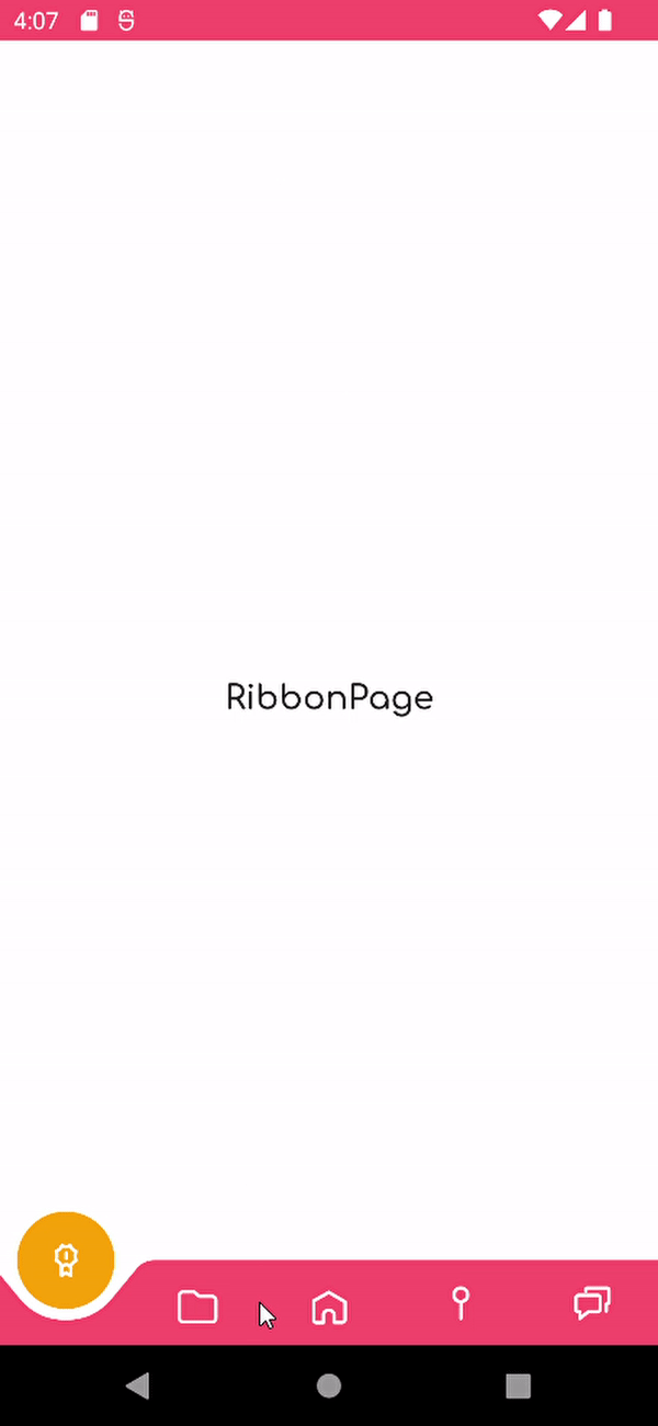
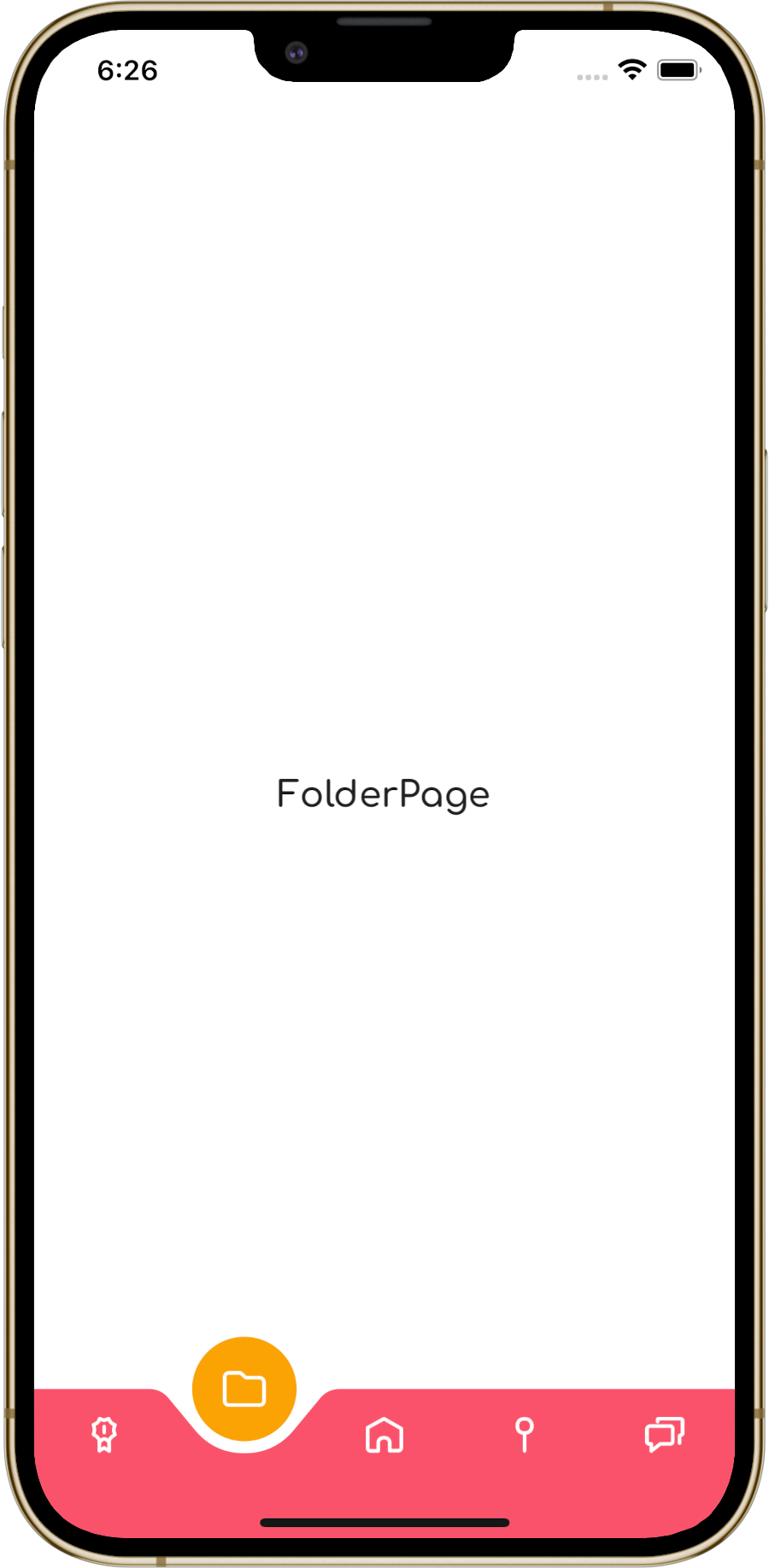
Output:
|
Android |
iOS |
Windows |
|---|---|---|

|

|

|
SimpleShell provides multiple groups of states.
States in the SimpleShellSectionState.[ShellSection route] format:
<VisualStateManager.VisualStateGroups>
    <VisualStateGroup x:Name="SimpleShellSectionStates">
        <VisualState x:Name="SimpleShellSectionState.HomeTab">
            <VisualState.Setters>
                <Setter TargetName="tabBar" Property="View.Background" Value="Red"/>
            </VisualState.Setters>
        </VisualState>
        <VisualState x:Name="SimpleShellSectionState.SettingsTab">
            <VisualState.Setters>
                <Setter TargetName="tabBar" Property="View.Background" Value="Green"/>
            </VisualState.Setters>
        </VisualState>
    </VisualStateGroup>
</VisualStateManager.VisualStateGroups>
When a user navigates to a tab with a HomeTab route, the view named tabBar will have a red background, and when to a tab with a SettingsTab route, the view named tabBar will have a green background.
States in the SimpleShellContentState.[ShellContent route] format:
<VisualStateManager.VisualStateGroups>
    <VisualStateGroup x:Name="SimpleShellContentStates">
        <VisualState x:Name="SimpleShellContentState.HomePage">
            <VisualState.Setters>
                <Setter TargetName="tabBar" Property="View.Background" Value="Yellow"/>
            </VisualState.Setters>
        </VisualState>
        <VisualState x:Name="SimpleShellContentState.SettingsPage">
            <VisualState.Setters>
                <Setter TargetName="tabBar" Property="View.Background" Value="Blue"/>
            </VisualState.Setters>
        </VisualState>
    </VisualStateGroup>
</VisualStateManager.VisualStateGroups>
When a user navigates to a ShellContent with a HomePage route, the view named tabBar will have a yellow background, and when to a ShellContent with a SettingsPage route, the view named tabBar will have a blue background.
States in the SimplePageState.[Page type name] format:
<VisualStateManager.VisualStateGroups>
    <VisualStateGroup x:Name="SimplePageStates">
        <VisualState x:Name="SimplePageState.HomePage">
            <VisualState.Setters>
                <Setter TargetName="tabBar" Property="View.Background" Value="Purple"/>
            </VisualState.Setters>
        </VisualState>
        <VisualState x:Name="SimplePageState.SettingsPage">
            <VisualState.Setters>
                <Setter TargetName="tabBar" Property="View.Background" Value="Orange"/>
            </VisualState.Setters>
        </VisualState>
    </VisualStateGroup>
</VisualStateManager.VisualStateGroups>
When a user navigates to a HomePage page, the view named tabBar will have a purple background, and when to a SettingsPage page, the view named tabBar will have a orange background.
When a user navigates to a page that is part of the shell hierarchy, SimpleShell goes to the RootPage state, otherwise SimpleShell goes to the RegisteredPage state:
<VisualStateManager.VisualStateGroups>
    <VisualStateGroup x:Name="SimplePageTypeStates">
        <VisualState x:Name="SimplePageTypeState.RegisteredPage">
            <VisualState.Setters>
                <Setter TargetName="backButton" Property="Button.IsVisible" Value="true"/>
            </VisualState.Setters>
        </VisualState>
        <VisualState x:Name="SimplePageTypeState.RootPage">
            <VisualState.Setters>
                <Setter TargetName="backButton" Property="Button.IsVisible" Value="false"/>
            </VisualState.Setters>
        </VisualState>
    </VisualStateGroup>
</VisualStateManager.VisualStateGroups>- .NET MAUI
Shelloffers a platform-specific appearance. - Platform-specific navigation controls that .NET MAUI
Shellprovides probably have better performance than controls composed of multiple .NET MAUI views. - A
SimpleShell-based application may not have as good accessibility in some scenarios due to the lack of platform-specific navigation controls. .NET MAUIShellshould be accessible out of the box since it uses platform-specific controls. - Maybe I have implemented something wrong that has a negative impact on the performance, accessibility, or something like that.
The SimpleShell class is inherited from the .NET MAUI Shell class, but all the handlers are implemented from the ground up. These handlers are inspired by the WinUI version of Shell handlers.
SimpleShell currently does not provide any page transitions. Pages are simply swapped in a container during navigation.

SimpleToolkit.SimpleShell.Controls is a collection of ready-to-use, navigation-related controls (not only) for SimpleShell.
In order to use SimpleToolkit.SimpleShell.Controls, you need to call the UseSimpleToolkit() extension method in your MauiProgram.cs file:
builder.UseSimpleToolkit();