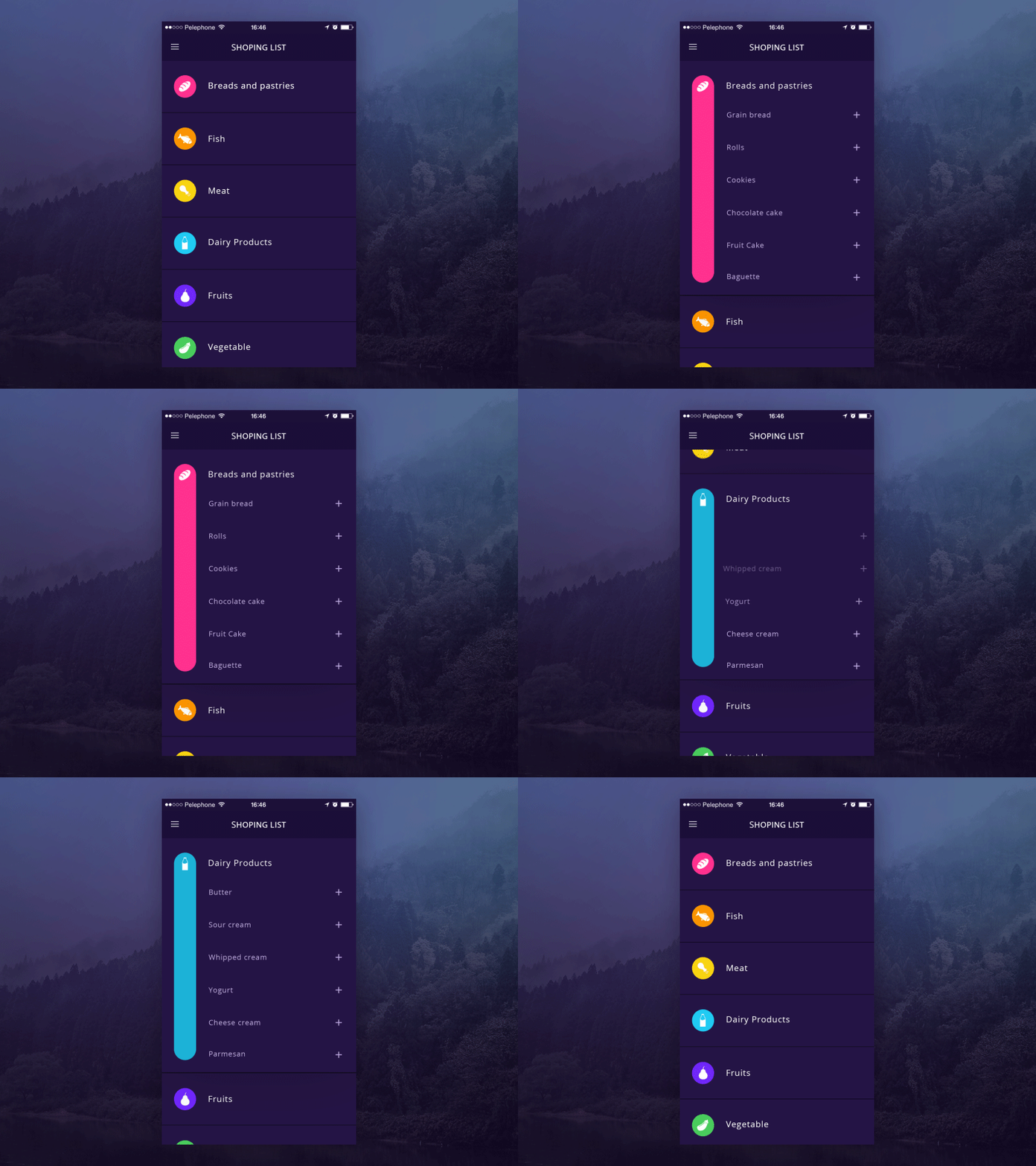
This library is strongly inspired in this concept from Hila Peleg in dribble. See it below
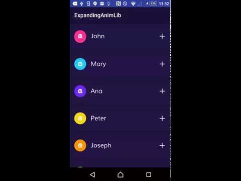
For more details on how to use this library please refer to the example in this repository. You can see a video of the example working here:
dependencies {
    compile 'com.diegodobelo.expandingview:expanding-view:0.9.4'
}First of all include the ExpandingList in your Activity (or Fragment) layout. This will be the list of items (ExpandItem):
<com.diegodobelo.expandingview.ExpandingList
        android:id="@+id/expanding_list_main"
        android:layout_width="match_parent"
        android:layout_height="match_parent"/>
Now create a new layout (xml) file to represent the item (such as res/layout/expanding_item.xml). This will be the Item (header) that can be expanded to show sub items:
<RelativeLayout xmlns:android="http://schemas.android.com/apk/res/android"
    xmlns:app="http://schemas.android.com/apk/res-auto"
    android:layout_width="match_parent"
    android:layout_height="94dp">
    <TextView
        android:id="@+id/title"
        android:layout_width="wrap_content"
        android:layout_height="wrap_content"
        android:layout_centerVertical="true"
        android:gravity="center_vertical|left"
        android:textSize="22sp"/>
</RelativeLayout>
Create another layout file to represent the sub items (such as /res/expanding_sub_item.xml). This will be the sub items that will be shown when the Item is expanded:
<RelativeLayout xmlns:android="http://schemas.android.com/apk/res/android"
    xmlns:app="http://schemas.android.com/apk/res-auto"
    android:layout_width="match_parent"
    android:layout_height="48dp">
    <TextView
        android:id="@+id/sub_title"
        android:layout_width="match_parent"
        android:layout_height="match_parent"
        android:layout_centerVertical="true"
        android:layout_marginLeft="8dp"
        android:textSize="18sp"
        android:gravity="center_vertical|left"/>
</RelativeLayout>
Now create a layout file (such as /res/expanding_layout.xml) to represent the whole item, including both item layout and sub item layout. We will explain each custom attribute later:
<com.diegodobelo.expandingview.ExpandingItem
    xmlns:android="http://schemas.android.com/apk/res/android"
    xmlns:app="http://schemas.android.com/apk/res-auto"
    android:layout_width="match_parent"
    android:layout_height="wrap_content"
    app:item_layout="@layout/expanding_item"
    app:sub_item_layout="@layout/expanding_sub_item"
    app:indicator_size="42dp"
    app:indicator_margin_left="16dp"
    app:indicator_margin_right="16dp"
    app:show_indicator="true"
    app:show_animation="true"
    app:start_collapsed="true"
    app:animation_duration="250"/>
Note that we included expanding_item and expanding_sub_item layouts created before.
Now that you have all the required layouts you are able to use them in Java code. Let's start inflating the ExpandingList:
ExpandingList expandingList = (ExpandingList) findViewById(R.id.expanding_list_main);Create a new ExpandingItem in the ExpandingList. This method receives the expanding_layout created before. Yes! We can have different layouts for different items in the same list. The items will be created based on expanding_item layout and the sub items will be created based on expanding_sub_item layout:
ExpandingItem item = expandingList.createNewItem(R.layout.expanding_layout);

/*ExpandingItem extends from View, so you can call
findViewById to get any View inside the layout*/
(TextView) item.findViewById(R.id.title)).setText("It Works!!");
Let's create the sub items. There is a method to create items in batch:
//This will create 5 items
item.createSubItems(5);

//get a sub item View
View subItemZero = item.getSubItemView(0);
((TextView) subItemZero.findViewById(R.id.sub_title)).setText("Cool");

View subItemOne = item.getSubItemView(1);
((TextView) subItemOne.findViewById(R.id.sub_title)).setText("Awesome");

...
For each item you can set the indicator color and the indicator icon:
item.setIndicatorColorRes(R.color.blue);
item.setIndicatorIconRes(R.drawable.ic_icon);| Attribute Name | Type | Default Value | Meaning | Mandatory |
|---|---|---|---|---|
| item_layout | reference | The layout for the Item (header). | Yes | |
| sub_item_layout | reference | The layout for the sub items. | Yes | |
| separator_layout | reference | A layout to separate items. | No | |
| indicator_size | dimension | 0dp | The indicator size in dp. | No |
| indicator_margin_left | dimension | 0dp | The margin between the indicator and its left. | No |
| indicator_margin_right | dimension | 0dp | The margin between the indicator and its right. | No |
| show_indicator | boolean | true | true if you want to show the indicator. false otherwise. | No |
| show_animation | boolean | true | true if you want to show animations. false otherwise. | No |
| start_collapsed | boolean | true | true if you want the sub views to start collapsed. false otherwise. | No |
| animation_duration | integer | 300ms | The animations duration in milliseconds. | No |
Method to create and add a new item.
- Parameters:
layoutId— The item Layout
Method to remove an item.
- Parameters:
item— The item to be removed, of type {@link ExpandingItem}
Method to remove all items.
Method to get an Item from the ExpandingList by its index.
- Parameters:
index— The index of the item. - Returns: An {@link ExpandingItem} in the list.
Return how many items exists in the list.
- Returns: Items count.
Set a listener to listen item stage changed.
- Parameters:
listener— The listener of type {@link OnItemStateChanged}
Tells if the item is expanded.
- Returns: true if expanded. false otherwise.
Returns the count of sub items.
- Returns: The count of sub items.
Collapses the sub items.
Expand or collapse the sub items.
Set the indicator color by resource.
- Parameters:
colorRes— The color resource.
Set the indicator color by color value.
- Parameters:
color— The color value.
Set the indicator icon by resource.
- Parameters:
iconRes— The icon resource.
Set the indicator icon.
- Parameters:
icon— Drawable of the indicator icon.
Creates a sub item based on sub_item_layout Layout, set as ExpandingItem layout attribute.
- Returns: The inflated sub item view.
Creates a sub item based on sub_item_layout Layout, set as ExpandingItem layout attribute. If position is -1, the item will be added in the end of the list.
- Parameters:
position— The position to add the new Item. Position should not be greater than the list size. - Returns: The inflated sub item view.
Creates as many sub items as requested in {@param count}.
- Parameters:
count— The quantity of sub items.
Get a sub item at the given position.
- Parameters:
position— The sub item position. Should be > 0. - Returns: The sub item inflated view at the given position.
Remove sub item at the given position.
- Parameters:
position— The position of the item to be removed.
Remove the given view representing the sub item. Should be an existing sub item.
- Parameters:
view— The sub item to be removed.
Remove the given view representing the sub item, with animation. Should be an existing sub item.
- Parameters:
view— The sub item to be removed.
Remove all sub items.
 Copyright (c) 2016, Diego Bezerra <diego.bezerra@gmail.com>
 Permission to use, copy, modify, and/or distribute this software for any purpose
 with or without fee is hereby granted, provided that the above copyright notice
 and this permission notice appear in all copies.
 THE SOFTWARE IS PROVIDED "AS IS" AND THE AUTHOR DISCLAIMS ALL WARRANTIES WITH
 REGARD TO THIS SOFTWARE INCLUDING ALL IMPLIED WARRANTIES OF MERCHANTABILITY AND
 FITNESS. IN NO EVENT SHALL THE AUTHOR BE LIABLE FOR ANY SPECIAL, DIRECT, INDIRECT,
 OR CONSEQUENTIAL DAMAGES OR ANY DAMAGES WHATSOEVER RESULTING FROM LOSS OF USE,
 DATA OR PROFITS, WHETHER IN AN ACTION OF CONTRACT, NEGLIGENCE OR OTHER TORTIOUS
 ACTION, ARISING OUT OF OR IN CONNECTION WITH THE USE OR PERFORMANCE OF THIS SOFTWARE.


