Another toast for react. Simple side project of mine.
First, you install the package by running this command in your terminal
npm install toast-for-react
In your App.js file, simply import
ToasContainer component and useToast hook, like this:
import {ToastContainer, useToast } from "toast-for-react";
In your App component, call the useToast hook, like this:
const { toastStateList, showToast } = useToast();
toastStateList is an array of objects, where each object represents a state for a certain toast.
showToast is a function that is used for displaying toast. Its parameters will be explained below.
After you've called the useToast hook,
you can add ToastContainer to your App component. It is recommended that you put it at its top (otherwise, behaviour may or may not be unpredictable). Minimal setup looks like this:
<ToastContainer toastStateList={toastStateList} />
The toast looks like this:
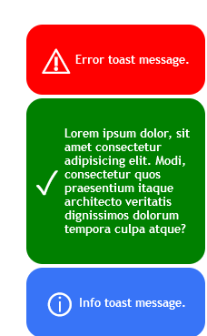
If you are reading this on npm site and don't see the image, visit the github repo link.
Additional props will be explained below.
Definition of this function looks like this
showToast( messageContent, messageType, displayTime, showIcon )
Show toast functions on a per-toast level, each call will produce a different toast.
Parameters
| Parameter name | Required | Default value | Description |
|---|---|---|---|
| messageContent | yes | no default value | content of the toast which will be displayed |
| messageType | no | info | type of toast; it can have one of 3 values: "sucess", "info", "error" |
| displayTime | no | 5000 | duration of toast display (in milliseconds) |
| showIcon | no | true | indicates whether the appropriate icon for given messageType will be displayed |
Toast container is a component which serves as a wrapper for all toast components. It's configuration is global. Toast components can be configured via showToast function (all options are listed above).
What cannot be configured on a per-toast basis is toast position on a screen. That is the duty of the ToastContainer. Once set, its configuration is global and applied to all toasts.
Props
| Prop name | Required | Default value | Description | Available options |
|---|---|---|---|---|
| toastStateList | yes | no default value | list of toast state objects obtained via useToast hook |
/ |
| justify | no | flex-end | flex justification inside the ToastContainer |
flex-start, flex-end, center |
| direction | no | column | flex direction inside the ToastContainer |
row, column, column-reverse |
| side | no | right | side on which will the ToastContainer be rendered |
left, right |
| head | no | bottom | indicates whether the ToastContainer will be rendered on the top or the bottom |
top, bottom |