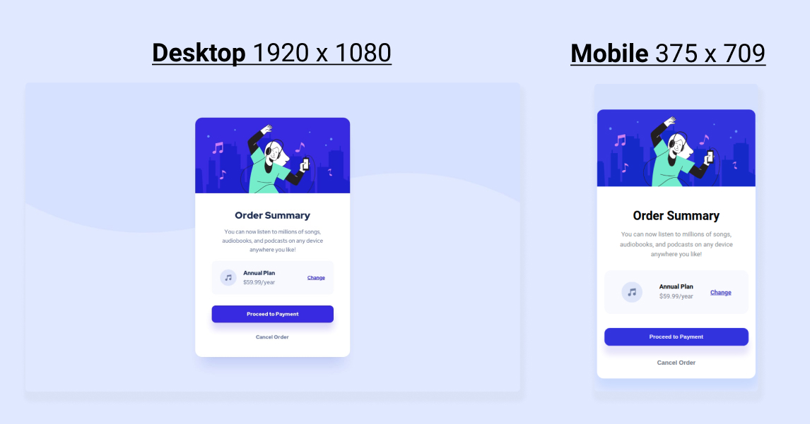
This is a solution to the Order summary card challenge on Frontend Mentor. Frontend Mentor challenges help you improve your coding skills by building realistic projects.
Users should be able to:
- See hover states for interactive elements
-
[Live Site URL](https://dinesvlarsen.github.io/01-order-summary-component/)
I started with getting all the content on the page with HTML, then I grouped the contents in containers (Ended up adding some extra ones later when I started with the layout).
Also had to find a font that resembled the design font, ended up going for roboto, which wasn't a perfect match but close enough for me. Considering I'm not 100% focused on having it pixel perfect since I'm mainly doing the challenge to familiarize myself with HTML & CSS.
When everything was grouped I started applying some basic styles, like background colors, colors, font sizes etc.
And when everything was grouped I focused on laying the contents out properly, by using a lot of flex-box, margins and paddings (honestly think I could have accomplished a lot of the things I was doing a lot more efficiently, and with less code. But I kind of lacked a plan before I went into the whole thing and just tried my way forward.)
I am pretty happy with the result, but think the execution could be better, with a better execution I'm sure the implementation would improve as well since the code would be better organized and easier to work with.
- Semantic HTML5 markup
- CSS custom properties
- Flexbox
- Web-first workflow (which I regret)
Was struggling with centering the entire component to the page, but apparently that was because there was no set height applied to one of the containers, once it got a height it worked fine.
Also learned about the background-image properties: background-repeat: no-repeat; background-size: 100%; (Was struggling with the background not reaching the entire width of my window, background-size fixed that issue)
Did not take a mobile first approach on this, and I'm pretty sure doing so would help with the responsiveness of it.
I'd like to have the future pages be a bit more responsive and have the mobile design a bit more exact.
Would also like to master using rems and ems, max-width and min-widths, since I believe these units will help a lot with responsiveness as well.
Css-grid could also be a cool tool to add in my tool-box in the future.
My semantic HTML also needs a bit of work, I'm probably not using the best tags for the different content on the page, which in reality would hurt its SEO and accessibility.
- Frontend Mentor - @dinesvlarsen
- Twitter - @dinesvlarsen
Want to thank @Manas Khandelwal and @/^([THICC]{5})=>$/ from Jonas Schmedtmanns discord channel for helping me figure out why I couldn't center the component in the middle of the page.
And ofc Frontendmentor for providing the challenge.
