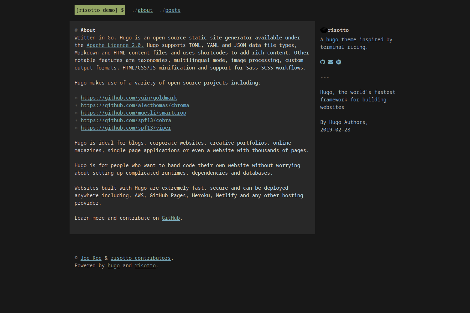
risotto is a minimalist, responsive hugo theme inspired by terminal ricing aesthetics.
The easiest way to install the theme is to clone this repository into your site's themes directory:
git clone https://github.com/joeroe/risotto themes/risottoIf your site is already a git repository, you can add the theme as a submodule instead:
git submodule add https://github.com/joeroe/risotto.git themes/risottoIf you installed the theme using git clone, pull the repository to get the latest version:
cd themes/risotto
git pull
Or, if you added it as a git submodule:
git submodule update --remoteTo use the theme, add theme = 'risotto' to your site's config.toml, or theme: risotto to your config.yaml respectively.
See exampleSite/config.toml for the theme-specific parameters you need to add to your site's config.toml or config.yaml to configure the theme.
risotto uses the base16 framework to define colour schemes that can be used with the theme.palette parameter.
A selection of 16 palettes (10 dark, 6 light) are bundled with the theme: apprentice, base16-dark, base16-light, dracula, gruvbox-dark, gruvbox-light, material, papercolor-dark, papercolor-light, solarized-dark, solarized-light, tender, tokyo-night-dark, tokyo-night-light, windows-95 and windows-95-light.
The default is base16-dark.
The easiest way to use other base16 styles is to place .css file from https://github.com/monicfenga/base16-styles/tree/master/css-variables and place it in your static/css/palettes directory.
Or to define a wholly custom theme, you will need to define the following CSS variables for the following base16 colours (see base16-dark.css for an example):
| Base | Default colour | Used for | Examples |
|---|---|---|---|
| 00 | Dark | Background | Page background |
| 01 | │ | Alt. background | Content background |
| 02 | │ | In-text backgrounds | <pre>, <code>, <kbd>, <samp> |
| 03 | │ | Muted text | :before & :marker symbols |
| 04 | │ | Alt. foreground | Aside text |
| 05 | │ | Foreground | Content text |
| 06 | │ | ||
| 07 | Light | ||
| 08 | Red | ||
| 09 | Orange | ||
| 0A | Yellow | Highlights | Selected text, <mark> |
| 0B | Green | Primary accent | Logo |
| 0C | Cyan | Active links | a:active, a:hover |
| 0D | Blue | Links | a:link, a:visited |
| 0E | Magenta | ||
| 0F | Brown |
For light mode palettes, the sequence of 00–07 should be reversed (light to dark, not dark to light). Note that not all colours are currently used in the theme.
