Run gulp serve and you could try the example at http://localhost:8001.
- ./src/**/*.scss
- ./src/**/*.js
- ./examples/js/*.js
Full width spotlight bar when screen width is smaller than the responsive breakpoint. The search result details, searching text, no results text and results icon would be hidden.
- Default search placeholder text
- Default searching text
- Default no result text
- Default toggle key (To toggle the spotlight bar:
Ctrl + 'toggle key')
So user could select this non-minified version for debugging in their app.
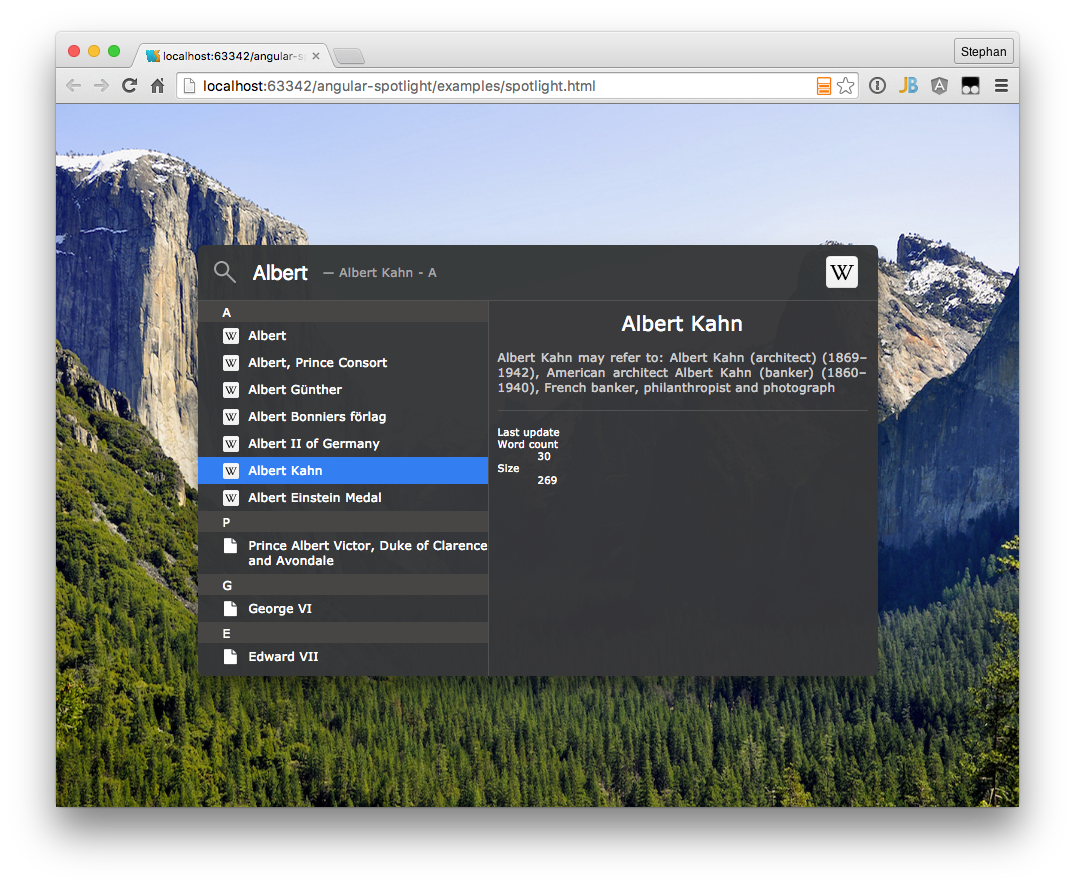
Spotlight is the awesome search feature of Mac OS X. Now it is time to move this piece of software into the web area.
To see a working example of this angular tool, have a look at: http://cdn.rawgit.com/SteKoe/angular-spotlight/master/examples/. The example implements two search sources: One using Github-Search-API, the other one using Wikipedia (EN) Search API.
The final result of this project is to have an angular directive which consumes a list of result items coming from any search service one can imagine (Lucene, Elastic Search, ...). The preliminary JSON format which is consumed by the directive is as follows:
[
  {
    "name": "I am a category",
    "items": [
        {
            "name": "First result in category", // Will be shown in the results list panel
            "type": "your-custom-type", // Will be used to load custom icons / templates in the result item detail panel
            "href": "http://...", // Link which will be triggered when user double clicks on result item or uses enter key
            "description": "Whatever description", // Additional attriutes which can be accessed in custom result item detail panel
            ...
        },
        ...
    ]
  },
  {
    ...
  }
  ...
]
The current implementation takes name and items attributes to create the result list as seen in the theming section below.
Angular Spotlight implements a very basic result panel template which just shows a standard icon and the name of the selected element.
In order to extend and add custom types and templates or override the default one, Angular Spotlight offers an interface to manipulate the default behavior.
The result panel checks depending on the type field in the JSON response which template and icon to use.
The following listing shows how to add custom icons to the Spotlight Directive.
Just use the addIcons() function offered by AngularSpotlightProvider inside the configuration phase of your angular application.
The AngularSpotlightProvider consumes a JSON object having a key-value pair.
The key has to fit the type field in your JSON response whereas the value contains the icon.
Angular Spotlight currently supports urls including data urls as well as css classes.
Check the example below.
Any result of type wikipedia will have an svg image icon specified by a data url.
vCards will show a standard user icon by using FontAwesome icon css classes.
AngularSpotlightProvider.addIcons({
    'wikipedia': 'data:image/svg+xml;utf8,<svg> ... </svg>',
    'vcard':     'fa fa-user'
});
If you want to customize the template of the result panel as well, use the addTemplates function of AngularSpotlightProvider.
The function also takes an JSON object having a key-value pair.
The key again addresses the type and the value a HTML template which will be shown, when an item having the corresponding type is selected in the results list.
You can either use inline HTML or specify a HTML template file path.
AngularSpotlightProvider.addTemplates({
    'wikipedia': 'templates/wikipedia.html',
    'vcard':      '<div class="ng-spotlight-results-detail-vcard">\
                       <div class="profile-image"><span class="fa fa-user"></span></div>\
                       <ul>\
                           <li class="name">{{selectedItem.name}}</li>\
                               <li ng-if="selectedItem.phone"><span class="fa fa-phone"></span> {{selectedItem.phone}}</li>\
                               <li ng-if="selectedItem.email"><span class="fa fa-envelope"></span> {{selectedItem.email}}</li>\
                               <li ng-if="selectedItem.fax"><span class="fa fa-print"></span> {{selectedItem.fax}}</li>\
                               <li ng-if="selectedItem.www"><span class="fa fa-globe"></span> <a href="#" ng-href="{{selectedItem.www}}" target="_blank">{{selectedItem.www}}</a></li>\
                       </ul>\
                   </div>'
});Angular Spotlight currently includes three themes: Dark, Light and Material Design. This is - of course - due to the dark and light themes available on Mac OS. Thanks to Lukas @Pandaros for adding the light theme as well as the Material Design theme - much appreciated! :)
- We adopted the behavior, look and feel from Apple's Spotlight from Mac OS. All rights regarding the design, concept and of course the name "Spotlight" are Trademark of Apple Inc.
- Implements InputGrow Feature implemented by James Padolsey
- Background of Material Design Theme is taken from Google's Material Design Guide (1)
- Background image which is used to illustrate to transparency for dark and light themes is taken from apfellike.com
Copyright 2015 Stephan Köninger
Licensed under the Apache License, Version 2.0 (the "License"); you may not use this file except in compliance with the License. You may obtain a copy of the License at
http://www.apache.org/licenses/LICENSE-2.0
Unless required by applicable law or agreed to in writing, software distributed under the License is distributed on an "AS IS" BASIS, WITHOUT WARRANTIES OR CONDITIONS OF ANY KIND, either express or implied. See the License for the specific language governing permissions and limitations under the License.


