A simple toggle switch widget. It can be fully customized with desired icons, width, colors, text, corner radius etc. It also maintains selection state.
In the pubspec.yaml of your flutter project, add the following dependency:
dependencies:
  ...
  toggle_switch: "^0.1.4"
Import it:
import 'package:toggle_switch/toggle_switch.dart';class MyApp extends StatelessWidget {
@override
Widget build(BuildContext context) {
return MaterialApp(
home: Scaffold(
body: Center(
child: Column(
mainAxisAlignment: MainAxisAlignment.center,
children: [
Padding(
padding: const EdgeInsets.only(top: 35.0, bottom: 15.0),
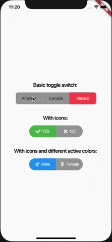
child: Text('Basic toggle switch: ',
style:
TextStyle(fontWeight: FontWeight.bold, fontSize: 18.0)),
),
ToggleSwitch(
minWidth: 90.0,
initialLabelIndex: 2,
activeBgColor: Colors.redAccent,
activeTextColor: Colors.white,
inactiveBgColor: Colors.grey,
inactiveTextColor: Colors.grey[900],
labels: ['America', 'Canada', 'Mexico'],
onToggle: (index) {
print('switched to: $index');
},
),
Padding(
padding: const EdgeInsets.only(top: 35.0, bottom: 15.0),
child: Text('With icons: ',
style:
TextStyle(fontWeight: FontWeight.bold, fontSize: 18.0)),
),
ToggleSwitch(
minWidth: 90.0,
cornerRadius: 20,
activeBgColor: Colors.green,
activeTextColor: Colors.white,
inactiveBgColor: Colors.grey,
inactiveTextColor: Colors.white,
labels: ['YES', 'NO'],
icons: [FontAwesomeIcons.check, FontAwesomeIcons.times],
onToggle: (index) {
print('switched to: $index');
}),
Padding(
padding: const EdgeInsets.only(top: 35.0, bottom: 15.0),
child: Text('With icons and different active colors: ',
style:
TextStyle(fontWeight: FontWeight.bold, fontSize: 18.0)),
),
ToggleSwitch(
minWidth: 90.0,
cornerRadius: 20,
activeBgColor: Colors.green,
activeTextColor: Colors.white,
inactiveBgColor: Colors.grey,
inactiveTextColor: Colors.white,
labels: ['Male', 'Female'],
icons: [FontAwesomeIcons.mars, FontAwesomeIcons.venus],
activeColors: [Colors.blue, Colors.pink],
onToggle: (index) {
print('switched to: $index');
})
],
),
),
),
);
}
}