This document explains the main points in using WebSharper.JQueryUI and how it differs from its corresponding JavaScript library.
The original library, jQuery UI 1.10.3, works by doing a jQuery selection on an element and calling the relevant widget constructor as an instance member, for example:
$("#datepicker").datepicker();In the jQuery UI binding for WebSharper™ widgets like Datepicker are
represented as types. To create the corresponding Datepicker widget
with WebSharper™ you write:
let datePicker = Datepicker.New()The datePicker object now contains the available methods. For
example, to call the getDate methods you use:
let date = datePicker.GetDate()Using the JQuery UI WebSharper™ extension within a WebControl will automatically include the required JavaScript and Css resources.
You may override the location of the fetched resources by modifying the app settings
in in your web.config file.
There are two configurable values: One for the JavaScript file and another one for the Css file. Here is an example of how to override both settings.
<appSettings>
  <add key="WebSharper.JQueryUI.Dependencies+JQueryUIJs" value="/scripts/jquery-ui.js" />
  <add key="WebSharper.JQueryUI.Dependencies+JQueryUICss" value="/css/jquery-ui.css" />
</appSettings>
If you want to serve the resource files locally you need to make sure to you use the same naming conventions as used by the online repository.
Constructor functions are provided for all Widgets and Effects.
There are typically a few options for constructing Widgets depending
on the desired configuration.
In the original jQuery UI library configuration settings are usually passed as a JavaScript object. For example, a calendar may be initialized in a disabled state by passing a configuration setting to the constructor function:
$("#datepicker").datepicker({{ disabled: true }});In WebSharper™ configuration settings for any widget are represented by a corresponding configuration type and may be passed to the constructors as parameters:
let conf = DatepickerConfiguration(Disabled = true)
let datePicker = Datepicker.New(conf)jQuery UI methods are represented as member methods on the objects returned when
creating a widget. Typically the widget and effect objects contain
some common methods like destroy, enable, disable, and option.
For example, the Datepicker widget has a method for setting the
date. The JavaScript snippet for this may look like:
$("#datepicker").datepicker("setDate", "03/14/2010");The WebSharper™ bindings contain (possibly overloaded) methods with corresponding names:
datePicker.SetDate(new Date(2010,03,14))The fundamental difference between original jQuery UI JavaScript widgets and their WebSharper™ counterparts is that in JavaScript the constructor methods are typically called on elements already attached to the DOM tree. For example, in order for the following code to work:
$(selector).datepicker();the selector needs to refer to an element already attached to the page.
In WebSharper™ you normally do not work with inserted nodes, so whenever you call constructor method such as:
Datepicker.New()the actual initialization of the internal element is delayed until this node is rendered to the page.
Therefore caution needs to be taken when using widget objects. If the widget is not yet rendered, some instance member calls may result in runtime errors.
For example, the following code:
let datePicker = Datepicker.New()
datePicker.SetDate(new Date(2010,3,14))
will not work since the call to SetDate assumes that the
datePicker object is rendered.
Since all widgets implement the IPagelet interface you may use the
OnAfterRender function to accomodate for this.
You may rewrite the code above using the OnAfterRender as in:
DatePicker.New()
|> OnAfterRender(fun datePicker ->
    datePicker.SetDate(new Date(2010,3,14))
)jQuery UI widgets allow to add event handlers to widgets. For example,
the Datepicker widget supports the onSelect event:
$("#datepicker").datepicker({
   onSelect: function(dateText, inst) { ... }
});
In the WebSharper™ binding Events are also represented as functions. To add an event handler for a Datepicker objects you use:
datePicker.OnSelect (fun date -> ...)The OnSelect function accepts a callback function of type
JavaScript.Date -> unit. The signatures of the callback functions
differ slightly from their JavaScript counterparts. For example, the
JavaScript callback function may accept two arguments, with the second
one representing a reference to the datePicker object and the date
is passed as a string rather than a DateTime object.
In contrast with other method invocations, events may be applied to objects that has not yet been initialized (rendered). If an event is attached to a non initialized object it is implicitly delayed until the rendering of the object. Therefore the following code is perfectly valid:
let datePicker = DatePicker.New()
datePicker.OnSelect(fun date -> ...)This document lists a few usage examples of WebSharper.JQueryUI. To read on the principles of WebSharper.JQueryUI and how it differs from the JavaScript library, check the main documentation.
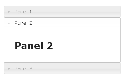
The following example shows how to wrap elements inside an Accordion widget.
[<JavaScript>]
let Accordion () =
    let accElems =
        [
            "Panel 1", H1 [Text "Panel 1"]
            "Panel 2", H1 [Text "Panel 2"]
            "Panel 3", H1 [Text "Panel 3"]
        ]
    let accordion = Accordion.New(accElems)
    Div [accordion]
Result:
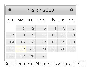
The datepicker provides a convenient way of letting the user select
dates. Here a label is updated with the most recently selected date
by utilizing the OnSelect function.
[<JavaScript>]
let PickDate () =
    let datepicker = Datepicker.New()
    let selDate = Label []
    datepicker.OnSelect (fun dt ->
        selDate.Text <- dt.ToLocaleDateString()
    )
    Div [
        Div [Label [Text "Selected date:"]; selDate]
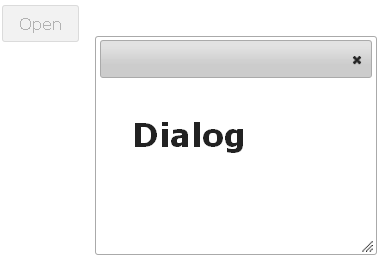
]An example of how you can use the Dialog and Button widgets:
[<JavaScript>]
let Dialog () =
    let button = Button.New "Open"
    let pan = Div [button]
    button.OnClick (fun ev ->
        let dialog = Dialog.New(H1 [Text "Dialog"])
        pan.Append(dialog)
        dialog.OnClose(fun ev ->
            button.Enable()
        )
        button.Disable()
    )
    pan
The button is created using the New constructor with a string
argument specifying the label. To add an event handler for the click
for the button you use the button.OnClick function. Here a new
Dialog object is created and the button is disabled. To enable the
button again when the dialog closes you use the OnClose function for
the dialog.
The following sample shows how to use the slider widget to let the user specify a percentage value.
[<JavaScript>]
let Slider () =
    let slider = Slider.New()
    let selVal = Label []
    slider.OnChange(fun ev ->
        selVal.Text <- string slider.Value + "%"
    )
    Div [
        Div [
            Label [Text "Selected Value: "]
            selVal
        ]
        -< [
            slider
        ]
    ]
To capture the change event for the slider you add an event handler
for the OnChange event. Every time the value of the slider changes,
the text property of the selVal label is updated with the most
recent text.
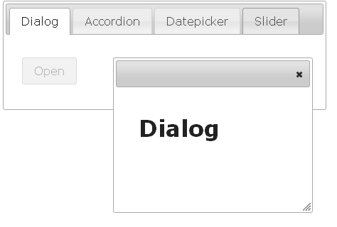
In the example, the widgets above are displayed using the Tabs control. Each widget is displayed on a a separate tab panel.
[<JavaScript>]
let Main () =
    let tabElems =
        [
            "Dialog", Dialog ()
            "Accordion", Accordion ()
            "Datepicker", Date ()
            "Slider", Slider ()
        ]
    let tabs = Tabs.New(tabElems, TabsConfiguration())
    Div [StyleAttribute "width:500px"] -< [tabs]


