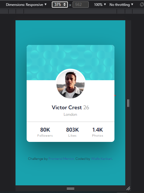
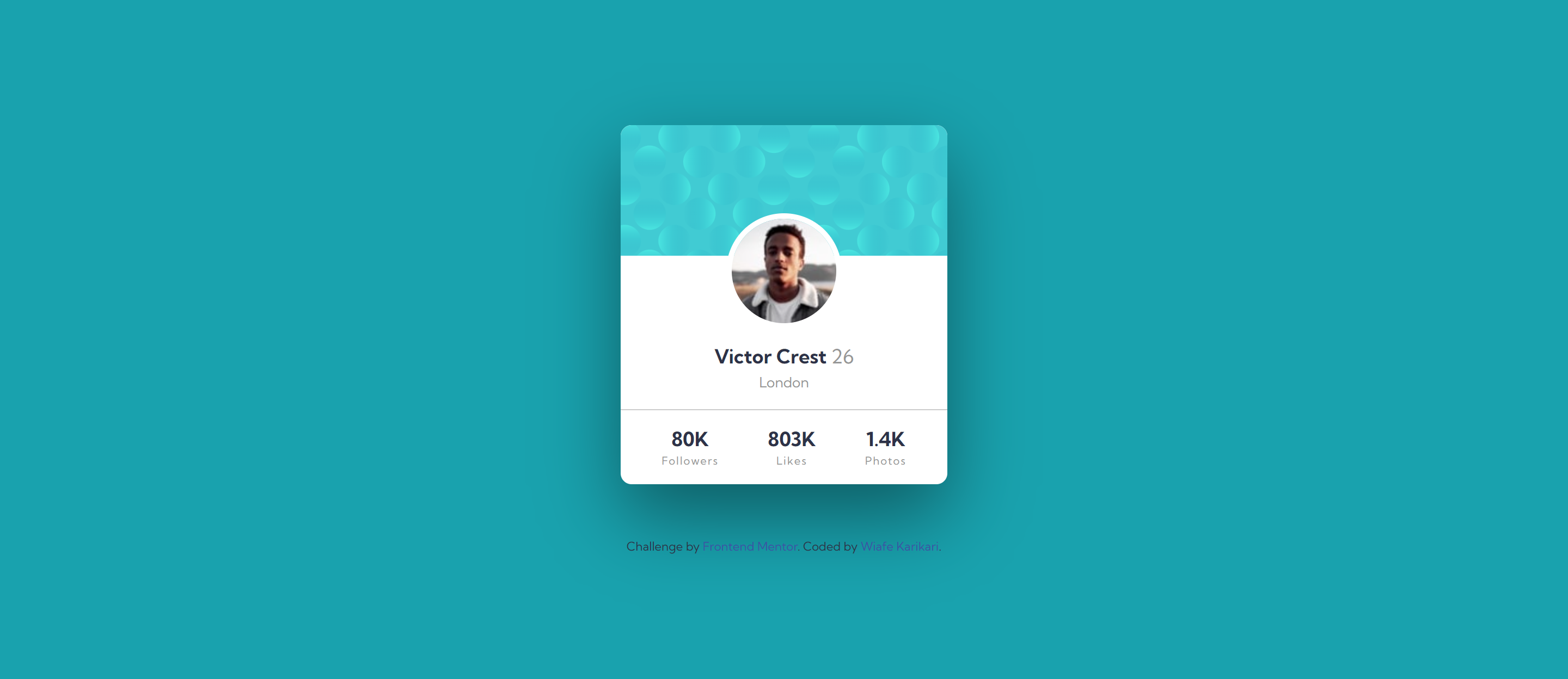
This is a solution to the Profile card component challenge on Frontend Mentor. Frontend Mentor challenges help you improve your coding skills by building realistic projects.
- Build out the project to the designs provided
- Live Site URL: https://doublekari.github.io/profile-card-component-main/
I started by rewritting the HTML, creatings the containers to hold each section of the card. Then I start styling the mobile view first making sure it was responsive. Finalised styles with the the desktop view using media queries.
- Semantic HTML5 markup
- Flexbox
- Mobile-first workflow
- Learnt how to get rid of the whitespace left behind after using a relative positioning.
- stackoverflow - This helped me with getting rid of the whitespace left behind after a relative positioining of an element.
- Frontend Mentor - @doubleKari
- Twitter - @stealyear

