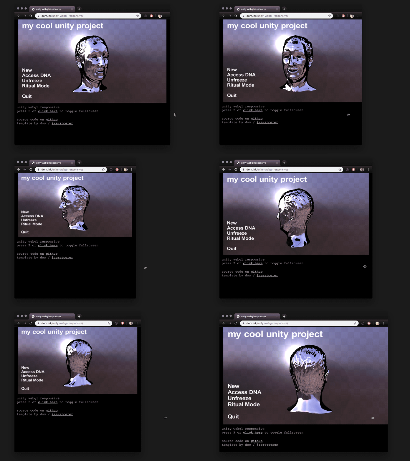
Responsive layout template for Unity WebGL applications, intended for websites that have more going on than the application itself.
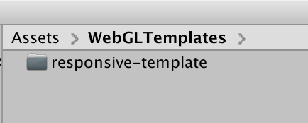
Create a folder called WebGLTemplates in the Assets folder of your Unity project.
Copy the responsive-template folder and all of its contents into WebGLTemplates.
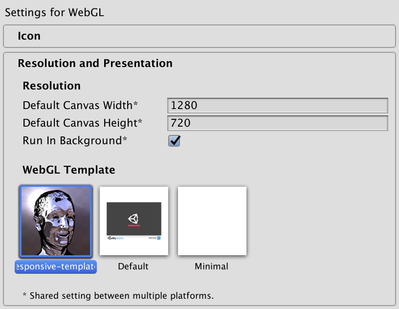
Select the template in the Player settings (Edit > Project Settings then select the Player category) and set the default canvas resolution.
Optionally, change the max-width property of .webgl-wrapper in style.css to set the application's maximum width:
.webgl-wrapper {
  width: 100%;
  max-width: 1280px;
}
- The application canvas is dynamically resized based on the current width of the
.webgl-wrapperdiv. - The canvas is expected to have a 16:9 aspect ratio. For other formats, change the aspect ratio in the
refreshCanvasfunction ofapp.jsin the template folder. - Press F to toggle fullscreen.
Resulting HTML includes credits and a link back to this page but feel free to remove all of that and modify the template as needed. Disney head in the example project courtesy of David OReilly.


