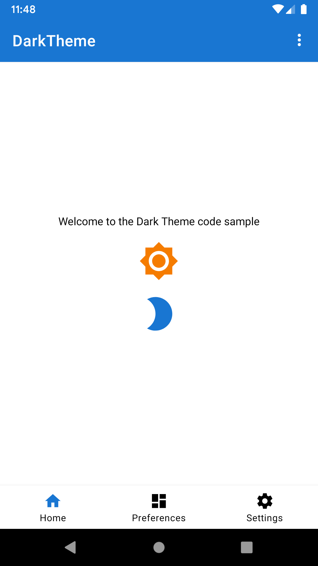
Sample demonstrating the different ways to support Dark Mode on Android. Uses the Material Design Components Library.
Android Q has explicit user support for Dark Mode, allowing users to choose whether the device theme is dark or not. There are multiple ways you can allow Dark Mode in your app:
AppCompat has had "night mode" APIs for a number of years now. It allows developers to implement dark mode in their apps using the -night resource qualifier. The Material Design Components library builds upon AppCompat and exposes its own DayNight themes.
The DayNight theme in the AndroidX Material Components library provides Dark Theme backwards
compatibility down to API 14. The theme we use in the app (specified in AndroidManifest.xml#L23)
extends from DayNight (values/styles.xml#L16).
Use theme-defined colours when defining colours for your drawables.
For example, we use ?attr/colorOnBackground for the generic text color of the app (values/styles.xml#35).
When it's not possible to use theme-defined colours, you can use the -night qualifier to
extract hard-coded values and switch them out when the configuration changes to night mode.
For example, we use a different primary colour in dark mode. Check values-night/colors.xml
for more details. You can also specify custom drawables creating a drawable-night folder.
Tell AppCompat what mode to use by calling AppCompatDelegate.setDefaultNightMode() or
getDelegate().setLocalNightMode(). It can take different values:
- MODE_NIGHT_YES. Always use the dark theme.
- MODE_NIGHT_NO. Always use the light theme (Smart Dark can override it).
- MODE_NIGHT_FOLLOW_SYSTEM. Follows the current system setting
- MODE_NIGHT_AUTO_BATTERY. Dark when battery saver is enabled, light otherwise.
In the code sample, you can find the code related to this in the ThemeHelper class.
Smart Dark is a new feature in Android Q which can automatically theme a light app to dark by dynamically re-coloring the app being drawn at runtime. It has no direct developer APIs. It is made for apps which do not have explicit Dark Theme support yet.
Smart Dark applies to any theme whose value of android:isLightTheme=true. This is set on
all of the Theme.*.Light.* variants, including those from AppCompat. You can opt-in and opt-out at
both a theme and view level. Opt-in by setting android:forceDarkAllowed="true"
in the view or theme. Alternatively, you can enable/disable it in the code by calling
View#setForceDarkAllowed(boolean).
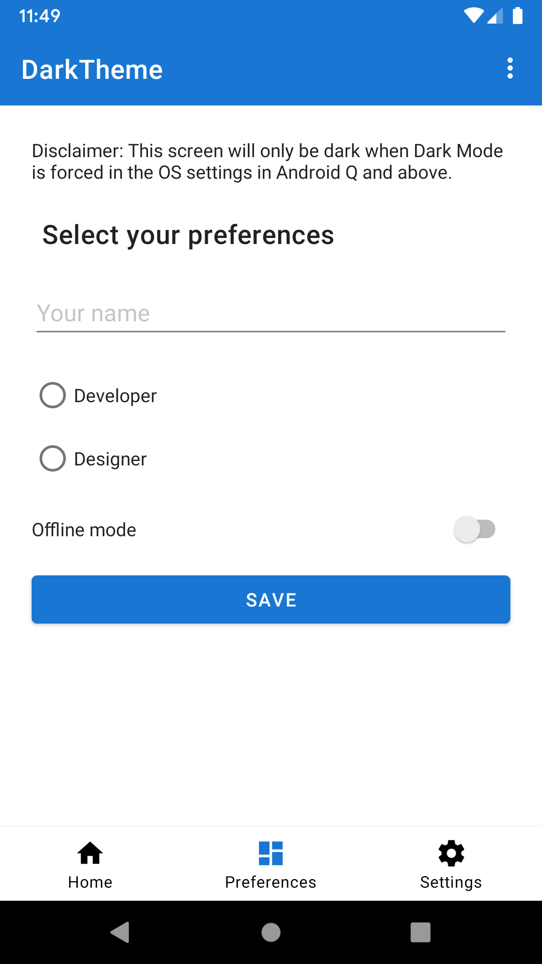
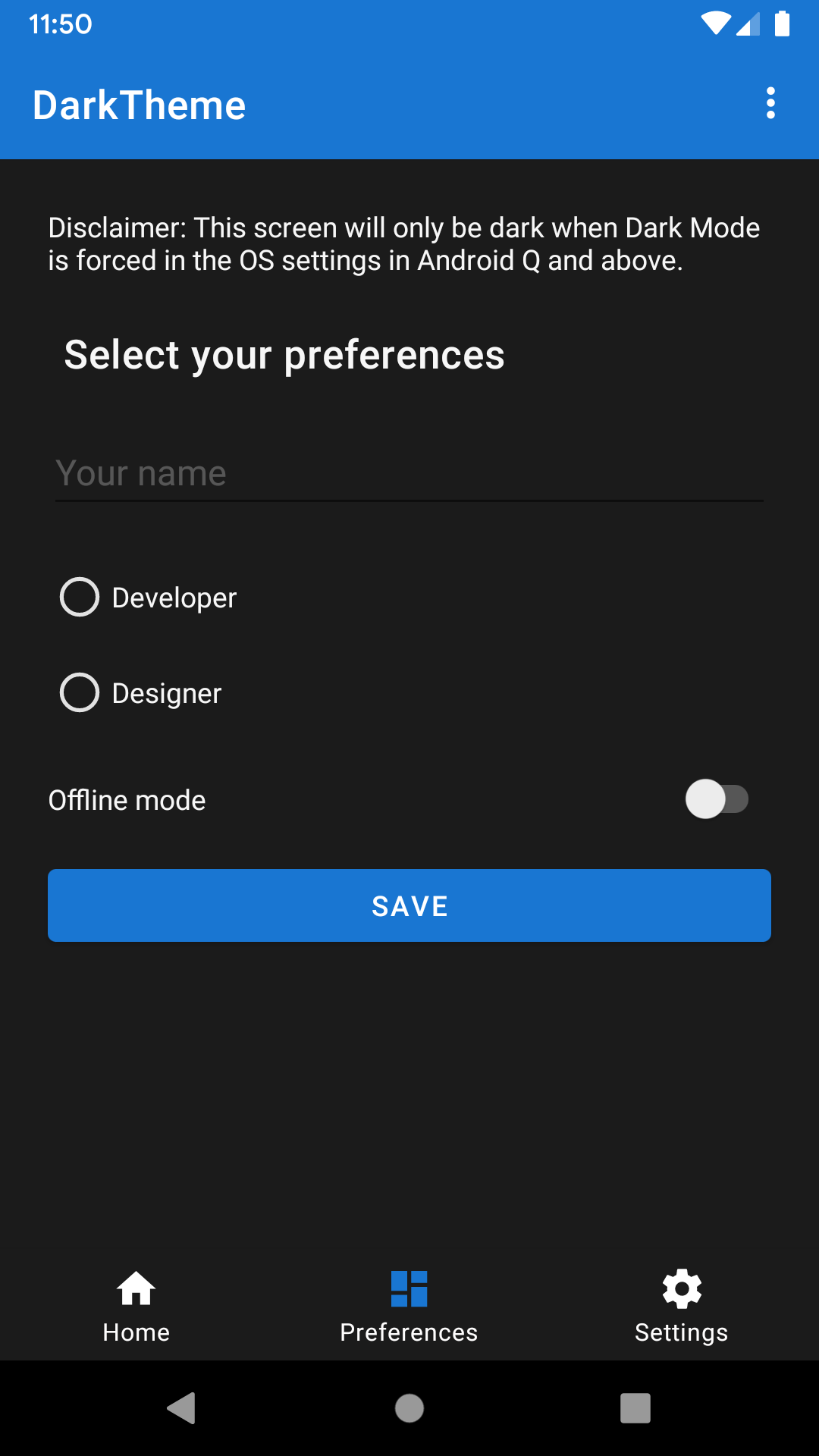
This feature is implemented in the PreferencesFragment. As you can see in the
layout/fragment_preferences.xml file, all colours are hard-coded to be light-theme suitable.
To make it use Smart Dark, the parent view sets android:forceDarkAllowed="true"
(you can see it in layout/fragment_preferences.xml#L19). In this case, when Smart Dark is
active, this screen will be automatically themed to be dark-mode friendly. The system will
change most of the colours to make that happen.
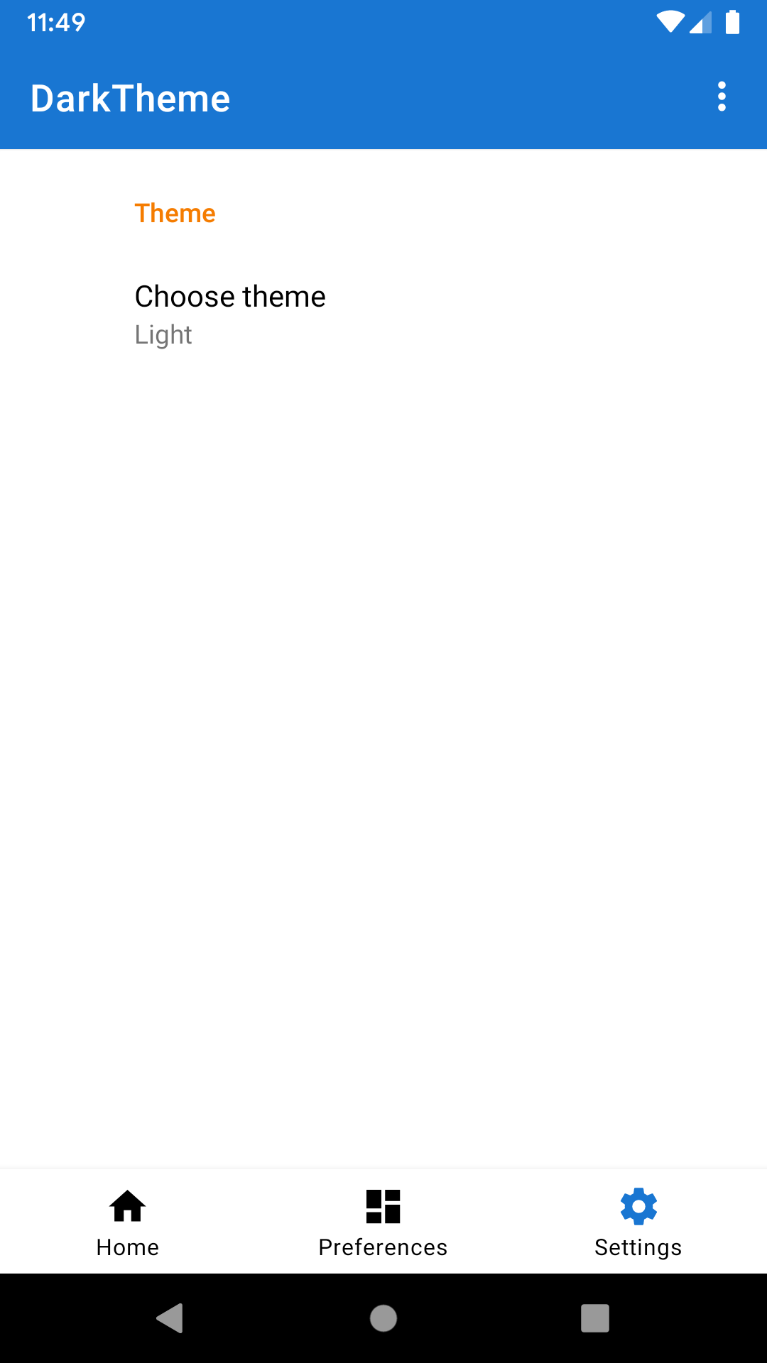
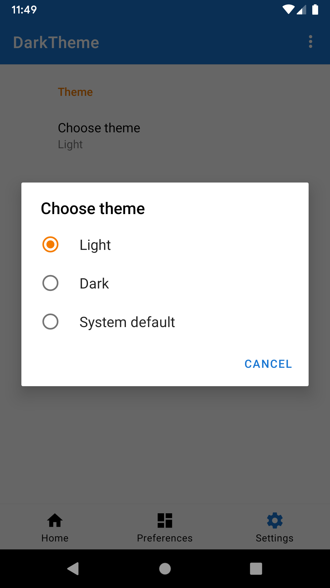
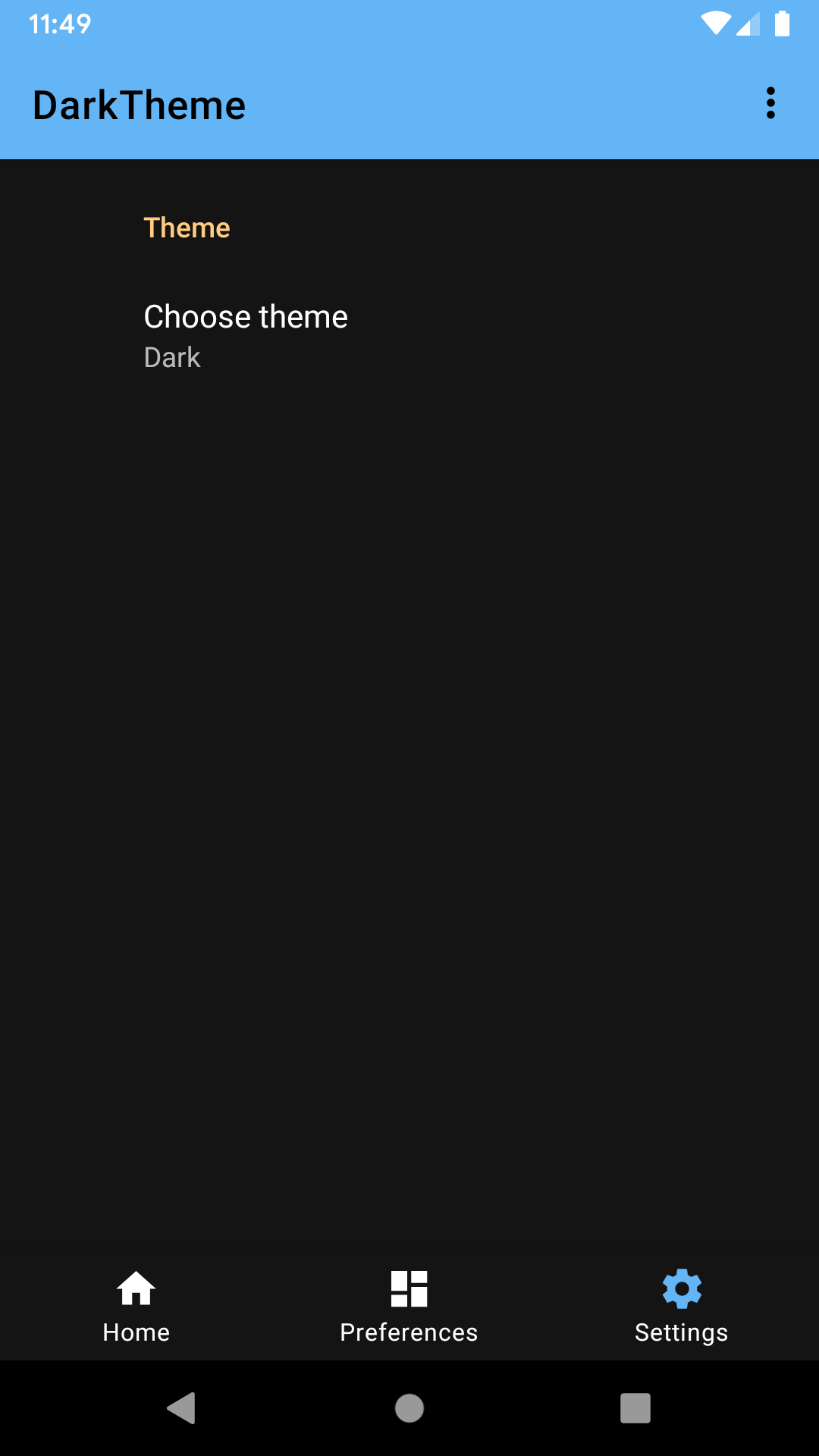
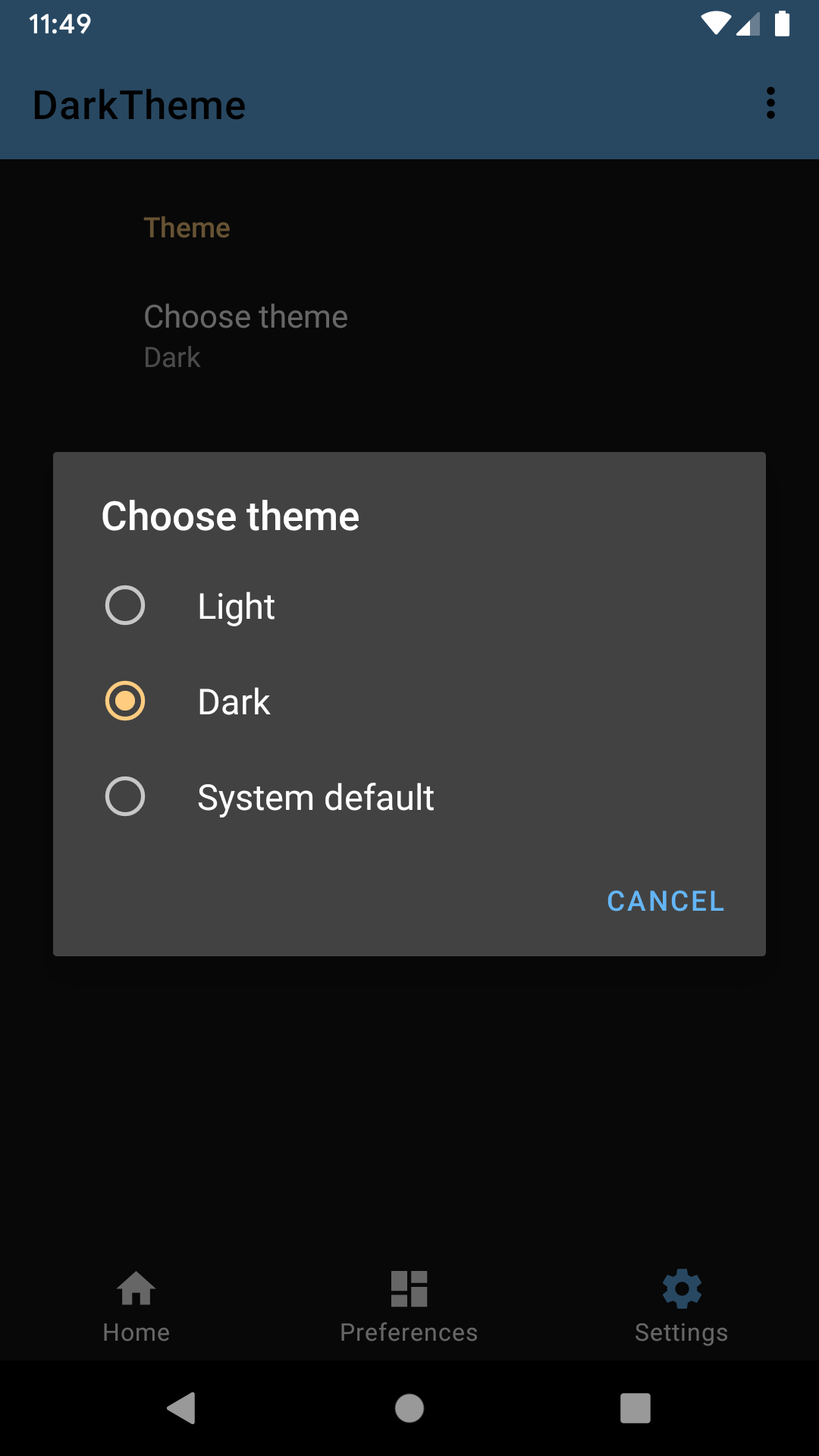
The user can decide which theme to use within the app. In the Settings screen, the user can choose the Light theme, Dark theme, or System Default (when the app is running on Android Q+) or Set by Battery Saver (when running on Android P or earlier). When using the System Default option, the system decides the theme based on the Platform System Settings introduced in Android Q.
These options, that are also listed above, are the settings that Google recommends.
Also, it recommends that this user choice is stored and applied whenever the user opens
the app again. In the code sample, the user preference is automatically stored in
SharedPreferences because we use the androidX preference library. Check SettingsFragment
and preferences.xml for more information about it. In the DarkThemeApplication class,
we retrieve and apply the user theme preference when the user opens the app.
Notice that the PreferencesFragment will be only in Dark Mode when the Smart Dark is active.
You can force it by running adb shell setprop debug.hwui.force_dark true on your terminal console.
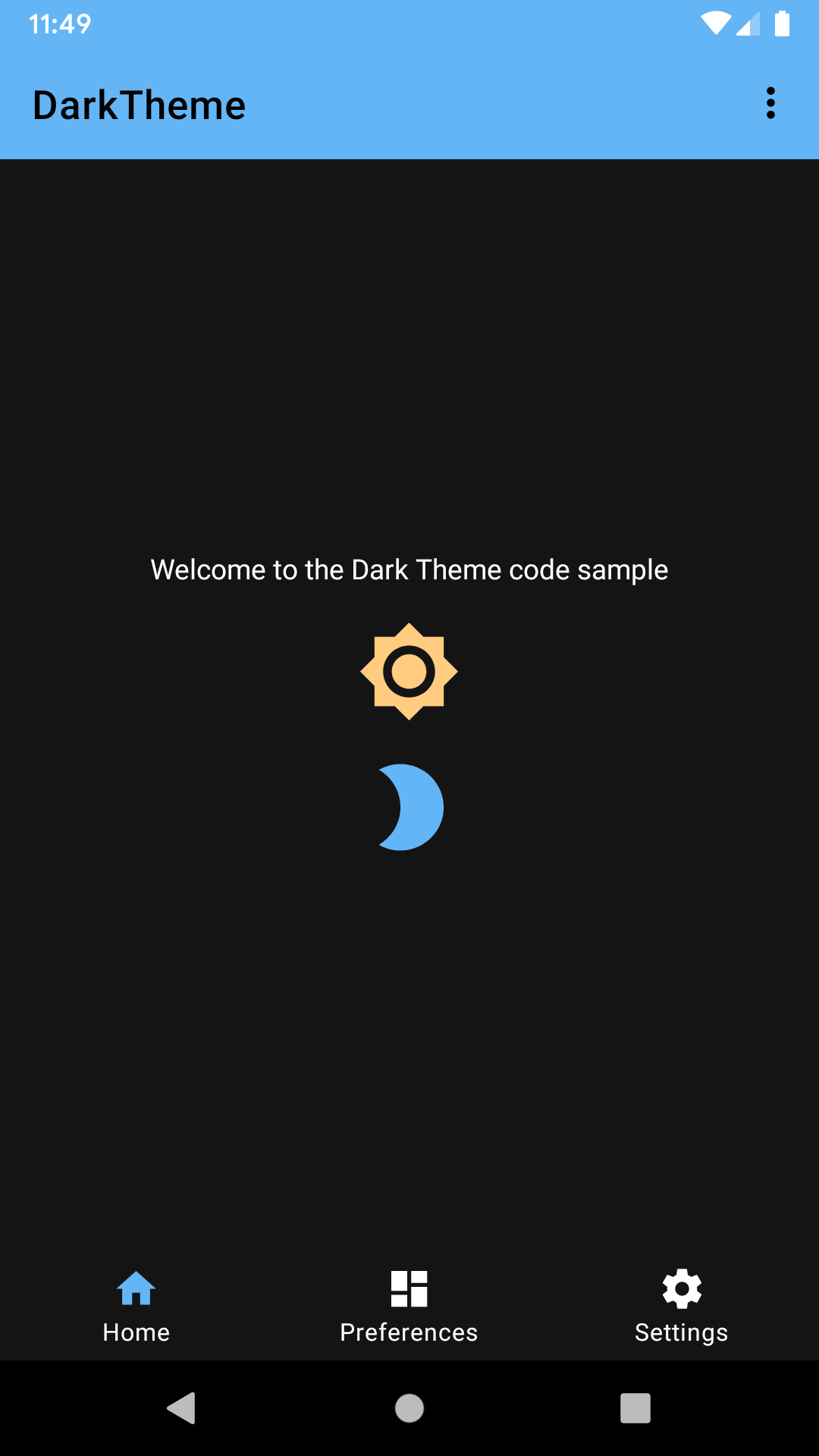
In the sample, we make views Dark-Mode friendly in different ways:
-
Vectors using tints.
drawable/ic_brightness_2.xmlis Dark-Mode friendly by using theandroid:tintattribute. -
Vectors using hard-coded colours.
drawable/ic_brightness.xmlis Dark-Mode friendly by setting its View tint infragment_welcome.xml#L38. Also, you can set it programmatically as we do with the tinted menu iconR.id.action_more. -
Tinted menu icons.
R.id.action_moreis tinted programmatically inMainActivity.java#L85. -
Different colorPrimary/colorsecondary for light/dark mode. We define the primary color in
values/styles.xml#L21where we set "colorPrimary" to@color/primary.@color/primaryis defined in bothvalues/colors.xmlandvalues-night/colors.xml. -
Text color. Same way as we did before, the text color is defined in
values/styles.xmlwith the"android:textColorPrimary"attribute. -
Window background. The window background is set in
values/styles.xmlwith the"android:windowBackground"attribute. The value is set to@color/backgroundso if Dark Mode is enabled the splash screen is black instead of white. -
Apply variations to a color using ColorStateList. Check out
color/color_on_primary_mask.xml. Instead of creating a new color with an alpha in hexadecimal values, we reuse the color and specify the alpha with a percentage number. -
Enable Smart Dark. The
PreferenceFragmentis not Dark-Mode friendly. It has all colours hard-coded to be suitable for light mode. To opt the Fragment in for Smart Dark, we setandroid:forceDarkAllowed="true"in the root View of the Fragment. You can find the code inlayout/fragment_preferences.xml#19.
- Android SDK 28
- Android Build Tools v28.0.3
- Android Support Repository
This sample uses the Gradle build system. To build this project, use the "gradlew build" command or use "Import Project" in Android Studio.
- Google+ Community: https://plus.google.com/communities/105153134372062985968
- Stack Overflow: http://stackoverflow.com/questions/tagged/android
If you've found an error in this sample, please file an issue: https://github.com/googlesamples/android-DarkTheme
Patches are encouraged, and may be submitted by forking this project and submitting a pull request through GitHub. Please see CONTRIBUTING.md for more details.
Copyright 2019 The Android Open Source Project, Inc.
Licensed to the Apache Software Foundation (ASF) under one or more contributor license agreements. See the NOTICE file distributed with this work for additional information regarding copyright ownership. The ASF licenses this file to you under the Apache License, Version 2.0 (the "License"); you may not use this file except in compliance with the License. You may obtain a copy of the License at
http://www.apache.org/licenses/LICENSE-2.0
Unless required by applicable law or agreed to in writing, software distributed under the License is distributed on an "AS IS" BASIS, WITHOUT WARRANTIES OR CONDITIONS OF ANY KIND, either express or implied. See the License for the specific language governing permissions and limitations under the License.
