Corned Beef vs. Pickles (in progress)
Motivation
In graduate school, I had a friend from a fairly sheltered background who was convinced that corned beef and pickles could only be eaten together. That is, no one would ever eat either separately. This was shocking to me, since I didn't think I'd ever had them together but did enjoy them both on their own. When the initial pronouncement was handed down, we spent half of the night calling people all over the country trying to discover what collection of backgrounds would lead you to this particular culinary compulsion. As you might expect, the surveying process of "call who ever is currently saved in your phone" did not return particularly generalizable results.
This issue then sat on the back burner for years until while helping a student in DATA115 track down a dataset about food consumption by age, I stumbled across the NHANES survey data collected by the CDC, which seemed to provide a potential way forward...
Data Sources
Every year, the National Center for Health Statistics performs a large survey of Americans health and consumption habits called the NHANES. They release anonymized responses to the large collection of questions and measurements that the gather data on. For this project I used the data from 2005. Specifcally, the Demographic Variables and the raw reponses to the Food Frequency Questionaire. This raw data is presented above.
Processing Steps
A significant amount of processing was necessary to actually analyze this dataset. To begin with, the raw data provided by the CDC is in a proprietary format for the SAS language, so the first step was to use the SAS viewer to export the data to a .csv to start the cleaning process. Then, I merged the demographic data with the relevant food consumption columns. In both cases, the given column labels were confusing so I replaced them with interpretable ones. There was also a great deal of excess data that I didn't need for the analysis, so I removed those columns from the dataset. There was demographic information on over 10k subjects but only about 6k filled out the food questionnaire, so I removed the non-participant rows from the data as well.
Each column value was coded according to a chart given in the underlying data source. For example, the values in the Pickles? column represented the following pickle eating frequencies.
| Data Value | Meaning |
| 1 | Never |
| 2 | 1-6 times per year |
| 3 | 7-11 times per year |
| 4 | 1 time per month |
| 5 | 2-3 times per month |
| 6 | 1 time per week |
| 7 | 2 times per week |
| 8 | 3-4 times per week |
| 9 | 5-6 times per week |
| 10 | 1 time per day |
| 11 | 2 or more times per day |
| 88 | Blank |
| 99 | Error |
Similar tables can be found at this link for the demographic columns.
Visualization
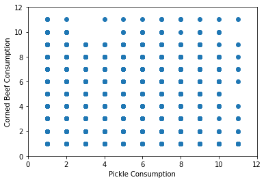
To begin with, I made a scatterplot of the various food frequency scores for the two food categories to see if there really were people who liked to eat both equally. This result shows that almost every possible category is filled, falsifying my classmate's hypothesis.
This plot obscures the number of participants who fall into each category (scatterplots are usually a poor choice for categorical data!) so we might get a better sense of the dataset using a heatmap of the contingency table, a stacked bar chart, or just looking at the actual values:
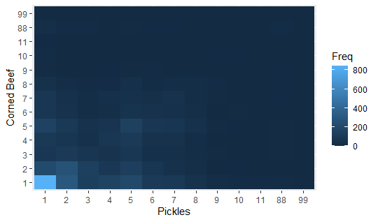
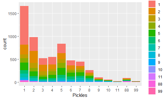
| x | 1 | 2 | 3 | 4 | 5 | 6 | 7 | 8 | 9 | 10 | 11 | 88 | 99 |
|---|---|---|---|---|---|---|---|---|---|---|---|---|---|
| 1 | 843 | 212 | 87 | 96 | 160 | 80 | 82 | 40 | 11 | 16 | 3 | 26 | 4 |
| 2 | 301 | 266 | 107 | 75 | 101 | 47 | 40 | 21 | 5 | 7 | 1 | 10 | 1 |
| 3 | 142 | 144 | 75 | 43 | 51 | 22 | 22 | 9 | 4 | 0 | 0 | 9 | 0 |
| 4 | 167 | 94 | 56 | 78 | 67 | 32 | 35 | 10 | 3 | 0 | 1 | 6 | 1 |
| 5 | 203 | 133 | 83 | 107 | 151 | 63 | 42 | 35 | 8 | 2 | 1 | 8 | 0 |
| 6 | 108 | 76 | 35 | 51 | 79 | 53 | 38 | 16 | 9 | 4 | 1 | 3 | 0 |
| 7 | 100 | 46 | 38 | 50 | 76 | 44 | 53 | 24 | 7 | 4 | 2 | 3 | 0 |
| 8 | 52 | 29 | 25 | 24 | 42 | 32 | 23 | 22 | 4 | 1 | 2 | 1 | 0 |
| 9 | 24 | 7 | 12 | 5 | 13 | 7 | 11 | 9 | 6 | 3 | 1 | 2 | 0 |
| 10 | 17 | 3 | 1 | 5 | 3 | 11 | 6 | 5 | 1 | 3 | 1 | 1 | 0 |
| 11 | 9 | 2 | 2 | 1 | 0 | 1 | 2 | 1 | 1 | 0 | 1 | 1 | 0 |
| 88 | 17 | 7 | 11 | 8 | 12 | 4 | 3 | 3 | 3 | 1 | 0 | 18 | 4 |
| 99 | 6 | 0 | 0 | 1 | 2 | 0 | 2 | 0 | 0 | 0 | 0 | 2 | 5 |
Analysis
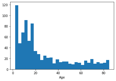
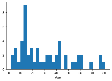
Having answered the initial question, I started to wonder if there were demographic features that distinguished the groups who either hated or liked both types of food. I began by separating the data into two sets: one for people who never ate either product and one for people who ate both at least once per week. The plots below show the histograms of ages of people in these two categories:
Descriptions of Code and Materials
The raw data downloaded from the sources described above are uploaded in .csv form as 2005_food and 2005_demo. The processed data with better column names and only the relevant rows and columns is uploaded as processed_data and the notebook used to do the processing and make the plots is uploaded as cornedbeefpickles.ipynb.