This Plugin lets you create interactive Charts in Obsidian.
To create a Chart within Obsidian a Codeblock of the type chart is used. The Properties are set using YAML Syntax. Example:
    ```chart
        type: ""
        labels: []
        series:
          - title: ""
            data: []
          - title: ""
            data: []

    ```
The title Property can be omitted, but it is not advised to do so.
You might not be able to copy the Examples directly into Obsidian, the Indentation is probably wrong and Obsidian tries to convert pasted Text to Markdown, which escapes a few important characters.
For anyone who has used this Plugin before the Release of v2.0.0, there is a legacy Mode so you don't need to manually convert your old Charts to the new Syntax. Just add legacy: true to your old Charts. Please do not use this for new Charts, legacy Mode might get removed in future Versions.
This Plugin provides 6 different Variants. The type of a Chart is set by the type: {Type} Property.
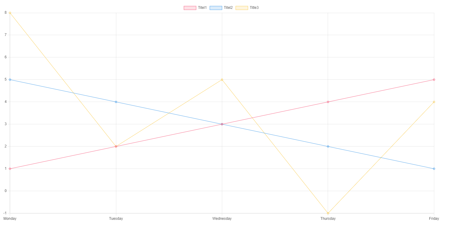
    ```chart
        type: line
        labels: [Monday,Tuesday,Wednesday,Thursday,Friday]
        series:
          - title: Title 1
            data: [1,2,3,4,5]
          - title: Title 2
            data: [5,4,3,2,1]
          - title: Title 3
            data: [8,2,5,-1,4]
    ```
The above example Code will render a Line Chart with 3 individual traces, titled "Title 1", "Title 2" and "Title 3".
See also: Modifiers
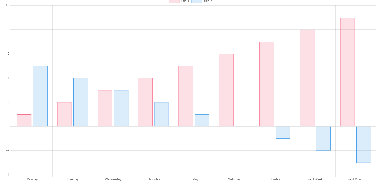
    ```chart
        type: bar
        labels: [Monday,Tuesday,Wednesday,Thursday,Friday, Saturday, Sunday, "next Week", "next Month"]
        series:
          - title: Title 1
            data: [1,2,3,4,5,6,7,8,9]
          - title: Title 2
            data: [5,4,3,2,1,0,-1,-2,-3]
    ```
The above example Code will render a Bar Chart.
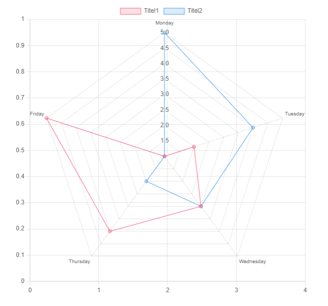
    ```chart
        type: radar
        labels: [Monday,Tuesday,Wednesday,Thursday,Friday]
        series:
          - title: Title 1
            data: [1,2,3,4,5]
          - title: Title 2
            data: [5,4,3,2,1]
        width: 40%
    ```
The above example Code will render a Radar Chart, a width Modifier is already added, since this Chart would be way to big otherwise.
    ```chart
        type: pie
        labels: [Monday,Tuesday,Wednesday,Thursday,Friday]
        series:
          - title: Title 1
            data: [1,2,3,4,5]
          - title: Title 2
            data: [5,4,3,2,1]
        width: 40%
        labelColors: true
    ```
The above example Code will render a Pie Chart, a width Modifier is already added, since this Chart would be way to big otherwise. The Property labelColors is also set to true, which is the desired behaviour most of the time.
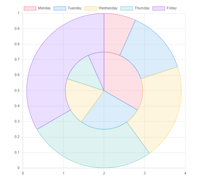
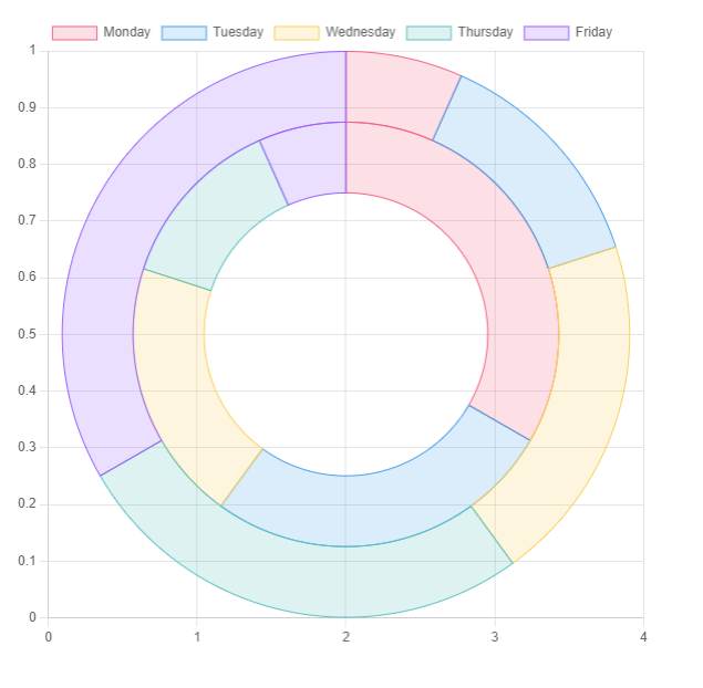
    ```chart
        type: doughnut
        labels: [Monday,Tuesday,Wednesday,Thursday,Friday]
        series:
          - title: Title 1
            data: [1,2,3,4,5]
          - title: Title 2
            data: [5,4,3,2,1]
        width: 40%
        labelColors: true
    ```
The above example Code will render a Doughnut Chart, a width Modifier is already added, since this Chart would be way to big otherwise. The Property labelColors is also set to true, which is the desired behaviour most of the time.
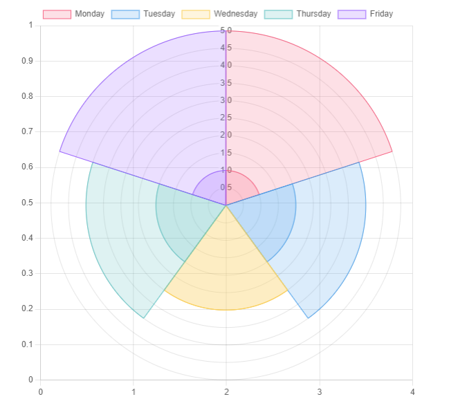
    ```chart
    type: polarArea
    labels: [Monday,Tuesday,Wednesday,Thursday,Friday]
    series:
      - title: Title 1
        data: [1,2,3,4,5]
      - title: Title 2
        data: [5,4,3,2,1]
    labelColors: true
    width: 40%
    ```
The above example Code will render a Polar Area Chart, a width Modifier is already added, since this Chart would be way to big otherwise. The Property labelColors is also set to true, which is the desired behaviour most of the time.
The width Modifier is used to set the width of any Chart. It is advised to use it for the following Charts:
- Pie Chart
- Doughnut Chart
- Radar Chart
- Polar Area Chart
The Values can be any valid CSS Property, for examples fixed Values (e.g. 400px) or dynamic Values (e.g 40%).
- Default:
100%
    ```chart
    type: polarArea
    labels: [Monday,Tuesday,Wednesday,Thursday,Friday]
    series:
      - title: Title 1
        data: [1,2,3,4,5]
      - title: Title 2
        data: [5,4,3,2,1]
    width: 40%
```The fill Modifier is used in Line Charts to fill the Area under the Traces.
- Expected:
boolean(trueorfalse) - Default:
false
    ```chart
        type: line
        labels: [Monday,Tuesday,Wednesday,Thursday,Friday]
        series:
          - title: Title 1
            data: [1,2,3,4,5]
          - title: Title 2
            data: [5,4,3,2,1]
          - title: Title 3
            data: [8,2,5,-1,4]
        fill: true
```The tension Modifier is used in Line Charts to set the tension of the Traces to the given points. A Value of 0 means no smoothness at all, a value of 1 is maximum smoothness.
- Expected: Double (0-1)
- Default: 0
    ```chart
        type: line
        labels: [Monday,Tuesday,Wednesday,Thursday,Friday]
        series:
          - title: Title 1
            data: [1,2,3,4,5]
          - title: Title 2
            data: [5,4,3,2,1]
          - title: Title 3
            data: [8,2,5,-1,4]
        tension: 0.5
```The beginAtZero Modifier is used to force set the Chart to begin at 0. Otherwise the Chart will cut out all unused space.
- Expected:
boolean(trueorfalse) - Default:
false
    ```chart
        type: line
        labels: [Monday,Tuesday,Wednesday,Thursday,Friday]
        series:
          - title: Title 1
            data: [4,2,3,4,5]
          - title: Title 2
            data: [5,4,3,2,2]
          - title: Title 3
            data: [8,2,5,3,4]
        beginAtZero: true
```The legend modifier sets whether or not the legend will be displayed.
- Expected:
boolean(trueorfalse) - Default:
true
    ```chart
        type: line
        labels: [Monday,Tuesday,Wednesday,Thursday,Friday]
        series:
          - title: Title 1
            data: [4,2,3,4,5]
          - title: Title 2
            data: [5,4,3,2,2]
          - title: Title 3
            data: [8,2,5,3,4]
        legend: false
```Determines where the legend will be displayed.
- Expected
top,left,bottom,right - Default:
top
Valid for bar and line types only.
Allows horizontal graphs
- Expected:
xory - Default:
y
Will change the bar and line graphs to be stacked.
- Expected:
boolean(trueorfalse) - Default:
false
Prepend either the x or y axis to any of these to modify them.
Can reverse the axis it is applied to
- Expected:
boolean(trueorfalse) - Default:
false
    ```chart
        type: line
        labels: [Monday,Tuesday,Wednesday,Thursday,Friday]
        series:
          - title: Title 1
            data: [4,2,3,4,5]
          - title: Title 2
            data: [5,4,3,2,2]
          - title: Title 3
            data: [8,2,5,3,4]
        xReverse: true
```Can set the min and max of the respecitve axis. Min will override beginAtZero.
- Expected:
int
Determines whether the axis (Display) or the ticks of the axis (TickDisplay) are visible.
- Expected:
boolean(trueorfalse) - Default:
true
Right now the Colors cannot be changed, I am working on implementing Color Pickers for a Settings Tab, so the Colors can be customized again.
All Charts are interactive.
- You can click the different Graphs inside the Legend to make them dissappear (and reappear)
- You can hover over the Chart to see more detailed information
- Go to Community Plugins in your Obsidian Settings and disable Safe Mode
- Click on Browse and search for "Obsidian Charts"
- Click install
- Toggle the Plugin on in the Community Plugins Tab
If you find this Plugin helpful, consider supporting me:


