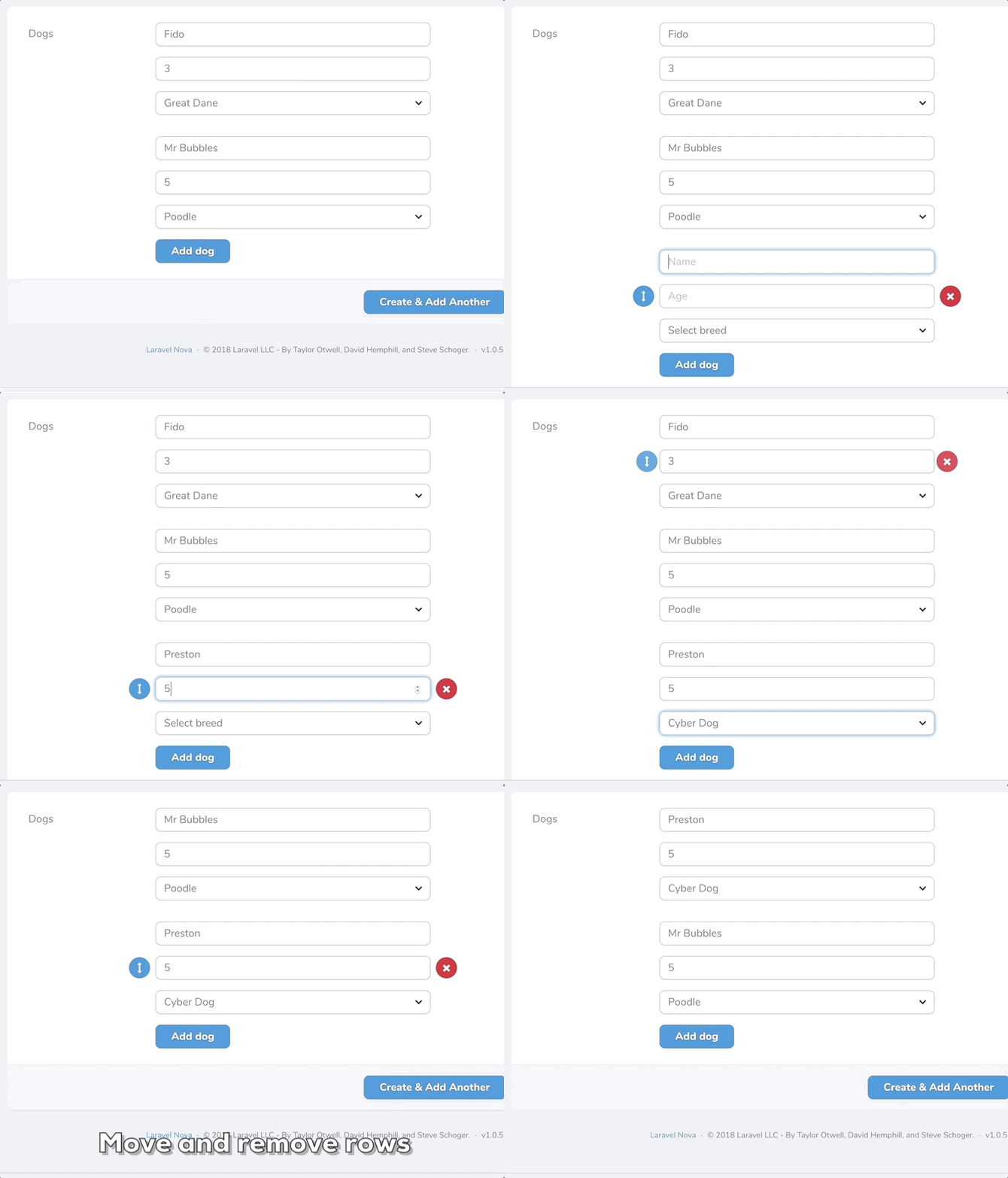
This package contains a Laravel Nova field that enables the creation of repeatable sets of 'sub' fields. Nova users are free to create, reorder and delete multiple rows of data with the sub fields you define. Data is saved to the database as JSON.
You can install this package in to a Laravel app that uses Nova via composer:
composer require fourstacks/nova-repeatable-fieldsTo add a repeater field, use the Fourstacks\NovaRepeatableFields\Repeater field in your Nova resource:
namespace App\Nova;

use Fourstacks\NovaRepeatableFields\Repeater;

// ...

class Petstore extends Resource
{
    // ...

    public function fields(Request $request)
    {
        return [
            // ...

            Repeater::make('Dogs'),

            // ...
        ];
    }
}
In order to use this package you should also ensure the Eloquent model that your Nova resource represents, is casting the attribute you wish to use a repeater field for, to an array:
namespace App;

// ...

class Petstore extends Model
{
    protected $casts = [
        'dogs' => 'array'
    ]
}
The underlying database field should be either a string or text type field.
This package comes with various options that you can use to define the sub fields within your repeater and
Parameters: array
Every repeater field you create should contain at least one sub field added via addField. The addField method accepts an array of sub field configuration options:
Repeater::make('Dogs')
    ->addField([
        // configuation options
    ])
Configuration options are:
[
    'label' => 'Dog name',
    //...
]
All sub fields must, at a minimum, be defined with a 'label'. This is a human-readable string that will appear in the Nova UI.
[
    'name' => 'dog_name',
    //...
]
By default, the name of the sub field (used when saving the data in the database) will be generated automatically using a snake case version of the sub field label. Alternatively you are free to override this convention and define a custom name to be used.
[
    'type' => 'number',
    //...
]
By default, the input type of the sub field will be a standard text field. You are free to define a different field type if you wish. Currently supported sub field types are: 'text', 'number', 'select', 'textarea'.
[
    'placeholder' => 'Name that dog',
    //...
]
By default, the input placeholder will be the same as the sub field label. However you are free to define a custom placeholder using this option that will appear instead.
[
    'width' => 'w-1/2',
    //...
]
If you choose to display your sub fields in a row (rather than stacked - see the displayStackedForm option below) you can define the widths of your fields using Tailwind's fractional width classes. You do not need to define widths for all your fields unless you want to. If no widths are entered for any sub fields all sub fields will be the same width.
Note that you are free to mix and match widths. For example you may with to set your first two fields to 50% width using w-1/2 then set the final field to be full width via w-full.
If you are displaying your sub fields in a stacked layout then width options will have no effect.
[
    'options' => [
        'fido' => 'Fido',
        'mr_bubbles' => 'Mr Bubbles',
        'preston' => 'Preston'
    ]',
    //...
]
If the type of the sub field you are defining is 'select', you will need to define an array of options for the select field. These are defined using an array of key/value pairs.
[
    'attributes' => [
        'min' => 1,
        'max' => '20',
        'style' => 'color: red'
    ]',
    //...
]
Via the attributes key you are free to define any custom properties you wish to add to the input via an associative array. These will be added via v-bind. For example you may wish to add min or max steps to a number field or a style attribute to a text field.
Repeater::make('Dogs')
    ->addButtonText('Add new dog');
You are free to configure the text for the button used to add a new set of sub fields in the Nova UI. By default this button is labelled 'Add row' but you can override this using the addButtonText option.
Repeater::make('Dogs')
    ->summaryLabel('Dogs');
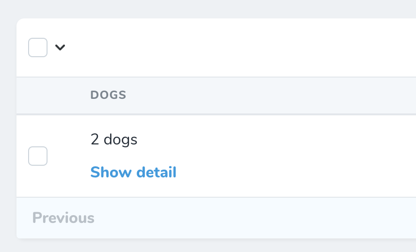
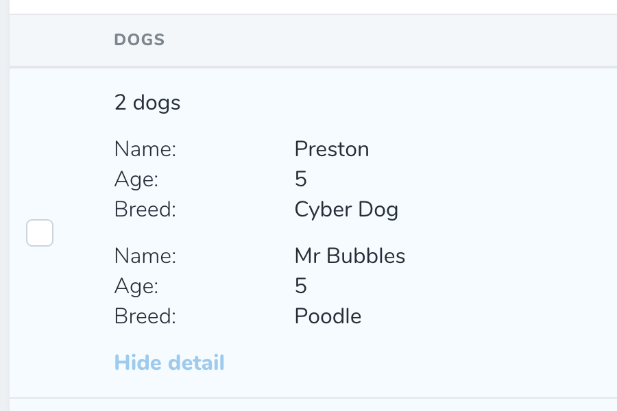
The detail and index views show a summary of the data inputted using the repeater field. By default this will show the count of the rows e.g. '3 rows' along with a link to expand to show the full data that was inputted:
You can overrides this summary text to something more specific e.g. '3 dogs':
Repeater::make('Dogs')
    ->displayStackedForm();
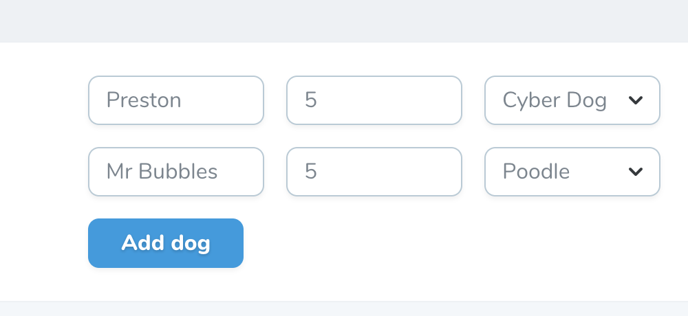
By default, a set of sub fields will appear as a series of horizontally aligned input fields:
This works well for repeater fields with only 2 or 3 sub fields, however for larger field sets a stacked form that displays repeater sub fields above one another will generally be a more usable layout. You can switch to a stacked layout using this option.
Repeater::make('Dogs')
    ->initialRows(4);
Sets the initial number of rows that will be pre-added on form initialization. For forms with existing rows, it will append up to the set number of rows.
Repeater::make('Dogs')
    ->maximumRows(4);
Sets the maximum number of rows as the upper limit. Upon reaching this limit, you will not be able to add new rows.
Please see CHANGELOG for more information on what has changed recently.
The MIT License (MIT). Please see License File for more information.


