SEM is a powerful tool that is infinitely flexible and able to handle diverse sorts of modeling procedures. However, it has two fatal flaws. First, latent variables are, by definition, unobserved. As such, data visualization, a critical component of model building, is not an easy task. Although some have advocated for the use of scatterplots of latent variables [@Hallgren2019], these plots assume the model has accurately estimated the parameters, which may or may not be the case. Second, standard latent variable models are estimated from summary statistics, such as means and covariances. These summary statistics may be misleading if model assumptions have been violated (e.g., if the data are not normally distributed or if relationships are nonlinear). Although there are SEM tools that allow users to model nonnormal data and nonlinear patterns, few diagnostic tools exist that allow users to assess the degree to which assumptions have been met (and/or whether violations of these assumptions are problematic).
To overcome both of these limitation, we develop visualization tools designed for latent variable models. These tools will not only provide diagnostic checks, but they will allow both researchers and lay audiences to intuitively understand the fit of latent variable models.
Currently, there is only a development version of flexplavaan. It can
be installed from github using the following command:
# install.packages("devtools")
devtools::install_github("dustinfife/flexplavaan")
There are five basic plots flexplavaan can produce:
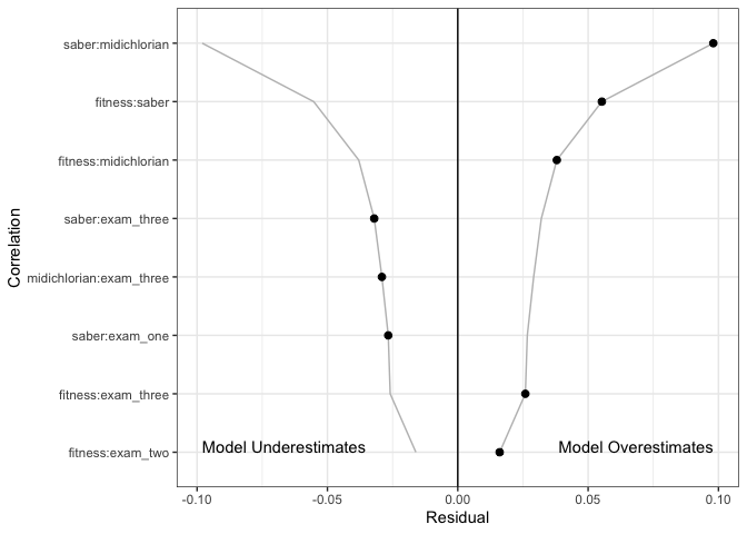
- Hopper plots. These plots show the residuals from the variance/covariance matrix of a structural equation model.
- Trace plots. These show pairwise associations between observed variables, while overlaying the model-implied fit (much like a scatterplot for a regression model).
- Disturbance-dependence plots. These are similar to residual dependence plots. They show the remaining association between two observed variables, once the model-implied fit has been removed.
- Measurement plots. These show the relationship between the observed variables and the (estimated or predicted) latent variable scores.
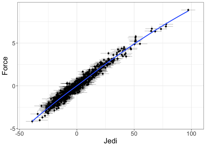
- Structural plots. These show the relationship between latent variables (and/or between endogenous variables).
I’ll show you how to use each of these in the following sections.
To show hopper plots, one simply fits a lavaan model:
require(flexplavaan)
require(lavaan)
data("jedi_jedi")

model = "
Force =~ fitness + saber + midichlorian + force_history
Jedi =~ exam_one + exam_two + exam_three
Jedi ~ Force
"

# Fit the models ----------------------------------------------------------
force_fit = sem(model, jedi_jedi)
Next, we can use the residual_plots function to generate the hopper
plot:
# show the hopper plots, only including those variables
# that have a residual larger than 0.01
residual_plots(force_fit, max_val = .01)
The X axis shows the absolute value of the residuals on the right and − 1× the absolute values on the left. In the above image, we see the largest residuals are between the saber/midichlorian/fitness variables.
To visualize trace/DDPs, one simply uses the visualize command:
# trail/ddp of the first 4 variables
visualize(force_fit, subset=1:4)
In the upper triangle are the trace plots. Here, the blue line shows a
loess line between the two observed variables. (The user can also
specify visualize(force_fit, method="lm") to get regression lines).
The red line is the model-implied fit from the model. The lower triangle
shows the relationship between the two indicators, once the
model-implied fit has been removed. The blue line is the loess line (as
before), while the red line is a horizontal line at y = 0. The
diagonals show a histogram of the residuals for each variable.
Users can also show the fit between the indicators and the empirical Bayes factor score estimates:
# show the measurement plot for the Force latent variable
implied_measurement(force_fit, latent="Force")
#> [[1]]
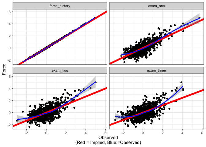
The advantage of measurement plots is they show a larger range of misfit than do the trace/DDPs. This is because trace/DDPs will only show misfit if that misfit shows up in bias in estimating the variance/covariance matrix. Measurement plots, on the other hand, show misfit that shows up in the estimates of the latent variables themselves.
Finally, we have structural plots:
# show the structural plot for the Force/Jedi latent variables
visualize(force_fit, plot="latent", formula = Force~Jedi)
#> Estimating Standard Errors...
The crosshairs highlight the fact that these variables are only estimates of the latent variables. Also, it is important to remember these plots are only meaningful if the former diagnostic plots check out. Otherwise, this is much like showing a regression line without raw datapoints in a regression model.
Obviously, the more latent variables one has, the more complex this plot
could become. The formula argument allows users specificity in how
latent variables are displayed. For more information on the syntax of
formulas, see the flexplot manual.
For more information, see the flexplavaan vignette.


