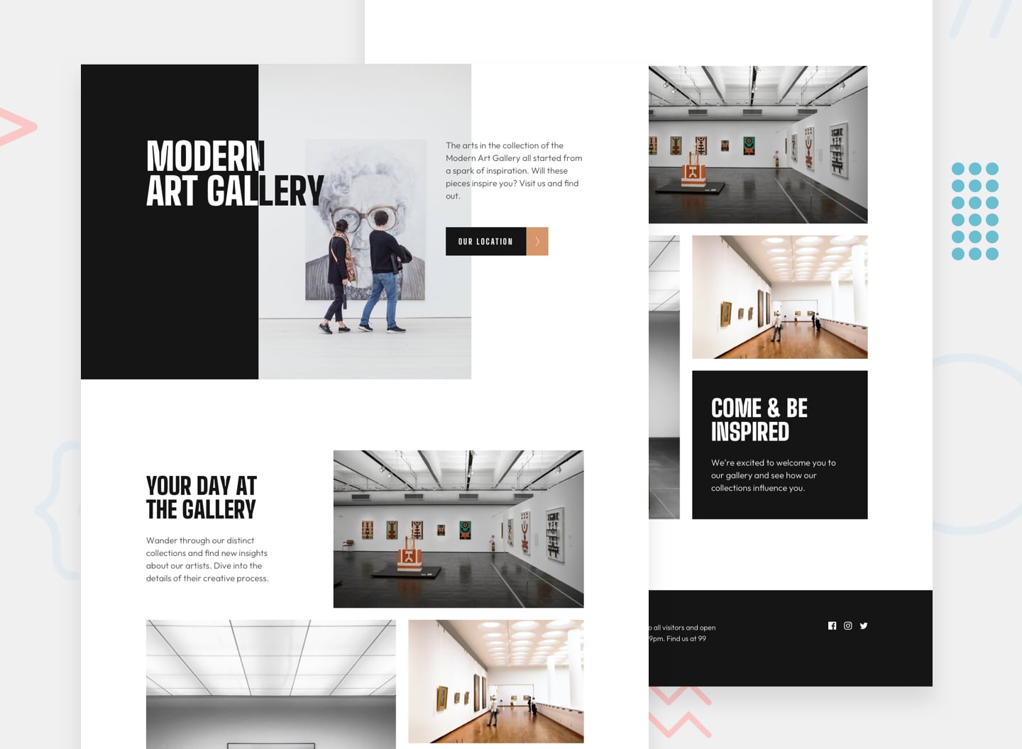
This is a solution to the Art gallery website challenge on Frontend Mentor. Frontend Mentor challenges are designed to help developers improve their coding skills by building realistic projects. Assets are provided, but no guidance, and developers are free to choose any approach to solving the challenge.
This is a simple two page, design that lends itself to intrinsic approach. I think this is a big improvement on my last attempt at this approach. I've avoided the use of media queries in favour of a more fluid approach. As with most things, there's a balance to be found here I think. I like the intrinsic design approach, and then using media queries to tweak details.
Users should be able to:
- View the optimal layout depending on their device's screen size
- See hover states for interactive elements
- Use Leaflet JS to create an interactive location map with custom location pin
- Focusing on intrinsic design forced me to improve my knowledge of modern CSS functions (
min,max,clamp, andflexandgridetc.). - CUBE CSS seems to play really nicely with this approach, I think as container queries come online this approach will become more practical.
- The font colour change on the
h1was a challenge. I usedmixed-blend-mode, which required some code restructuring that I'm not 100% happy with. - I'm quite pleased with the transitions on the buttons. I'm not sure transitioning
backgroundis performant, but hopefully a little bit is OK! - The first time for me using
image-setto optimise the fallback in the API fails. I progressively enhanced the rule to give the best solution to each user
- The zoom on the LeafletJS isn't great as the marker looses its central positioning. I have tried a few approaches but haven't been able to fix it yet.
- A lot of the approach I've tried to apply here comes from the work Stephanie Eckles has been doing on intrinsic design.
- I revisited Every Layout and used many of the approaches on the site for this challenge. They can sometimes appear quite complicated, but I really like the approach advocated. Highly recommended.
- I want to keep pushing on my learning an intrinsic design approach, but I'll allow myself more use of media queries so that the final product is more finished (as I have had to do with the
h1). - I'm still struggling to get my head around the
srcsetattribute andpictureelement. I continually have to refer back to this CSS Tricks article on how to implement them.
- Personal Website
- Frontend Mentor Profile - @dwhenson
