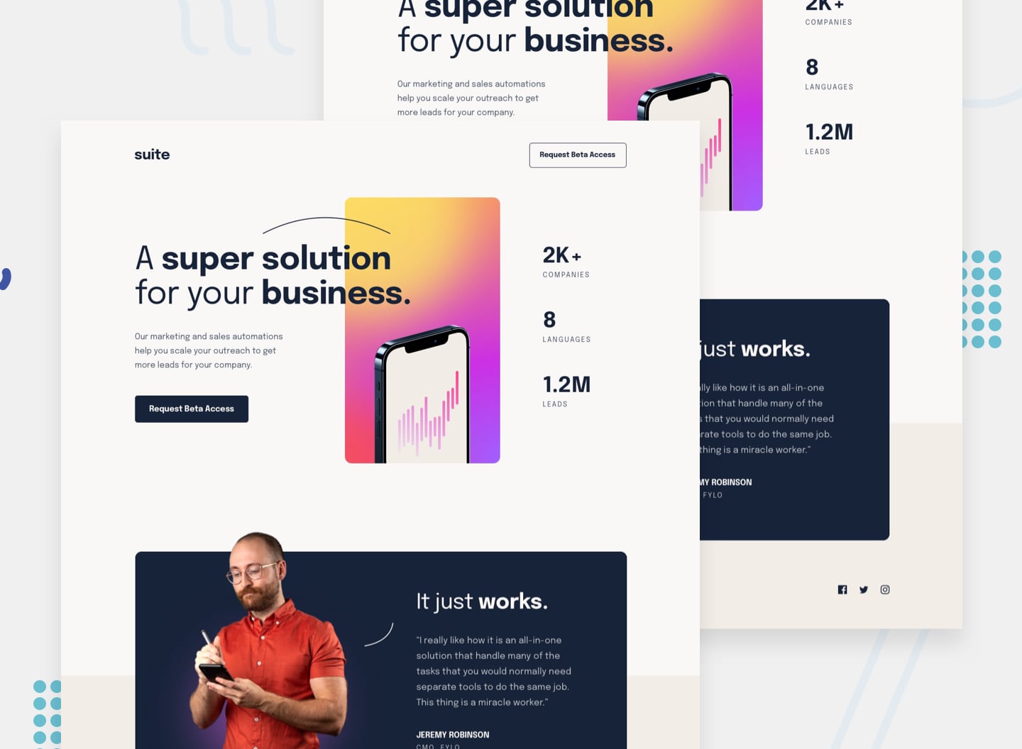
Not pixel perfect but I've been continuing to explore intrinsic design. I think this is a big improvement on my last attempt. This time I have only used two media queries: one to realign text from left to center, and another to remove the position adjustment on the hero image at narrow viewports.
- View the optimal layout depending on their device's screen size
- See hover states for interactive elements
- 💡 Focusing on intrinsic design forced me to improve my knowledge of modern CSS functions (
min,max,clamp, andflexandgridetc.) - 💡 CUBE CSS seems to play really nicely with this approach, I think as container queries come online this approach will become more practical
- 💡 Developing a production standard page using this approach would be very dependent on the design - media queries do have their place!
I think there might be a glitch or two as layout shifts around. I've done my best to prevent this, but getting this sorted with an intrinsic design approach is challenging. Especially when combined with other layout shifts as a result of, for example, the srcset adjustments.
- 🔗 A lot of the approach I've tried to apply here comes from the work Stephanie Eckles has been doing on intrinsic design.
- 🔗 I revisited Every Layout and used many of the approaches on the site for this challenge. They can sometimes appear quite complicated, but I really like the approach advocated. Highly recommended.
- 🙇♂️ I want to keep pushing on my learning an intrinsic design approach, but I'll allow myself more use of media queries so that the final product is more finished.
