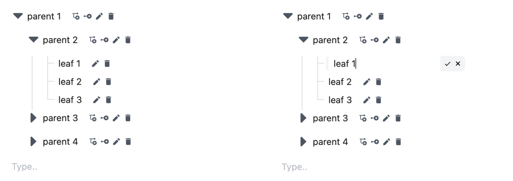
This is an editable tree based on antd components.
$ npm editable-antd-treeThe package can be found here.
Below there is a demonstration of the input data.
const tree = [
  {
    key: "1",
    title: "Technology",
    isLeaf: false,
    children: [
      {
        key: "2",
        parent: "1",
        title: "Phones",
        isLeaf: false,
        children: [
          // ...
        ],
      },
      {
        key: "3",
        parent: "1",
        title: "Laptops",
        isLeaf: true,
      },
    ],
    // ...
  },
  // ...
];
A simple example of this package can be seen below.
import { EditableAntdTree } from "editable-antd-tree";

import "editable-antd-tree/dist/esm/output.css"; // load style

const initTree = []; // 👀 example above

const App = () => (
  <>
    <EditableAntdTree treeData={initTree} />
  </>
);By downloading this package, there is a direct compatability with typescript.
| Property | Description | Type | Required |
|---|---|---|---|
treeData |
Initial tree data. See section below for all fields of TreeData. | EditableTreeNode[] |
Yes |
onTreeChange |
Executes uppon any tree data change. | Function |
No |
switcherIcon |
Controls the switcher icon, used to expand or collapse parent nodes. | React.ReactNode |
No |
size |
Controls the size of the tree. | xs, sm, md, lg, xl |
No |
loadData |
Function triggered when a non-leaf TreeNode lacks children. Loads data asynchronously and replaces TreeNode's children. | Function |
No |
createRootLeaf |
Contains properties explained in the sections below. | Object |
No |
createRootParent |
Contains properties explained in the sections below. | Object |
No |
deleteNode |
Contains properties explained in the sections below. | Object |
No |
updateNode |
Contains properties explained in the sections below. | Object |
No |
createLeaf |
Contains properties explained in the sections below. | Object |
No |
createParent |
Contains properties explained in the sections below. | Object |
No |
| Property | Description | Type | Required |
|---|---|---|---|
caption |
This property shows what should be displayed when a user hovers over the action. | string |
No |
disable |
This property indicates if the action should be disabled. | boolean |
No |
event |
This property is a Function that runs after the action has been pressed. | Function |
No |
| Property | Description | Type | Required |
|---|---|---|---|
caption |
This property shows what should be displayed when a user hovers over the action. | string |
No |
disable |
This property indicates if the action should be disabled. | boolean | Function |
No |
event |
This property is a Function that runs after the action has been pressed. | Function |
No |
+ All Tree properties of antd tree component.
| Property | Description | Type | Required |
|---|---|---|---|
key |
This field is used as a unique identifier. | string |
Yes |
title |
This field is displayed in the tree. | string |
No |
parent |
This field points to the parent key. | string |
No |
children |
This field contains more nested tree nodes. | EditableTreeNode[] |
No |
+ All TreeNode properties of antd tree component.
Special acknowledgements to the following packages:
After experimenting with various npm packages, none of them quite met my specific requirements. However, drawing inspiration from the packages mentioned earlier, I took it upon myself to develop a solution tailored to my needs, resulting in the creation of the editable-antd-tree package.


