
To start using MaterialFox UPDATED, follow these steps:
-
Open Firefox and type
about:configin the address bar, then press Enter. -
If a warning page appears, click
Accept the Risk and Continueto access theabout:configpage. -
Search for the following preferences using the search bar at the top of the
about:configpage, and ensure the following preferences aretrue:toolkit.legacyUserProfileCustomizations.stylesheetssvg.context-properties.content.enabledlayout.css.color-mix.enabled
-
Type
about:supportin the address bar and press Enter. -
Scroll down to the
Profile Foldersection and clickOpen Folder. -
Download the
chrome.zipfile from the latest release. -
Extract the contents of
chrome.zipinto your Firefox profile directory. -
Restart Firefox to apply the changes.
As an alternative to manual installation, you can use a PowerShell script.
For Windows, run the following PowerShell command:
$env:MATERIAL_FOX_VERSION = "latest"; PowerShell -ExecutionPolicy Unrestricted -c "iwr https://raw.githubusercontent.com/edelvarden/material-fox-updated/main/install.ps1 -useb | iex"For Firefox version 119 or below (Firefox ESR, Floorp or Waterfox)
$env:MATERIAL_FOX_VERSION = "tags/v1.0.7"; PowerShell -ExecutionPolicy Unrestricted -c "iwr https://raw.githubusercontent.com/edelvarden/material-fox-updated/main/install.ps1 -useb | iex"If you enjoy this project and want to help me maintain it further, buying me a coffee would be greatly appreciated! ☕️
Your suggestions and bug reports are also welcome on GitHub Issues.
You can apply visual design changes by adding some about:config customization options (preferences).
To set a preference, type about:config in the address bar and press Enter.
To enable a preference:
- Create a custom boolean preference by typing the preference name and clicking the plus button. For example,
userChrome.ui-chrome-refreshenables the new Chrome design.
To disable a preference:
- Search for it by name and delete the preference or toggle its state to
false.
Warning
Use only one preference with the prefix theme.
| Preference | Description |
|---|---|
userChrome.ui-chrome-refresh |
Enable the new Chrome design named "Chrome Refresh". |
userChrome.theme-chrome-refresh |
Enable a new color scheme like in "Chrome Refresh". |
userChrome.theme-material |
Enable Material color schemes. Read more. |
userChrome.theme-default |
Enable the default color scheme. This can be useful if you want to use it with Adaptive Tab Bar Color or native Firefox themes |
userChrome.ui-compact-url-bar |
Make the URL bar more compact by reducing its height. |
userChrome.ui-context-menu-icons |
Display context menu icons. |
userChrome.ui-no-menu-icons |
Hide the menu icons |
userChrome.ui-force-animation |
Force enable control animation, because it respects the user's animation disable preference by default. (Not required if you do not disable animation) |
userChrome.ui-force-old-icons |
Force the old icons to be used even if the userChrome.ui-chrome-refresh preference is enabled. |
userChrome.ui-no-ripple |
Disable ripple effect from buttons |
You can also add your own user CSS rules by using the custom.css file. Additionally, if you want to change some colors, you can override the default variable values with your own.
Follow these steps:
- Find and rename the
custom_example.cssfile in the root folder tocustom.css. - Open
custom.cssin a text editor. - Find the desired variable.
- Add your values. For example, set the accent color to red:
:root,
html,
body {
  /* add your css variables below */
  --md-accent-color: #ea4335 !important;
}- Save the file and restart Firefox to apply changes.
Note
Using this custom.css file can separate your changes from the source project. You can easily back up your file and not worry about overwriting your changes when updating or reinstalling the main files.
| Variable name | Description |
|---|---|
--md-accent-color |
accent color |
--md-background-color-0 |
dark tones |
--md-background-color-50 |
middle tones |
--md-background-color-100 |
light tones |
--md-text-primary |
main text color |
--md-text-secondary |
secondary text color |
--md-text-on-accent |
text on primary button |
--md-menu-background-color |
menu background color |
--md-menu-background-color-hover |
menu items background color on mouse over |
--md-menu-border-color |
controls border color |
--md-icon-color-primary |
navigation bar icons color |
--md-icon-color-secondary |
URL bar icons color |
--md-content-separator-color |
separator line between browser and content area |
--md-selection-text-color |
text selection color |
--md-selection-background-color |
selection background color |
Tip
You can find more variables in the variables/_colors.scss file. To use these variables, simply add the --md- prefix. For example, "accent-color": #a8c7fa, becomes --md-accent-color: #a8c7fa;.
Here are some examples of how you can use the custom.css file:
-
Replacing the font with your own. Change
"YourFontName"to the name of your font::root, html, body { /* add your css variables below */ } /* add your user css below */ *, *::before, *::after { font-family: "YourFontName" !important; }
-
Removing the separator line between the browser and content:
:root,
html,
body {
  /* add your css variables below */
  --md-content-separator-color: transparent !important;
}
Tip
You can use variables to completely recolor the theme. Here are some preset examples with code:
| Description | Preview |
|---|---|
|
Source code: theme-system-accent.css |
   |
|
Source code: theme-github.css |
 |
|
Source code: theme-dracula.css |
 |
You can use the Material Theme Builder to create a color theme from an image.
-
Create the
userChrome.theme-materialpreference in theabout:configpage. -
Go to the Material Theme Builder website.
-
Select from the presented images, upload your own, or use the "Random color" button to generate a theme.
-
Click the "Pick your fonts" button in the bottom right corner.
-
Skip this step and click the "Export theme" button.
-
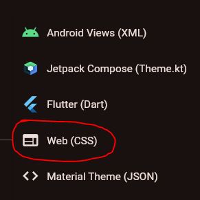
Click "Export" and select "Web (CSS)" from the dropdown menu.

This will download an archive of CSS files. You only need two files: light.css and dark.css. Open these in a text editor and extract the variables to your custom.css file. Wrap the variables in the appropriate media rule for light and dark themes.
Examples with previews
| Example | Preview |
|---|---|
| theme-material-blue.css |  |
| theme-material-red.css |  |
| theme-material-yellow.css |  |
| theme-material-green.css |  |
- Visual Studio Code (development environment)
- NodeJS (for npm)
- Open Firefox profile directory in terminal.
- Clone this repo with the following command:
git clone https://github.com/edelvarden/material-fox-updated.git chrome
cd chrome
npm install
npm run dev
Project structure
[Profile Folder]
└── chrome
    ├── chrome
    ├── src
    │   ├── user-chrome
    │   ├── user-content
    │   ├── user-chrome.scss
    │   └── user-content.scss
    ├── package-lock.json
    ├── package.json
    ├── userChrome.css
    └── userContent.css
- Then you can modify the files in the
srcdirectory, all changes will be automatically build in the[Profile Folder]/chrome/chromefolder.
To subsequently start the development mode, just use the following command:
npm run dev