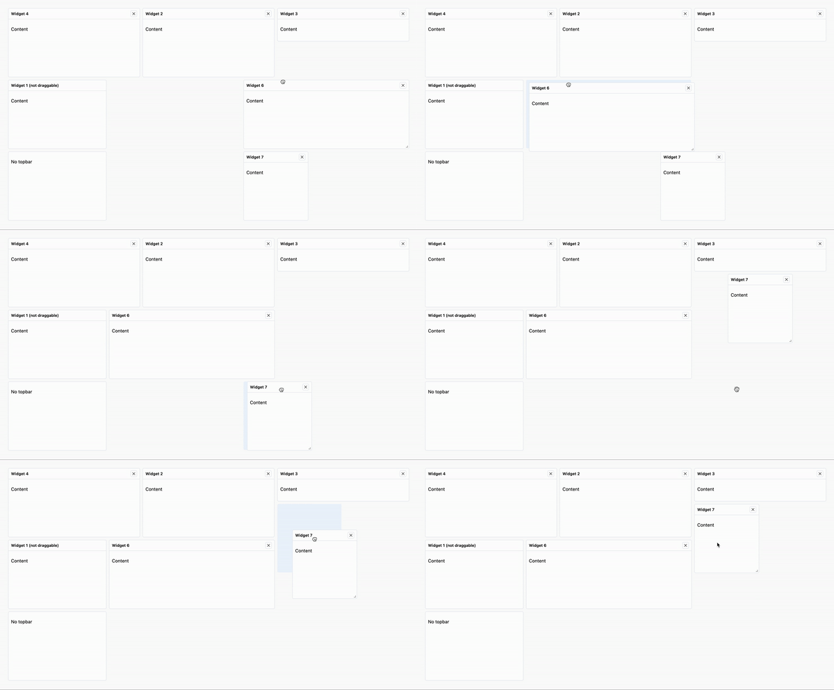
Highly customizable and performant React components specifically designed for creating interactive dashboards. With a focus on simplicity and flexibility, this library empowers developers to effortlessly build stunning dashboard interfaces.
See in action in the Storybook
- Codesandbox
- Stackblitz
Dashup provides a simple and versatile solution for building interactive dashboards in your React applications. With its intuitive API and extensive customization options, you can create dynamic and visually dope dashboards in no time.
Whether you need draggable and resizable widgets for flexible layout arrangements, fixed widgets, or a serialized layout for saving and loading dashboard configurations, this component library has you covered.
The components are built using React v18 and TypeScript, ensuring type safety and a seamless integration with your existing projects.
The library has no external dependencies, making it lightweight and easy to manage.
Intuitively drag and rearrange widgets within the dashboard to suit your needs. Resize widgets to optimize the layout and maximize content visibility.
Create widgets that can't be resized or moved, not even by other widgets!
Save and load the dashboard layout effortlessly using a serialized format.
Customize the appearance, behavior, and styling of the components to match your application's branding and requirements.
Using the best practices for React performance optimization, the library ensures smooth rendering and fluid user experiences.
Uses the power of Storybook for easy development and interactive documentation.
- React >= 18
- ReactDOM >= 18
Getting started with the Dashup is quick and straightforward. Follow the steps below to install the package and begin using the components in your project.
To install the Dashup, use the package manager of your choice:
npm install dashupyarn add dashuppnpm install dashupThe <Dashboard /> component exposes a simple but effective API:
interface DashboardProps {
  /** The widget list WidgetProps[] */
  widgets: Layout
  /** number of columns */
  columns?: number
  /** the rows height */
  rowHeight?: number
  /** the margin between widgets */
  margin?: [number, number]
  /** packing the layout */
  packing?: boolean
  /** the className for the placeholder (ghost) */
  placeholderClassName?: string
  /** callback method when a widget is moved, resized or deleted */
  onChange?: (widgets: Layout) => void
  /** callback method when the dashboard (or window) is resized */
  onResize?: () => void
}
const widget: WidgetProps = {
id: uuidv4(),
x: 0,
y: 2,
width: 3,
height: 2,
title: 'Widget 1',
draggable: true,
removible: true,
stationary: false,
component: <ComponentForWidget />,
}
const widgets: Layout = [widget, ...]
<Dashboard
widgets={widgets}
columns={12}
rowHeight={100}
onChange={handleDashboardChange}
/>interface WidgetProps {
id: string
/** In columns */
x: number
/** In rows */
y: number
/** In columns */
width: number
/** In rows */
height: number
/** In columns */
minWidth?: number
/** In rows */
minHeight?: number
maxWidth?: number
maxHeight?: number
/** make widget fixed */
fixed?: boolean
/** make widget draggable */
draggable?: boolean
/** make widget resizable */
resizable?: boolean
/** the widget title */
title: string
/** the component that will be rendered into the widget */
component?: JSX.Element
/** the component that will be the wiidget toolbar */
toolbar?: ReactElement
}interface CustomToolbarProps {
id?: string
title?: string
className?: string
}I'm actively seeking help to ensure the quality and reliability of the library through comprehensive testing. If you have experience with testing React components and would like to contribute, I would greatly appreciate your assistance. Whether it's writing unit tests, integration tests, or providing feedback on existing tests.
As you can see, there are quite a few tasks on the to-do list... Feel like helping me out with one?
Your contributions will be welcome!
- ⚡️ Extra features
- 💻 Codesandbox and Stackblitz examples
- 📄 Docuentation
- 📄 Contributing
- 🔬 Testing
Please, help me for test the component 🙏🏻
I welcome contributions from the community! If you'd like to contribute to this project, please review the contribution guidelines and submit a pull request.
This project is licensed under the MIT License.


