angular-number-picker
=====================
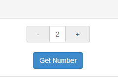
A directive used for picking number by using -/+ button, instead of typing the number directly.
This is an angular directive designed in mobile-first concept. Which means you would have better user experience while in mobile development.
While running on mobile device, you would increase/decrease the number continuously by long tap the -/+ button.
Try it: plunker
Requirement
- angularjs (1.4.3+)
UI dependency(optional)
- bootstrap (3.3.5+)
Install
bower install angular-number-picker --saveBasic Usage
- Include
angular-number-picker.jsinto yourindex.htmlby usingscripttag, or you have other way to import dependency(For example: requirejs), like following:
<script type="text/javascript" src="[location]/angular-number-picker.js"></script>- Add
angularNumberPickermodule as your angular app's dependency
var demo = angular.module('demo', ['angularNumberPicker']);- Use
h-numbertag in your html
<div ng-controller="DemoController">
    <h-number value="input.num" min="2" max="10" step="1" change="onChanged()"></h-number>
</div>- Writing
DemoController
demo.controller('DemoController', ['$scope', function($scope) {
   $scope.input = {
            num: 0
        };

   $scope.getNumber = function() {
       alert('The number is: [' + $scope.input.num + ']');
   };

   $scope.onChange = function(){
       console.log('The number is Changed ', $scope.input.num);
   };
}]);
h-number configuration
| Attribute | Type | Required | Description |
|---|---|---|---|
| value | expression | Yes | Expression to evaluate as the input number |
| min | Number | No | The minimal point to limit the operation. 0 by default |
| max | Number | No | The maximum point to limit the operation. 100 by default |
| step | Number | No | The step value for the operation. 1 by default |
| singular | String | No | Label to be included after value when value is 1 |
| plural | String | No | Label to be included after value when value is not 1 |
| change | Function | No | Function to be called while number is changed |
build-in class
input-group
The wrapper class for the h-number element
input-group-addon
The wrapper class for +- operator
form-control
The wrapper class for the number area at the center
active
The active class will be added to the input-group-addon button, while touching them. So it's possible to implement your own behavior.
It's easy to implement those classes to achieve your own UI
run demo locally
Install npm dependency
npm installInstall bower dependency
bower installrun demo
gulp demo


