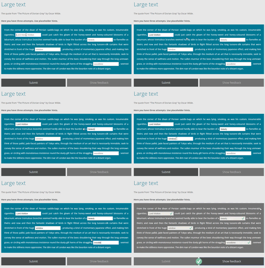
Text Input Inline is a question component based on Text Input component.
Text Input Inline allows the user to input a free-form answer in response to an initial question. The author may supply multiple correct answers to accommodate, for example, variations in spelling. The author may also supply a suffix and prefix to be added to the text field. Main difference from original Text Input component is capability to write multiline text with inline inputs fields.
With the Adapt CLI installed, run the following from the command line:
adapt install adapt-textInput-inline
Alternatively, this component can also be installed by adding the following line of code to the *adapt.json* file:
`"adapt-textInput-inline": "*"`
Then running the command:
`adapt install`
(This second method will reinstall all plug-ins listed in *adapt.json*.)
The attributes listed below are used in components.json to configure Text Input Inline, and are properly formatted as JSON.
In addition to the attributes specifically listed below, question components can implement the following sets of attributes:
- core model attributes: These are inherited by every Adapt component. They have no default values. Like the attributes below, their values are assigned in components.json.
- core buttons: Default values are found in course.json, but may be overridden by Text Input Inline's model in components.json.
_component (string): This value must be: textinputinline. (One word, all lowercase.)
_classes (string): CSS class name to be applied to [core plug-in]’s containing div. The class must be predefined in one of the Less files. Separate multiple classes with a space.
_layout (string): This defines the horizontal position of the component in the block. Acceptable values are full, left or right.
instruction (string): This optional text appears above the component. It is frequently used to guide the learner’s interaction with the component.
_attempts (integer): This specifies the number of times a learner is allowed to submit an answer. The default is 1.
_shouldDisplayAttempts (boolean): Determines whether or not the text set in remainingAttemptText and remainingAttemptsText will be displayed. These two attributes are part of the core buttons attribute group. The default is false.
_canShowModelAnswer (boolean): Setting this to false prevents the _showCorrectAnswer button from being displayed. The default is true.
_canShowMarking (boolean): Setting this to false prevents ticks and crosses being displayed on question completion. The default is true.
_canShowFeedback (boolean): Setting this to false disables feedback, so it is not shown to the user. The default is true.
_recordInteraction (boolean) Determines whether or not the learner's answer(s) will be recorded on the LMS via cmi.interactions. Default is true. For further information, see the entry for _shouldRecordInteractions in the README for adapt-contrib-spoor.
_allowsAnyCase (boolean): This setting determines whether or not the learner's input must match the uppercase and lowercase letters of the supplied answer/s. Set to false if case-sensitivity is required for a correct answer. The default is true.
_questionWeight (number): A number which reflects the significance of the question in relation to the other questions in the course. This number is used in calculations of the final score reported to the LMS.
_allowsPunctuation (boolean): This setting determines whether the learner's input may include punctuation characters listed below. The default is true.
) ( ~ _ - = } { : ; * & ^ % £ $ ! # - / , . `
_items (object array): Each item represents one text input box for this question and contains values for _answers, prefix, suffix, and placeholder.
_answers (string array): Text value/s that must be matched by the learner's input. Multiple answers can be created to accommodate, for example, variations in spelling. Example:
    "_answers": [
        "2",
        "two"
    ]
prefix (string): Text entered in this setting will appear before the input area.
suffix (string): Text entered in this setting will appear after the input area.
placeholder (string): This text supplies a short hint describing the expected value of the input field.
_feedback (object): If the Tutor extension is enabled, these various texts will be displayed depending on the submitted answer. _feedback contains values for three types of answers: correct, _incorrect, and _partlyCorrect. Some attributes are optional. If they are not supplied, the default that is noted below will be used.
correct (string): Text that will be displayed when the submitted answer is correct.
_incorrect (object): Texts that will be displayed when the submitted answer is incorrect. It contains values that are displayed under differing conditions: final and notFinal.
final (string): Text that will be displayed when the submitted answer is incorrect and no more attempts are permitted.
notFinal (string): Text that will be displayed when the submitted answer is incorrect while more attempts are permitted. This is optional—if you do not supply it, the _incorrect.final feedback will be shown instead.
_partlyCorrect (object): Texts that will be displayed when the submitted answer is partially correct. It contains values that are displayed under differing conditions: final and notFinal.
final (string): Text that will be displayed when the submitted answer is partly correct and no more attempts are permitted. This is optional—if you do not supply it, the _incorrect.final feedback will be shown instead.
notFinal (string): Text that will be displayed when the submitted answer is partly correct while more attempts are permitted. This is optional—if you do not supply it, the _incorrect.notFinal feedback will be shown instead.
Text Input Inline has been assigned a label using the aria-label attribute: ariaRegion. This label is not a visible element. It is utilized by assistive technology such as screen readers. Should the region's text need to be customised, it can be found within the globals object in properties.schema.
Note to developers:
Text Input Inline varies slightly from other Adapt question components in that the answer object does not have a _isCorrect. Only one answer object is supplied and its values determine which responses are correct.
No known limitations.
Version number: 0.0.1  Framework versions: 2.0.11+
Accessibility support: WAI AA
RTL support: yes
