A Python script to create cactus and scatter plots based on the matplotlib plotting library. The script makes use of only a tiny subset of what matplotlib can do.
mkplot was originally designed to make my life a lot easier by automating the plotting tasks, which a typical CS researcher has to deal with quite often. After a few years of using the script, I realized that it may be helpful for some other people (hopefully!) and so to make it publicly available. Enjoy! :)
First of all, make sure you have a Python interpreter installed. To run the script, you also need to install the matplotlib library. Please, see the corresponding installation instructions. Once matplotlib is installed on your computer, you can start using mkplot.
The script has a number of parameters, which can be set from the command line. To see the list of options, run:
mkplot.py -h
The data to plot can be given in one of the two formats:
While the CSV format is a simple table of values aggregating all the data, the preferred format is a series of JSON files, which describe the data for an individual tool/solver following this example:
{
	"preamble": {
		"program": "program-name",
		"prog_args": "-a some -b program --arguments",
		"prog_alias": "some-short-alias-to-use-in-the-plot",
		"benchmark": "name-of-benchmark-set"
	},
	"stats": {
		"some_problem_instance": {
			"status": true,
			"rtime": 10.567,
			"mempeak": "171864 KiB",
			"some-other-key": "key-value1"
		},
		"another_problem_instance": {
			"status": false,
			"rtime": 1000.00,
			"mempeak": "245759 KiB",
			"some-other-key": "key-value2"
		},
		"instance3": {
			"status": true,
			"rtime": 256.32,
			"mempeak": "57261 KiB",
			"some-other-key": "key-value3"
		}
	}
}
Here, the data describes the result of running a tool referred to as "program-name" with the given list of command-line arguments on a benchmark set called "name-of-benchmark-set" containing three problem instances. The result for each instance must have the information on its status: true or false meaning that the instance is solved or unsolved, respectively. All the other fields are non-mandatory (you can use whatever key/value you want). However, note that the rtime key is used by default when working with JSON files (to change this use the -k option).
For further details of the input format, please, see the example files.
A few usage examples of mkplot follow.
For instance, running
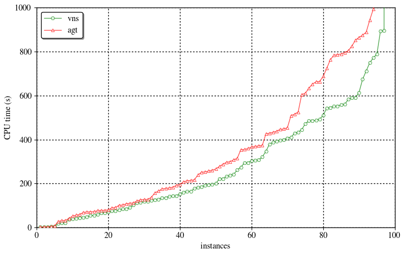
mkplot.py -l --legend prog_alias -t 1000 -b png --save-to examples/cactus.png examples/solver?.json
results in a simple cactus plot showing the performance of very-nice-solver and another-good-tool: 
Here, mkplot is set to show program aliases in the legend instead of their complete names.
If you need to create a scatter plot detailing the difference between the two solvers, just do
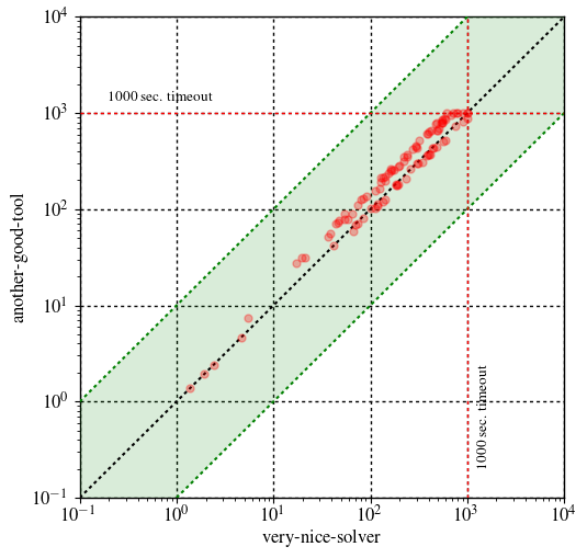
mkplot.py -l -p scatter -b png --save-to examples/scatter.png --shape squared -t 1000 --ylog --ymax 10000 --ymin 0.1 --xlog examples/csv-data.csv
The resulting scatter plot is the following:
Observe that here instead of JSON files, a CSV table is used.
This project is licensed under the MIT License - see the LICENSE file for details.
