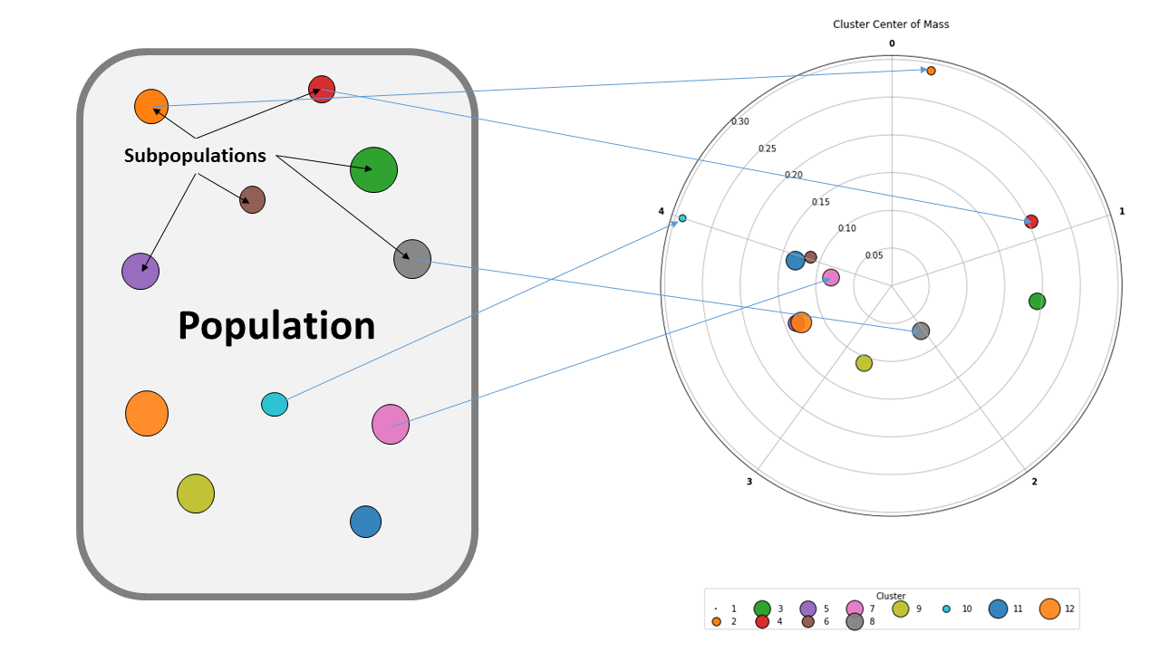
The clockplot is designed to help visualize how subgroups of a population are arranged over time, while maintaining a metric of for the heterogeneity or purity of that subgroup.
This visualization was designed with biology in mind. For example, given a cell population defined by a particular CD marker, we might be want to define subpopulations by the different combinations of other markers expressed by those cells, and see when those phenotypes might appear. The clockplot lets you arrange the stages or time points like hours on a clock, and then the subpopulations are "pulled" towards each time point based on their percentage component of that timepoint (this algorithm is partially inspired by tracking how the center of mass along a frequency wave moves during a Fourier transform).
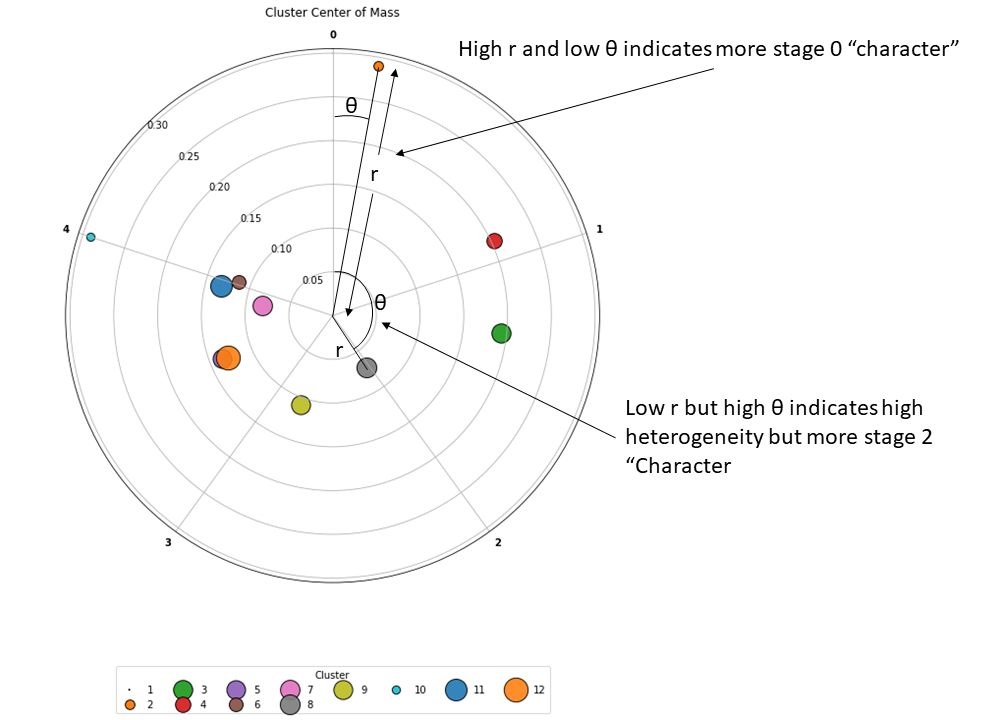
Essentially, the angle starting from 12 o'clock indicates how much time has passed in the experiment before a given population appeared. The population's proximity to the center of the clockplot indicates the heterogeneity of the population with respect to time. For instance, a population in the center of the plot indicates that the population is equally likely to appear at all time points of the experiment, while a population near the periphery has a stronger association to a given time point.
That said, this way of visualizing data could be applied to other data driven fields as well. Consider examining how the content of different stock portfolios changes over time, or looking at which times during the year we see more action versus ciné art movies are released?
Example with the included lineardemo data, which is simulated data made by "rolling" a population bolus across a series of time points. We can then order the populations based on their angle from 12 o'clock: 2, 4, 3, 8, 9, 12, 5, 7, 6, 11, 10.
Please see demo.ipynb for a demonstration of the usage.

