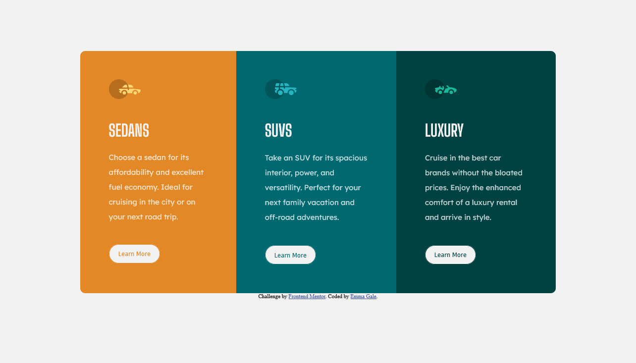
This is a solution to the 3-column preview card component challenge on Frontend Mentor. Frontend Mentor challenges help you improve your coding skills by building realistic projects.
Users should be able to:
- View the optimal layout depending on their device's screen size
- See hover states for interactive elements
- Live Site URL: https://3-column-preview-card-git-main-emjogale.vercel.app/
- Semantic HTML5 markup
- CSS custom properties
- Flexbox
- Mobile-first workflow
Firstly I realised that using a tag for Google fonts was the way to go - as the @import wasn't working correctly for me. Secondly that the line height is really important for giving nice spacing on the text.
I also learnt that the hover transition would be much nicer if I had a border already on the button - and had it the same colour as the background - so it wouldn't show until the hover transition happended. Otherwise the added height would cause the page to move in an annoying way.
Using tags for the svg's seemed to work well - whether this is preferrable to an or not yet I don't know.
I'm still not 100% on the container and positioning rules. Sometimes it seems I'm not sure whether a container is necessary or not - but I will hopefully get the hang of this.
- https://developer.mozilla.org/en-US/docs/Web/CSS/line-height - This helped me for the line height.
- https://www.freecodecamp.org/news/use-svg-images-in-css-html - This is really interesting article about the various ways you can use svg images.
- https://webdesign.tutsplus.com/articles/css-tips-for-better-color-and-contrast-accessibility--cms-34472 - This is an excellent article about how to easily improve the accessibility of colours. I found the bits about hsl colours particularly helpful.
- Frontend Mentor - @emjogale
- Twitter - @emmagale2635
