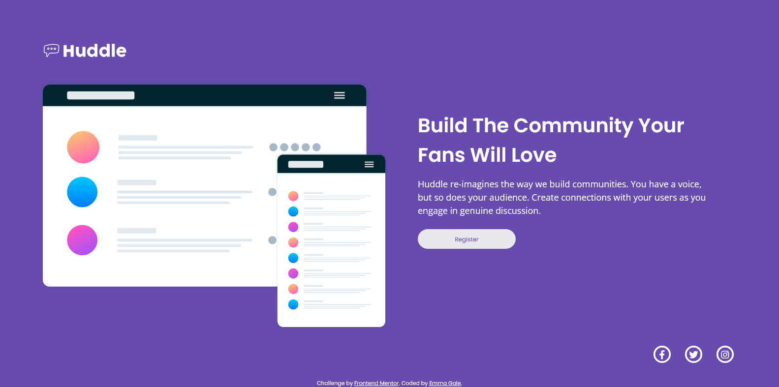
This is a solution to the Huddle landing page with single introductory section challenge on Frontend Mentor.
Users should be able to:
- View the optimal layout for the page depending on their device's screen size
- See hover states for all interactive elements on the page
- Solution URL: https://github.com/emjogale/huddle-landing-page
- Live Site URL: https://huddle-landing-page-lilac.vercel.app/
- Semantic HTML5 markup
- SCSS
- Flexbox
- Mobile-first workflow
Having completed a few challenges a bit haphazardly I decided to try and neaten up my approach. I felt it was time I dipped my toe into using SCSS and also look into better naming strategies for the classes I use. Although this is a fairly simple challenge I thought it was best to start small and see how I got on. Along the way I found some very useful articles
I enjoyed using SCSS for this, although as it is a small project it was fairly limited to what I could try out. I'm hoping I have correctly used the syntax. I would like to do a slightly bigger project to see how I can develop my use of SCSS and also further improve my class naming skills. I also need to get more of a grasp on using Font Awesome icons - as I found that quite tricky.
- Should We Use CSS or SCSS in 2021? - This helped me to clarify the benefits of SCSS
- Sass official documentation - this helped to clear up my confusion with the differences between Sass and SCSS.
- Introduction to Sass/Scss - I found this helpful alongside the official docs
- Frontend Mentor - @emjogale
- Twitter - @emmagale2635
I got inspiration and guidance on how to structure the Html and naming the classes from Grace Snow's project Mobile-first CSS grid layout, with scss, and flexbox in card headers
