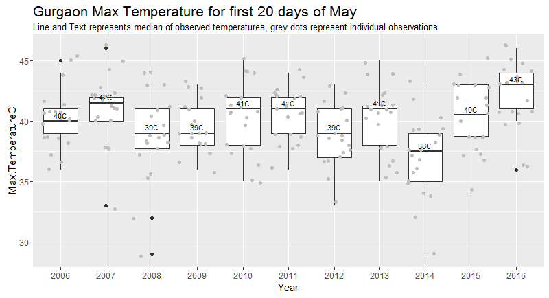
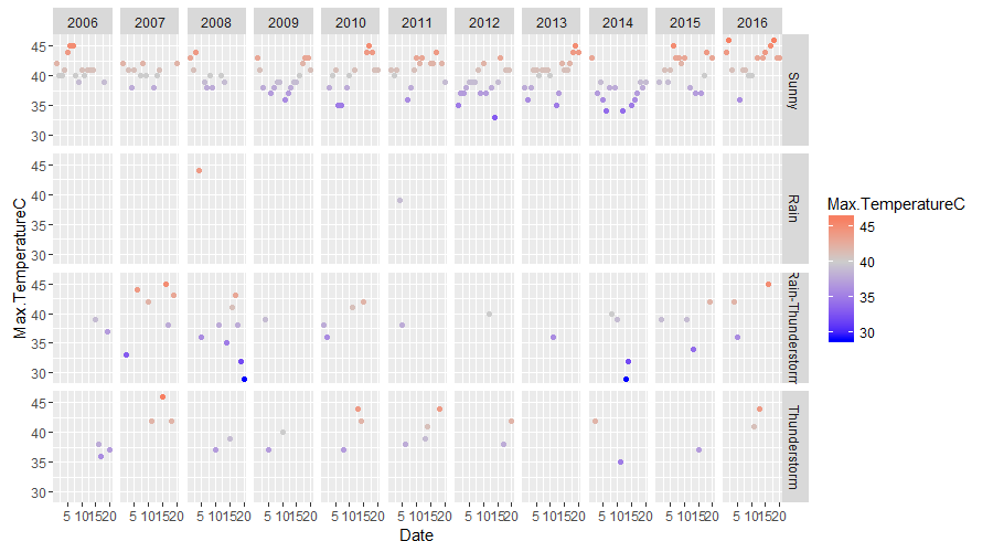
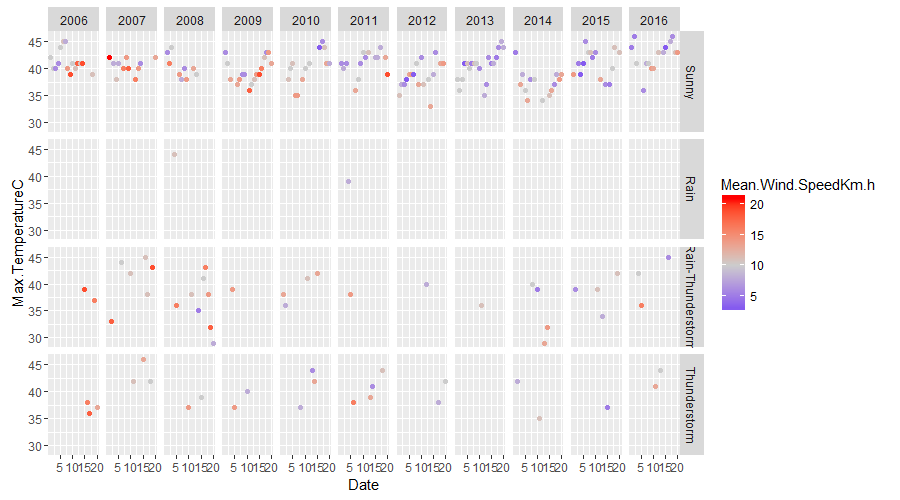
It's the 20th of May 2016, and Gurgaon is a furnace. It felt hotter than usual, and corroboration would have been nice. So to quantify this feeling we look at the maximum temperature for Gurgaon over the past 10 years. This script was used to create the following plots.

It does look to me like that 2016 has seen more hotter days than over the past few years. A small shift in median temperature can make things feel substantially different.
 The weather around this time of the year seems to be driven to extremes. They are either very hot, or involve an element of thunderstorm.
Since I was anyway trying to learn R, and found the Coursera course on Reproducibility highly enjoyable. I will try to showcase the steps taken to reach our above plot outputs. The steps involved are:
- Fetch data
- Manipulate data
- Plot data
The script uses the following libraries by Hadley
The script uses the dev branch of ggplot2 from Github, branch b181e9a since we use the sub title feature which isn't present in the CRAN version as of May 2016. The code to install this particular library version is:
# install.packages("devtools")
devtools::install_github("hadley/ggplot2")
The weather data is fetched from Wunderground, who helpfully provide a url which gives us a csv dump. I got the url by looking at the Wunderground page for a location and then clicking on the History tab. At the bottom of which is a link to a csv file. Looking at the url we see that some key information is encoded in it.
https://www.wunderground.com/history/airport/VIDP/2016/5/19/MonthlyHistory.html?req_city=Gurgaon&req_statename=India&reqdb.zip=00000&reqdb.magic=1&reqdb.wmo=42178&format=1
The script starts by taking the above url apart and putting it together by contructing a date sequence. For instance you can change the yearRange variable and set the initial year and final year to get data for all the years between and including them.
We loop through the yearRange and get the weather data for all the days in month of mDate for the given range of years. Changing the date in dDate doesn't seem to affect the output result.
## create a base path to create final data url
  basePath <- c("https://www.wunderground.com/history/airport/VIDP/","/","/","/MonthlyHistory.html?req_city=Gurgaon&req_statename=India&reqdb.zip=00000&reqdb.magic=1&reqdb.wmo=42178&format=1")

## set month and date
  mDate <- "05"
  dDate <- "01"

## set year range
  yearRange <- c(2006,2016)
Then do a loop between the yearRange and fetch the data.
 ## make a loop and fetch data for the year range mentioned for the entire month
  for (i in yearRange[1]:yearRange[2]) {
   filePath <- paste0(basePath[1],as.character(i),basePath[2],mDate,basePath[3],dDate,basePath[4])
    print(filePath)
    tmp <- read.csv(filePath)
    if(i == yearRange[1]){
      df1 <- tmp
    }else{
     df1 <- rbind(df1,tmp)
    }
  }
And since today is the 20th, I filter out data for dates 1-20 from past years too.
## filter out dates
df2 <- df1 %>% filter(Date < 21)
Then we calculate the median MaxTemperature for for each with the help of the dplyr package.
## calculate the median
df3 <- df2 %>% select(Year,Max.TemperatureC) %>% group_by(Year) %>% summarise(medTemp = median(Max.TemperatureC))
Now with the data in shape, we plot the data. Since I wanted to see how the pattern of max daily temperature has varied over the years I decided to visualise it as a box plot and display the median of the observations.
## do the box plot
 q <- ggplot(df2,aes(Year,Max.TemperatureC))
 q  <- q + geom_boxplot() + geom_jitter(colour="grey75")
## add in median to the box plot q
 q <- q + geom_text(data = df3, aes(y = medTemp, label = paste0(round(medTemp,0),"C")),size = 3, vjust = -0.5)
 q <- q + ggtitle("Gurgaon Max Temperature for first 20 days of May",subtitle="Line and Text represents median of observed temperatures, grey dots represent individual observations")
 q + theme(plot.title = element_text(hjust=0, size=16))
Probably put these in a function and make it more customisable. Inputs: Time Range, Locations etc
Make a Shiny App.
Please be gentle while hitting the Wunderground server. Looking at weather data options would be an important next steps.
